The Poetics of Space II: College Brutalism

architecture, college, design, photography

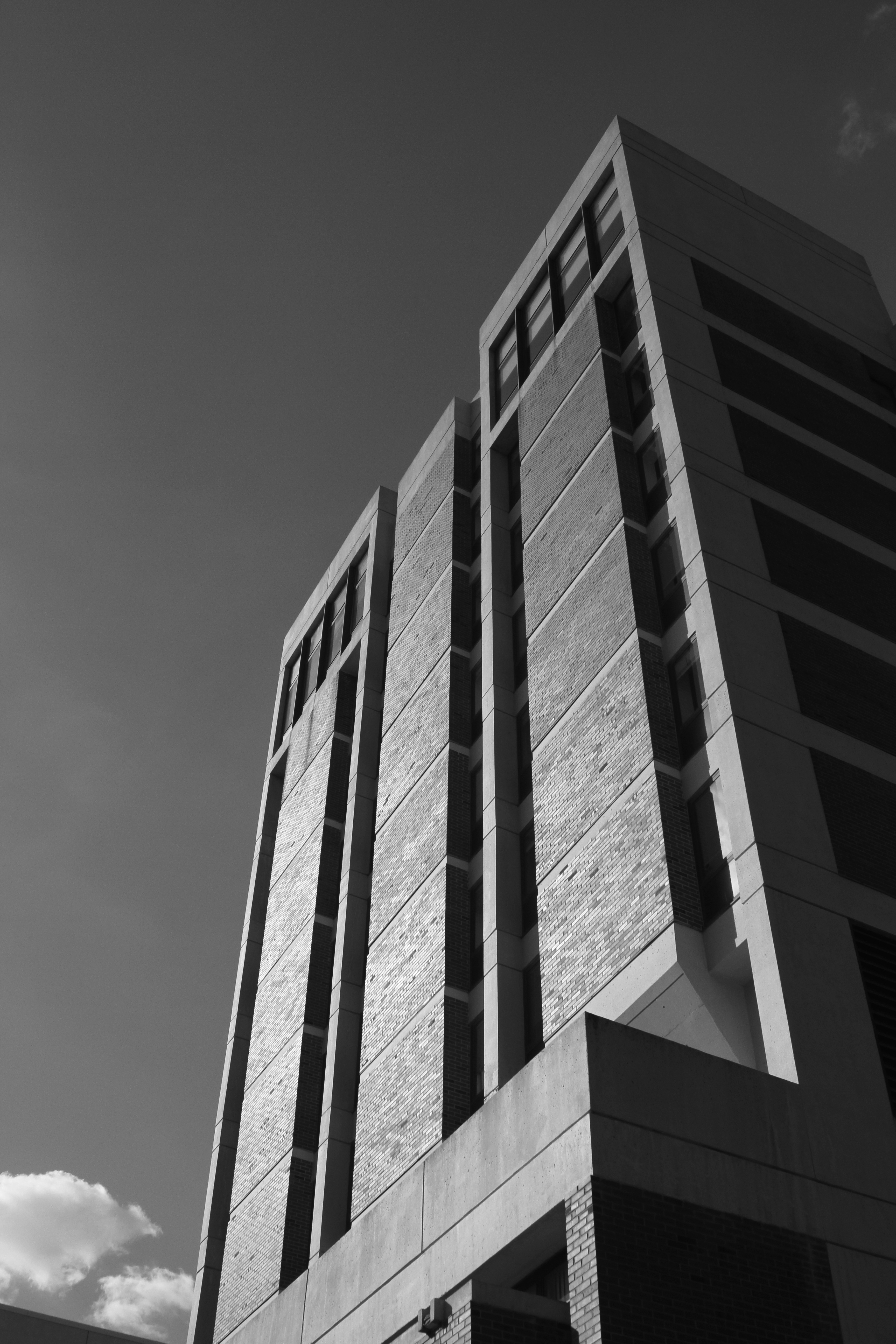
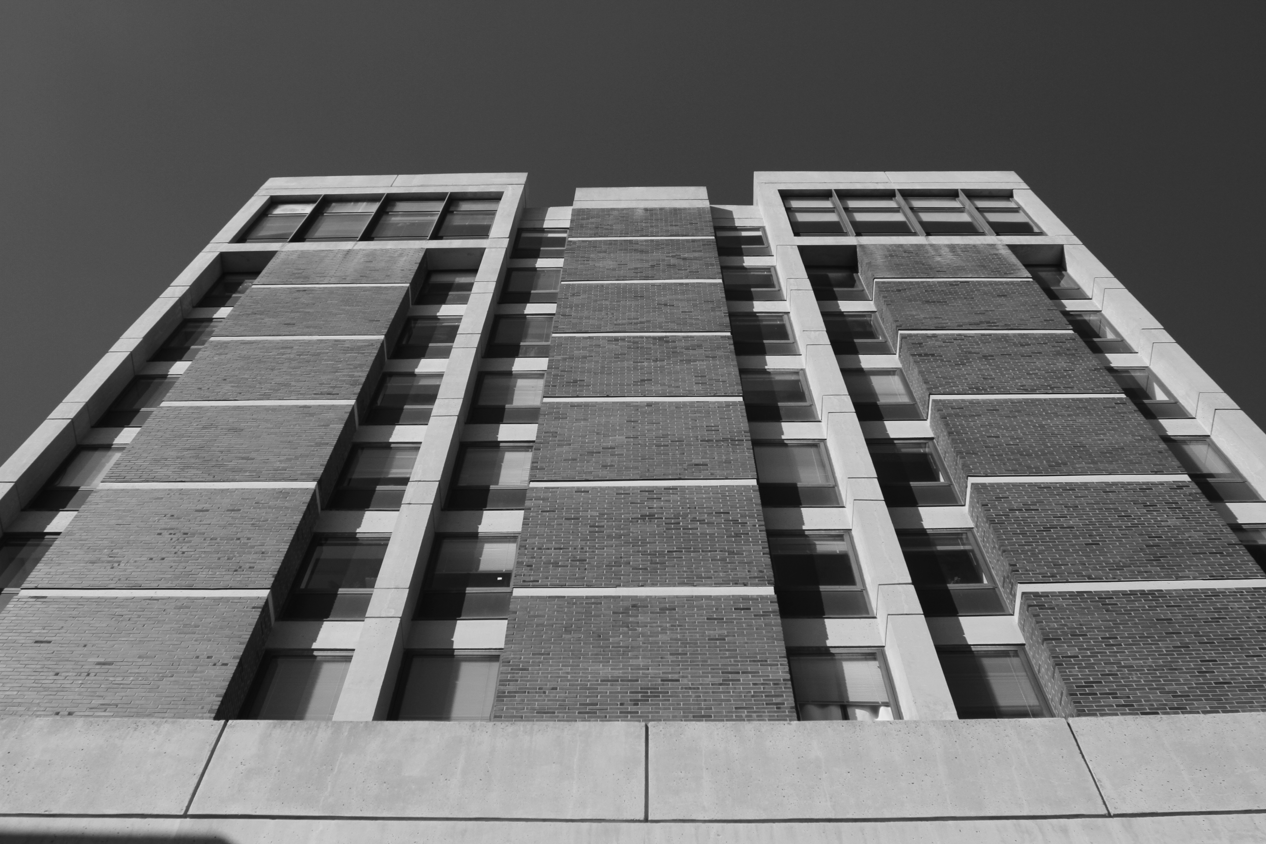
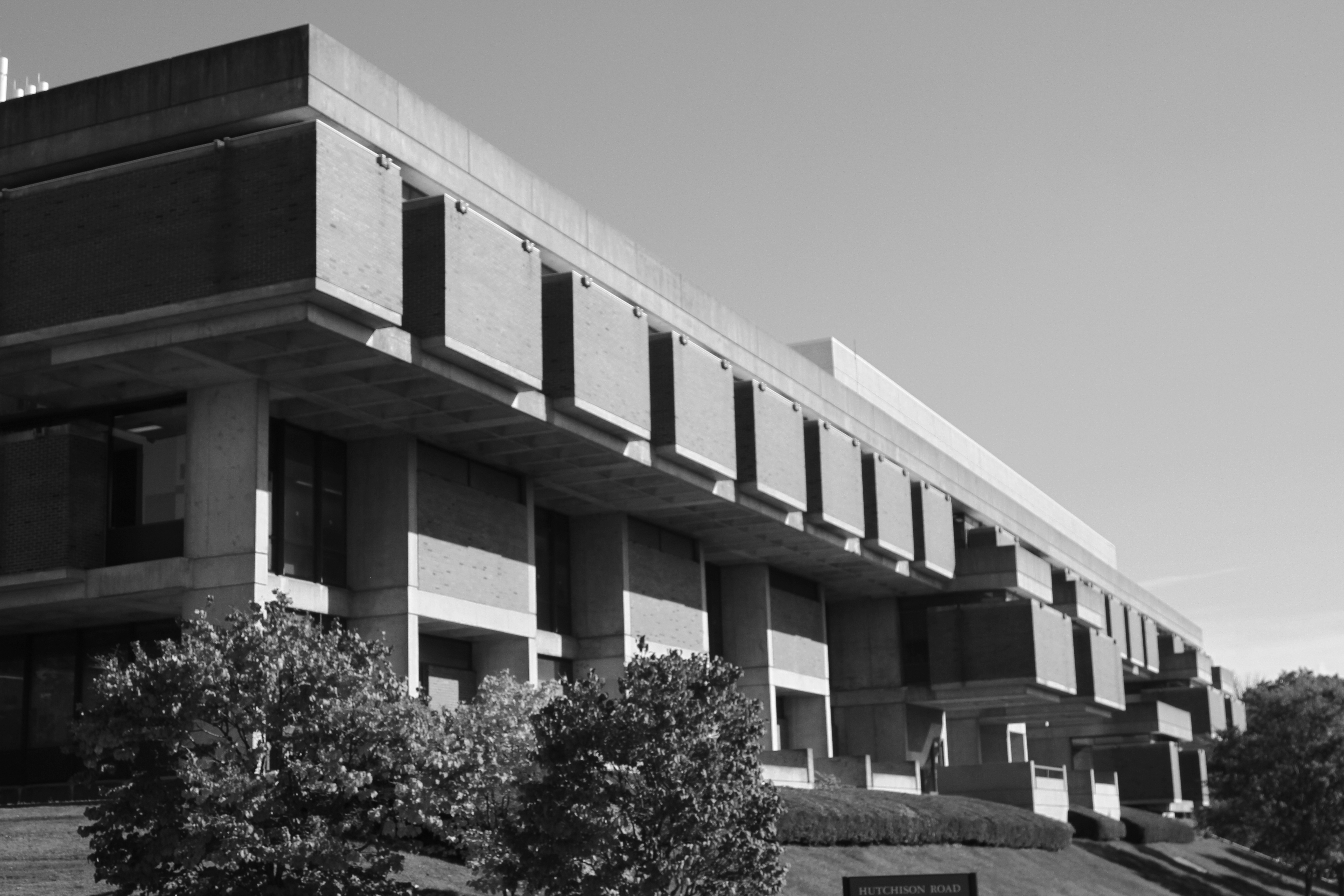
The second building I want to represent as part of my honors thesis exhibition is Hutchinson Hall, also known as “the battleship,” and its vertical peer, Hylan Tower.

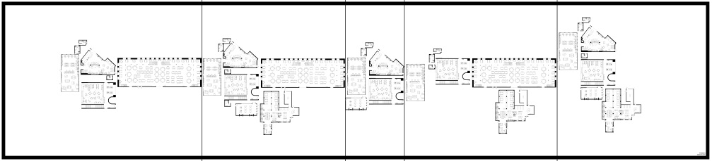
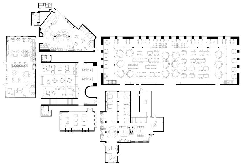
Here are my photographic studies so far (discussion after the pictures).

IMG_1990

IMG_1994

IMG_1997

IMG_1998

IMG_2000

IMG_2003

IMG_2007

IMG_2012

IMG_2014

IMG_2016

IMG_2021

IMG_2028

IMG_2029

IMG_2054

IMG_2061

IMG_2062

IMG_2067

IMG_2070

IMG_2074

IMG_2076

IMG_2079

IMG_2084

IMG_2085

IMG_2093

IMG_2114

IMG_2124

IMG_2132

IMG_2139

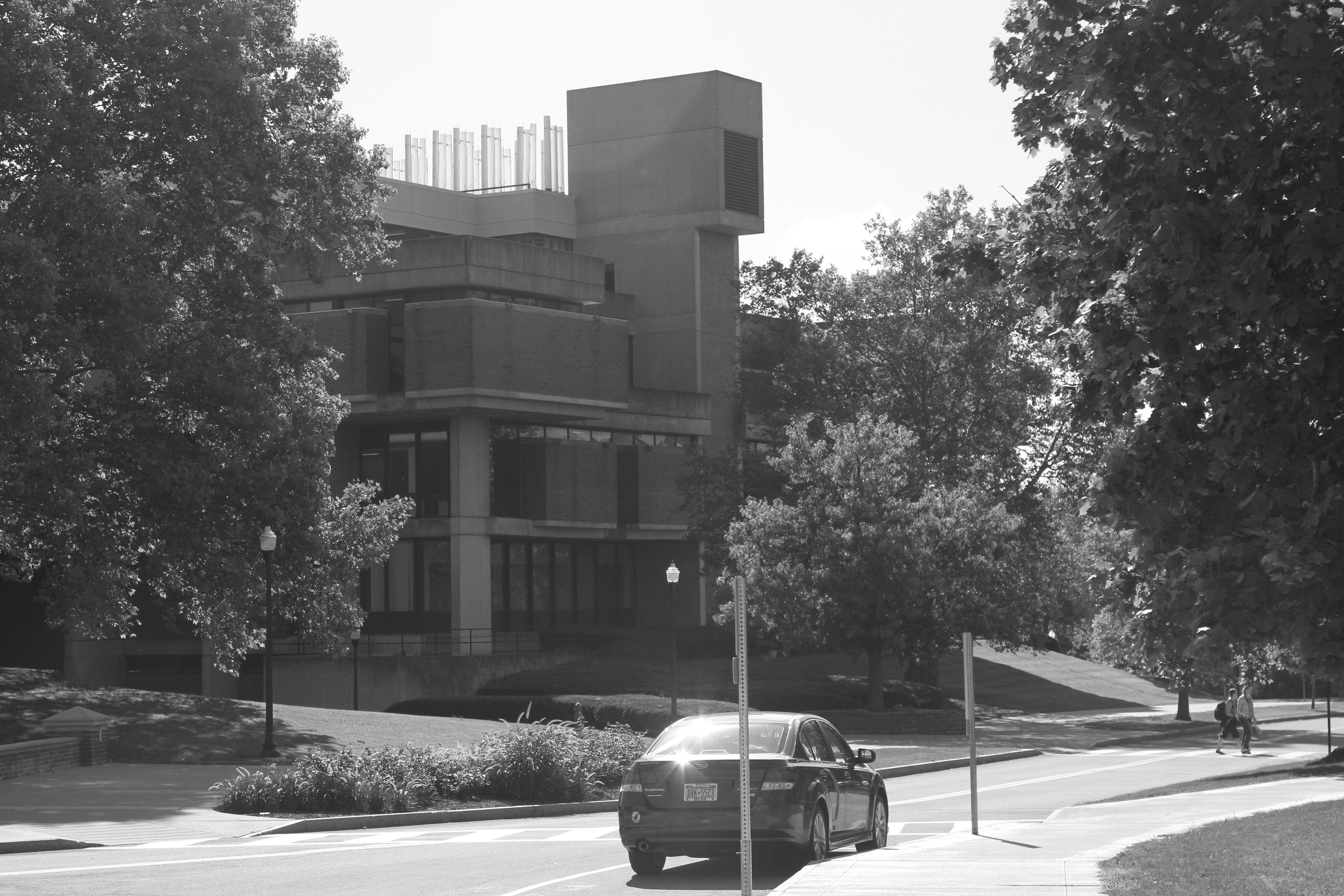
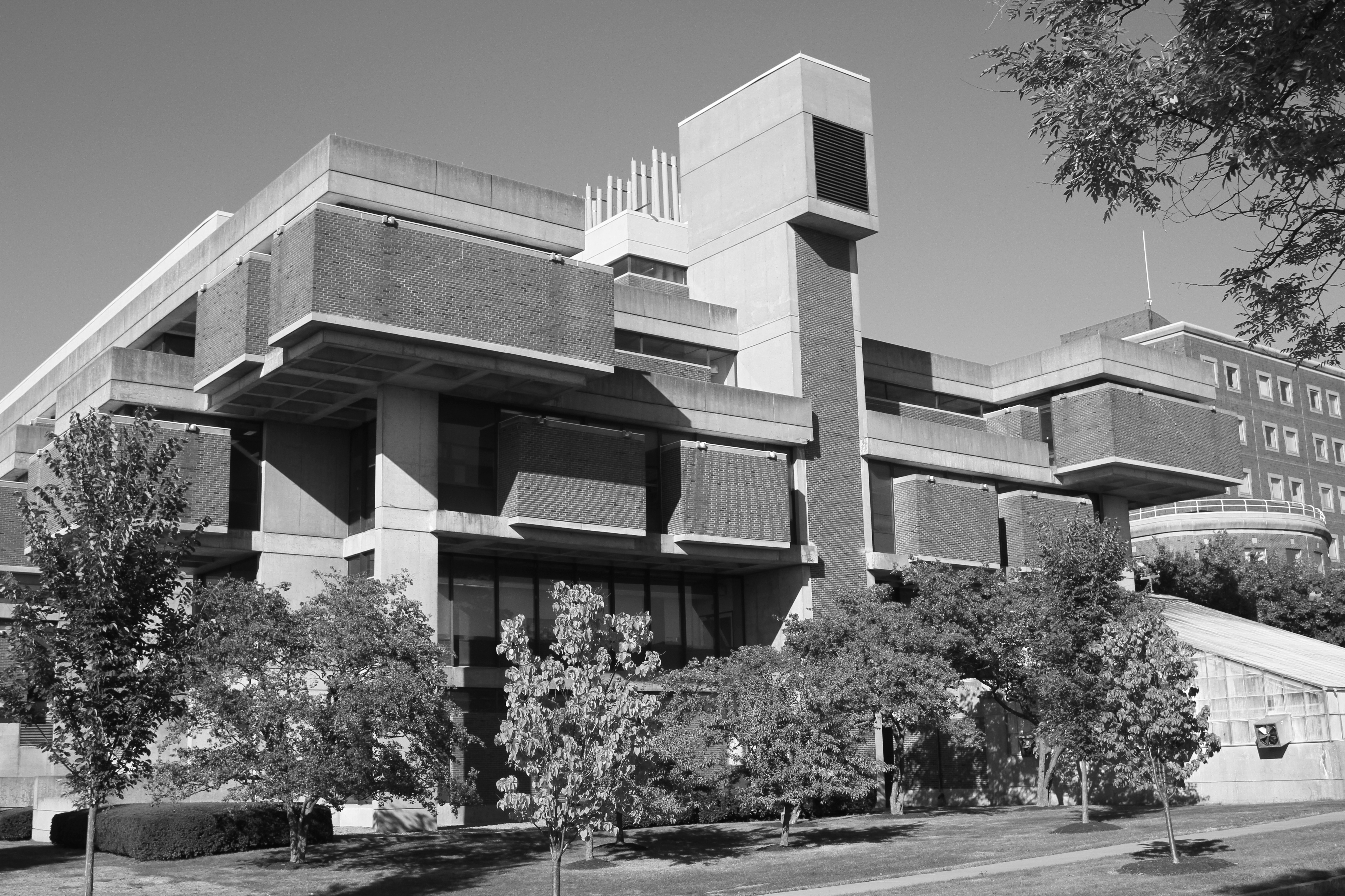
I have witnessed many negative remarks by students and faculty about this building. They wonder why do we need a bomb shelter on campus, and why couldn’t they do an ivy-covered brick building instead, with little stone cornices and details on the corners.

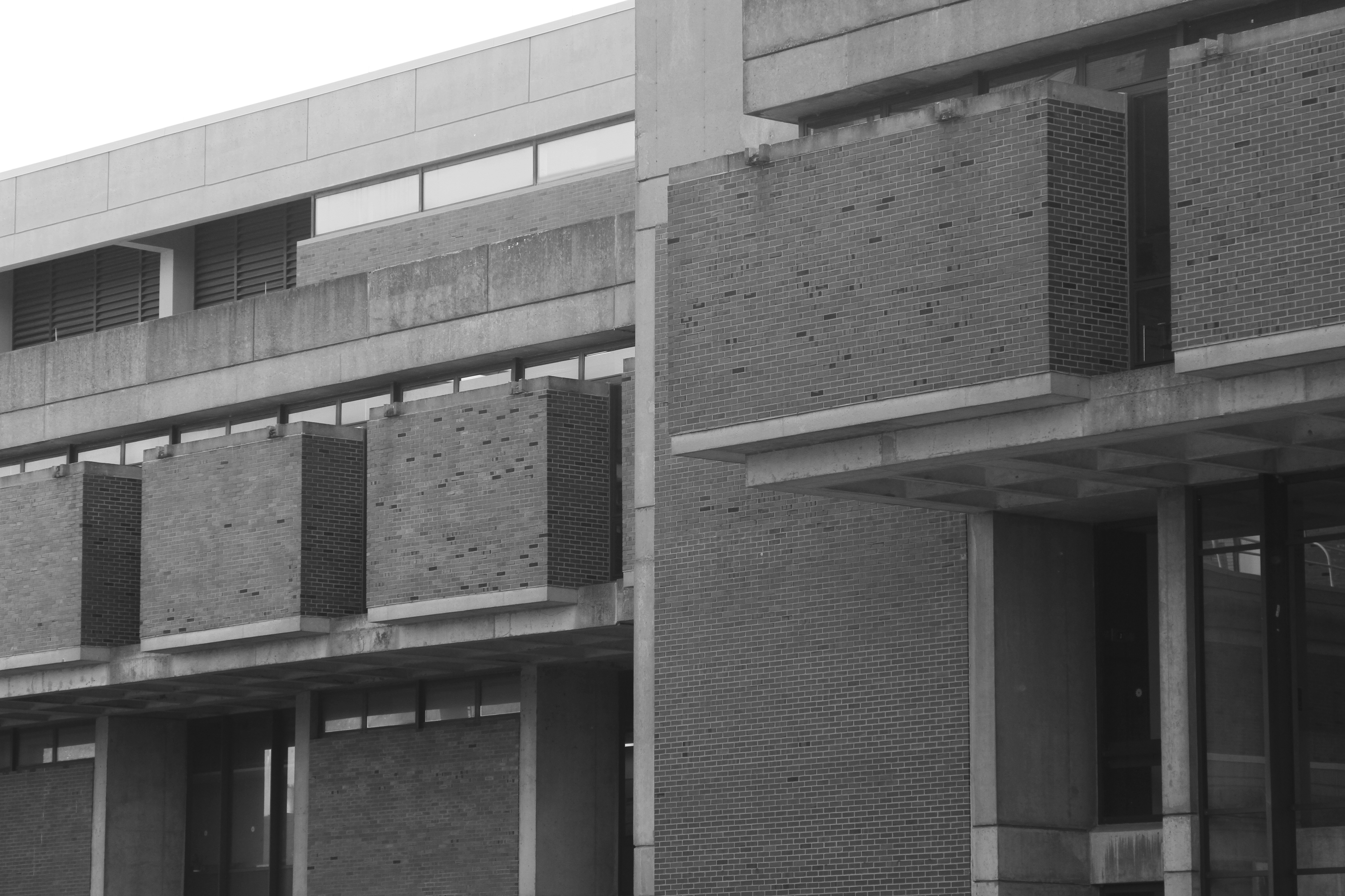
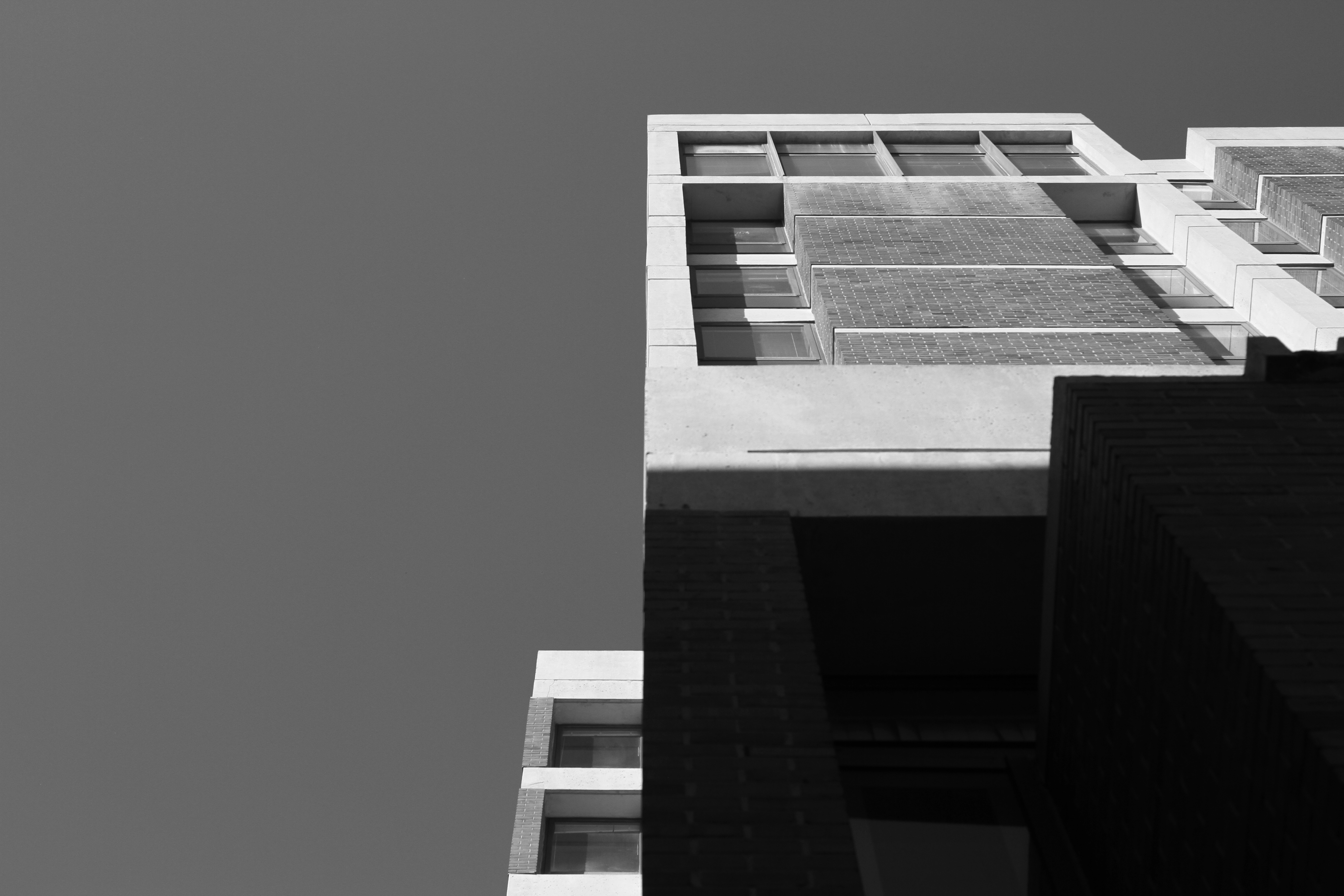
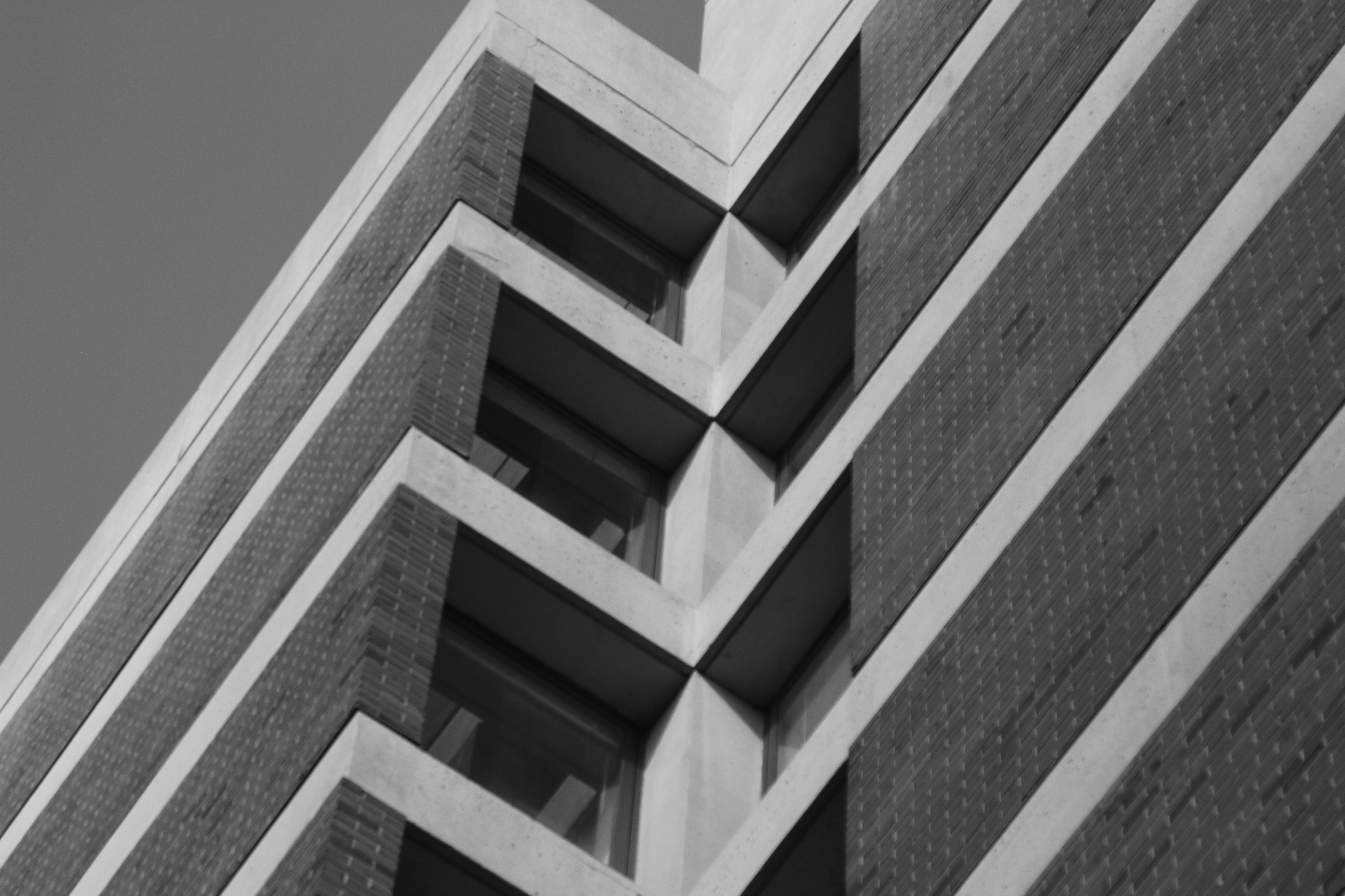
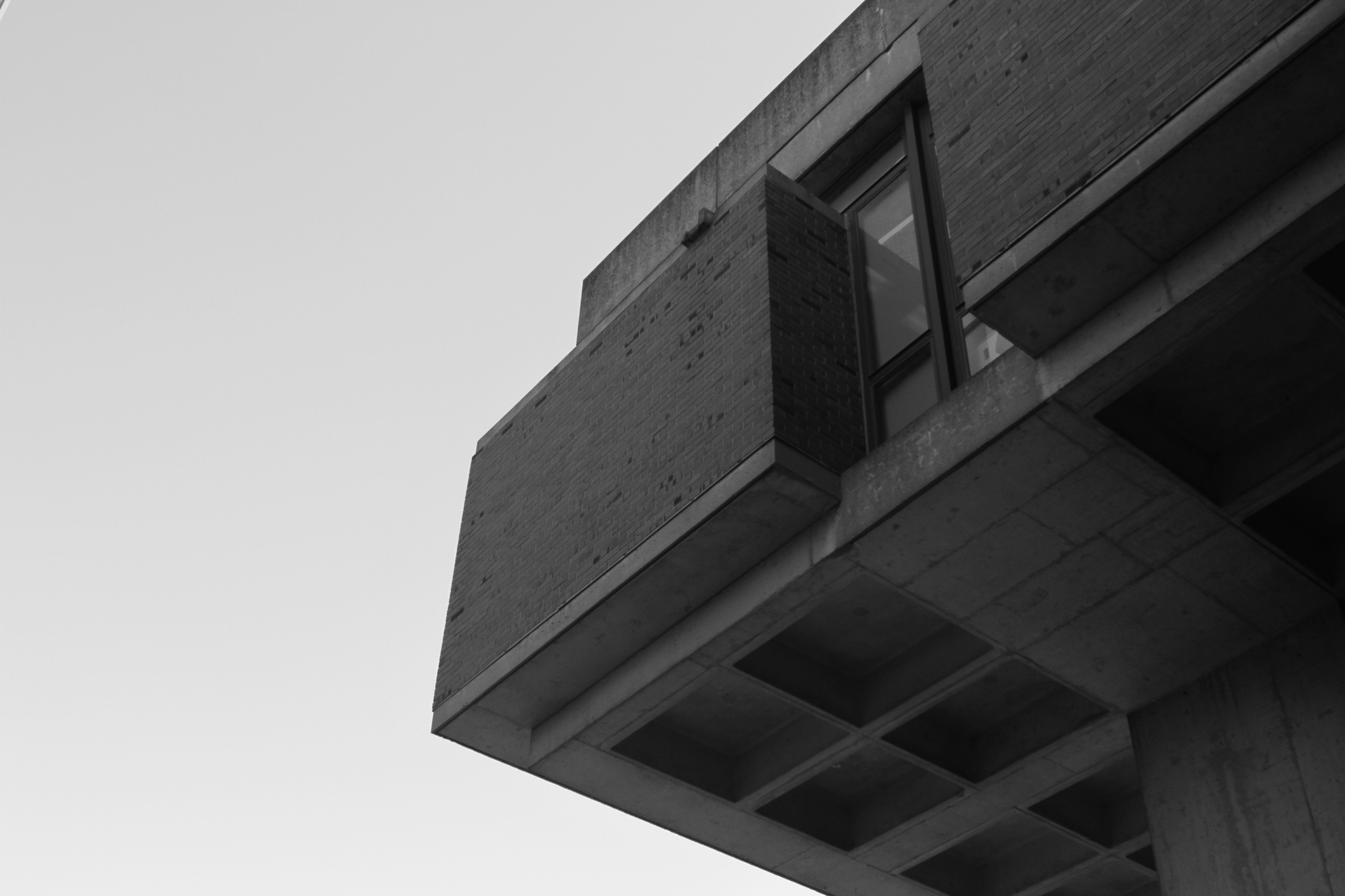
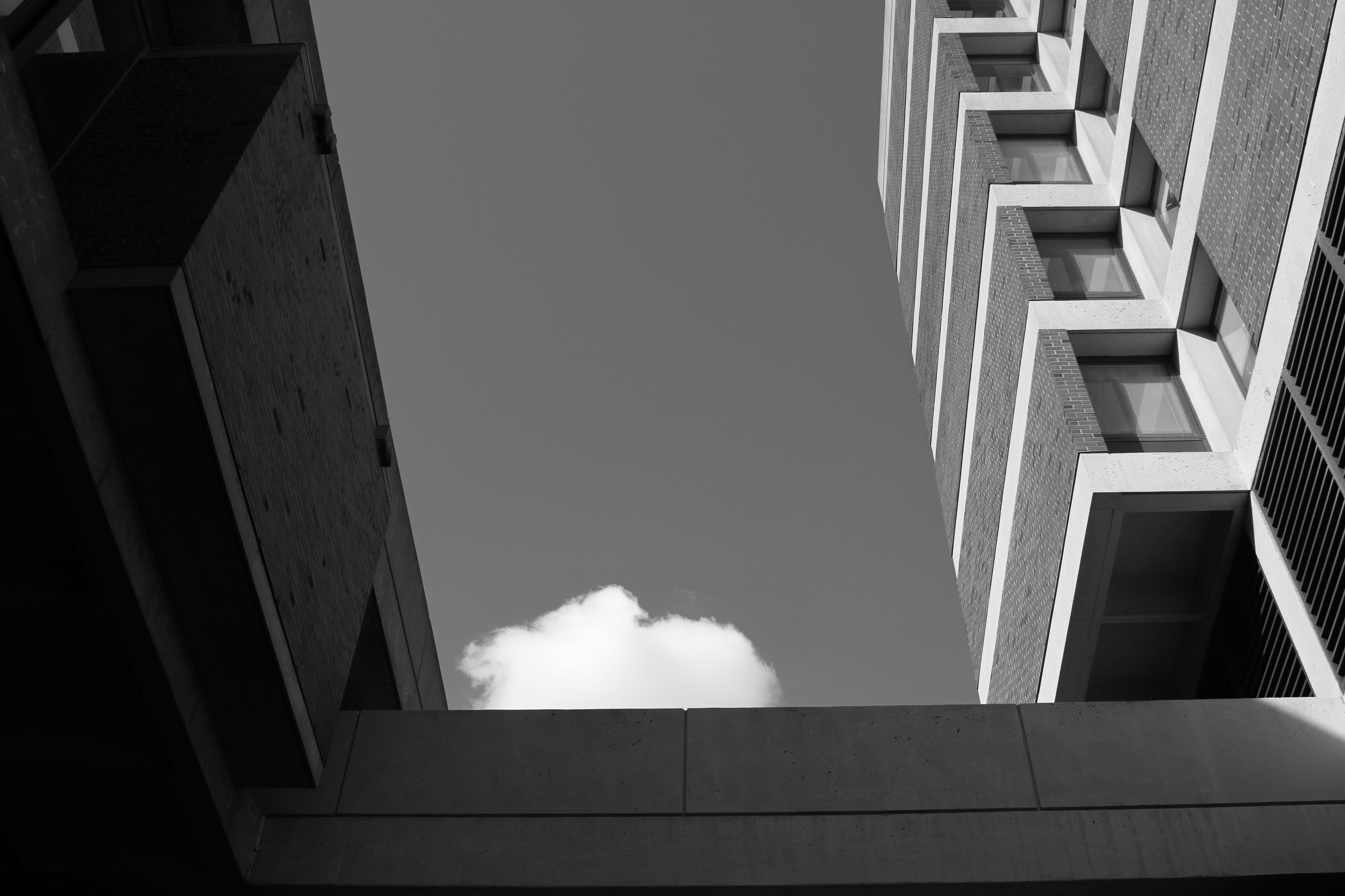
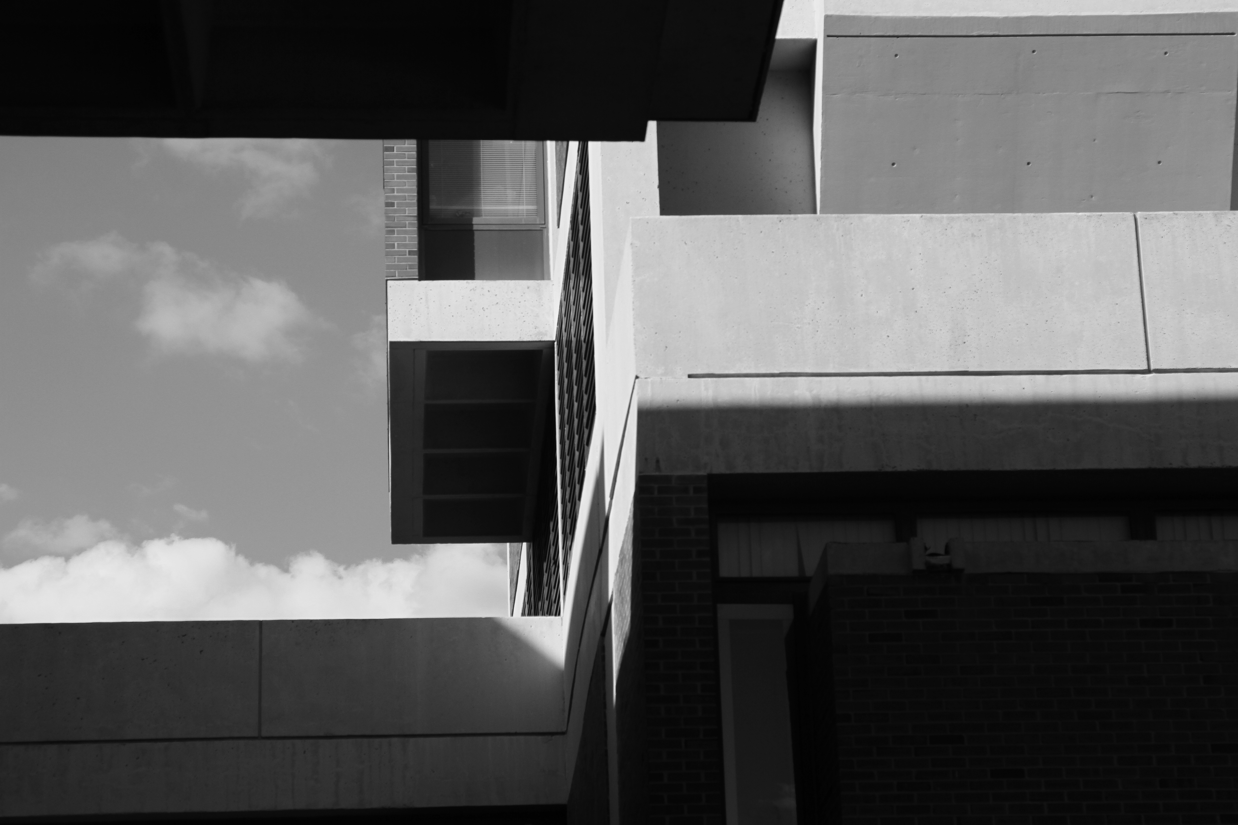
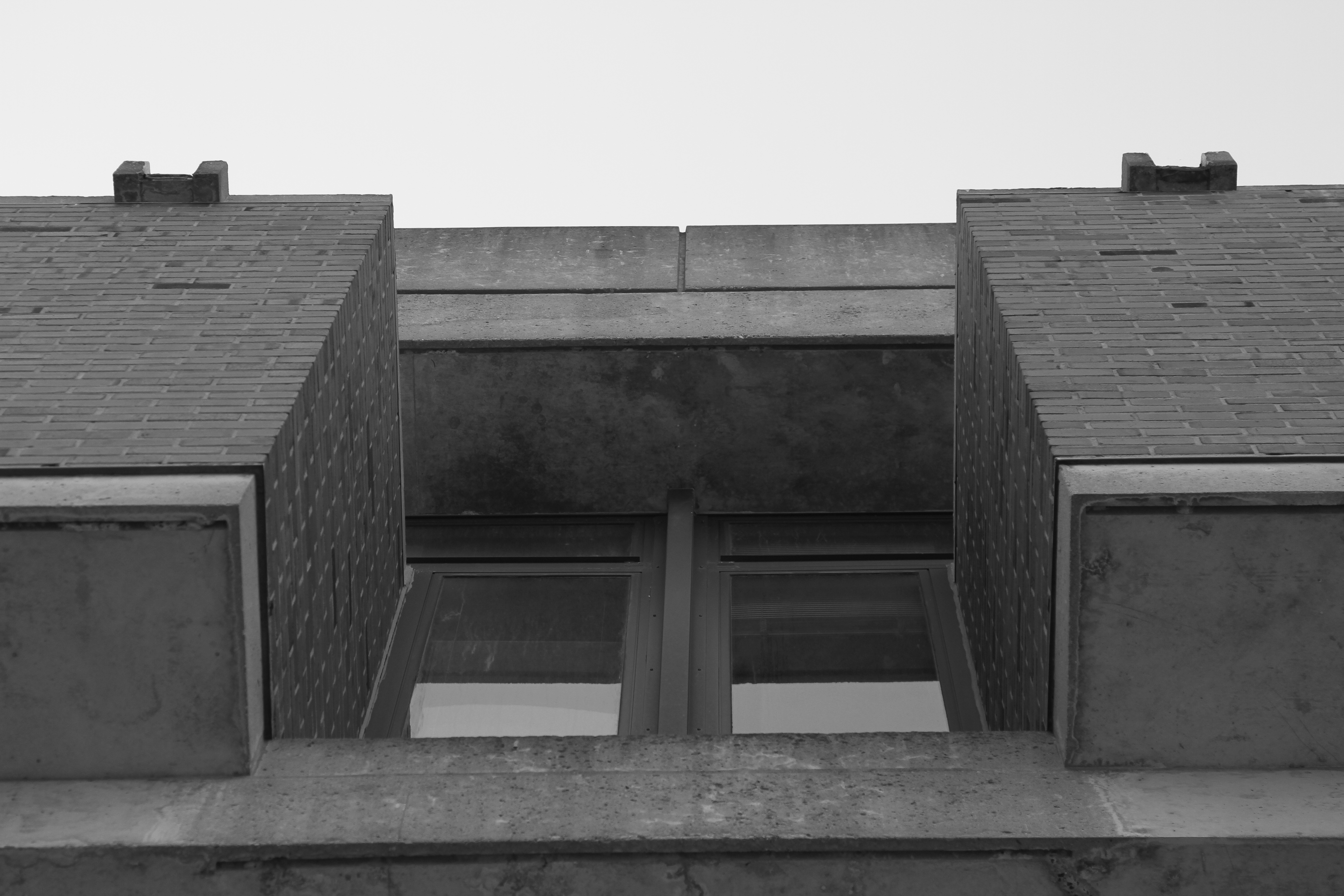
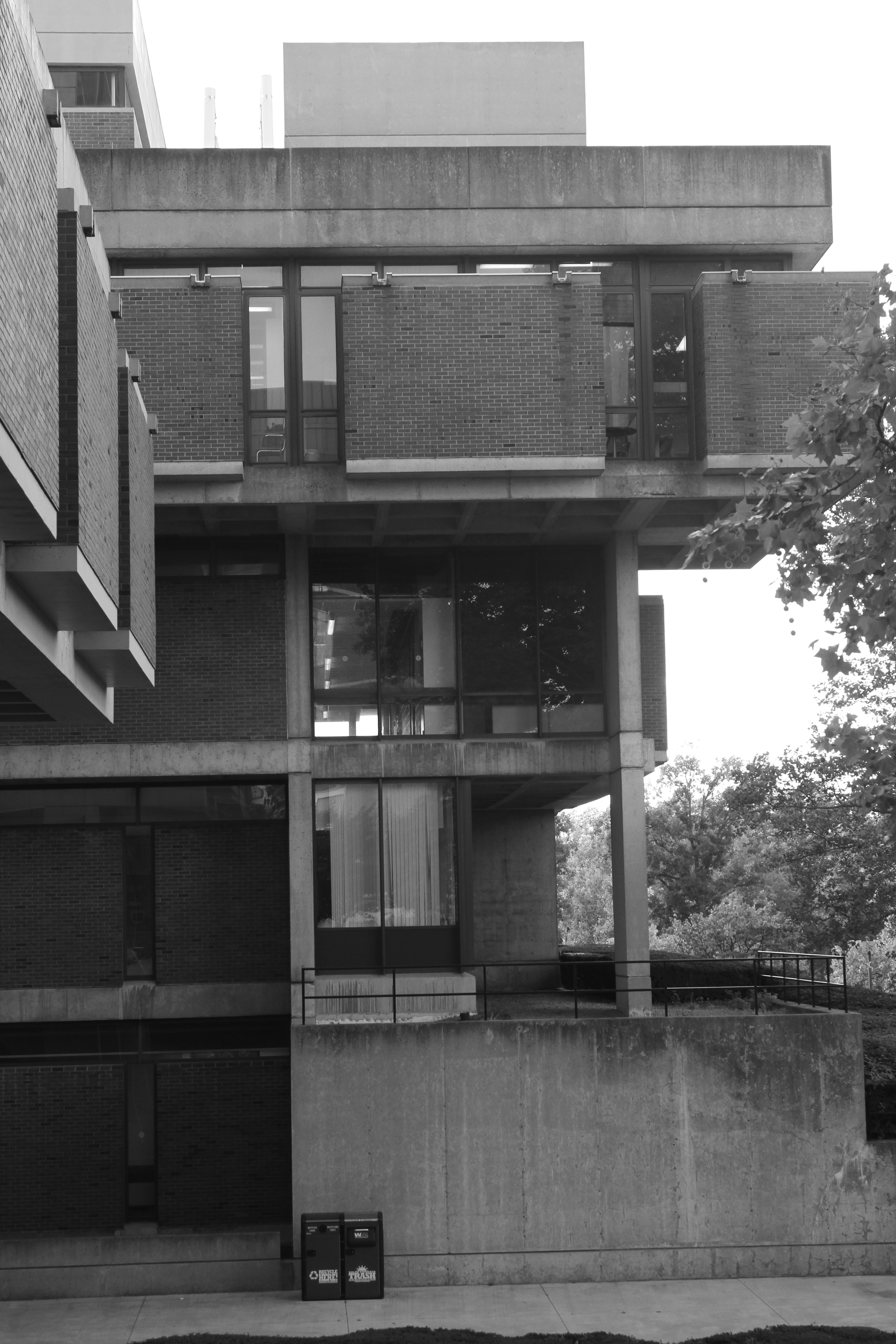
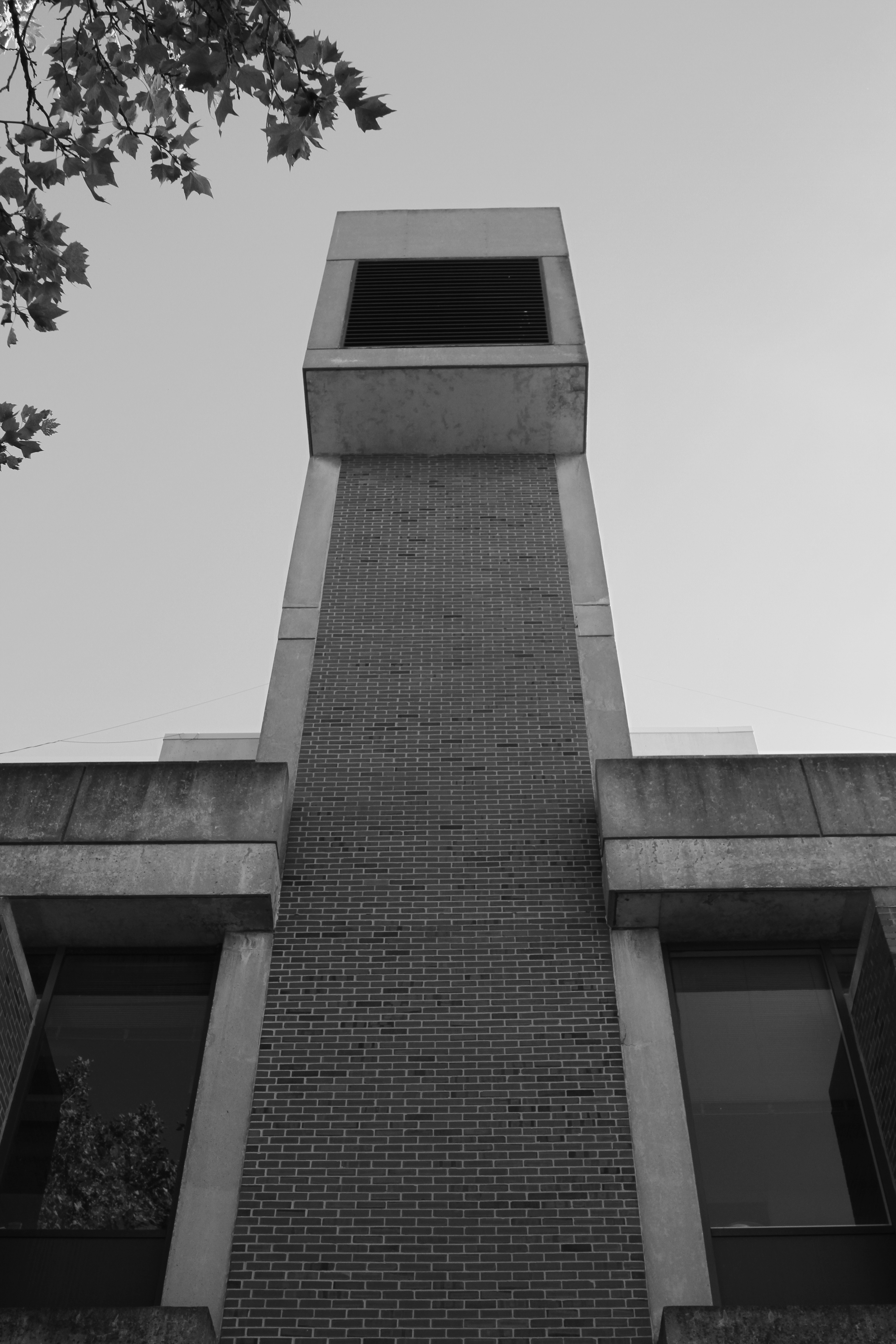
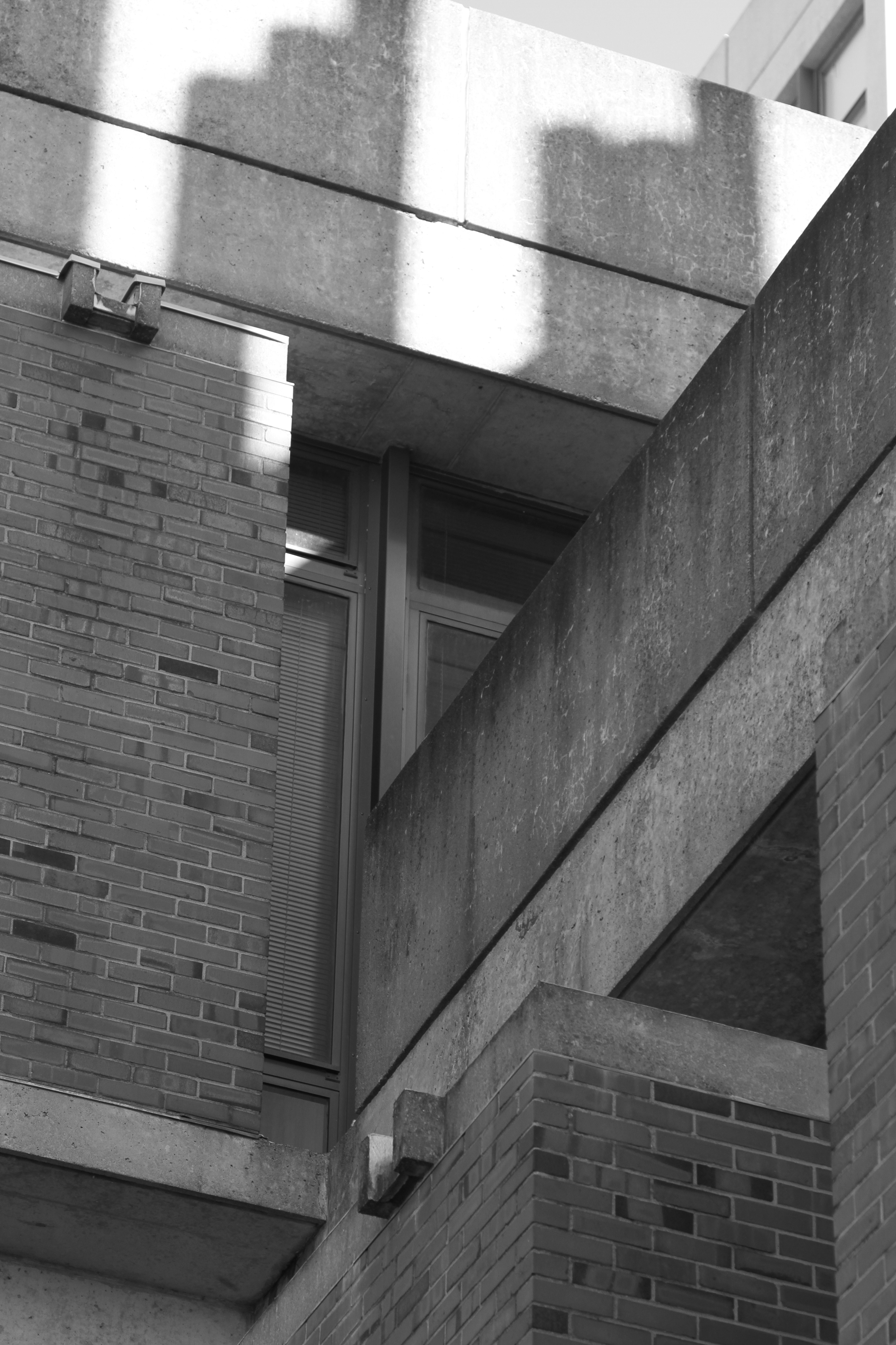
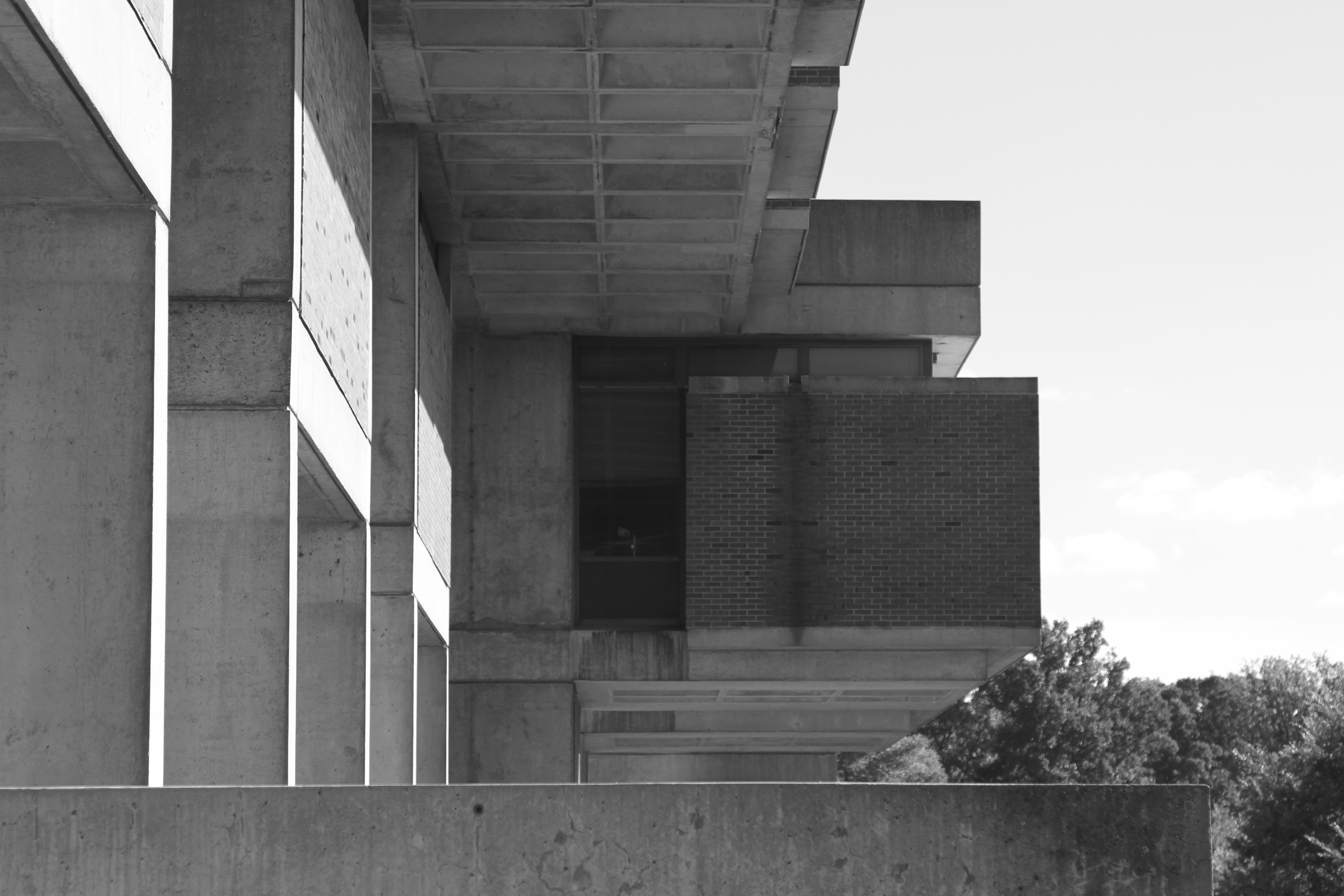
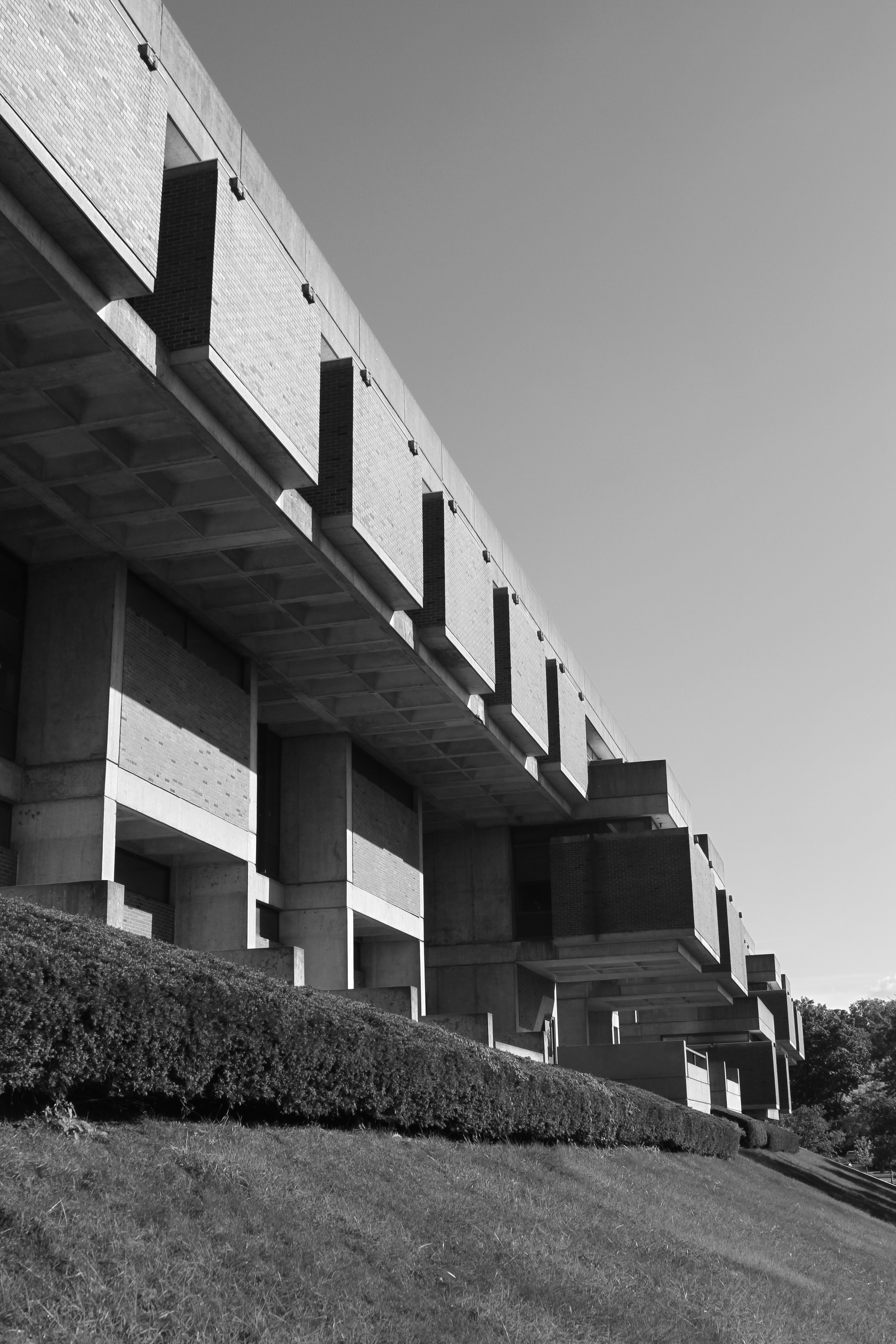
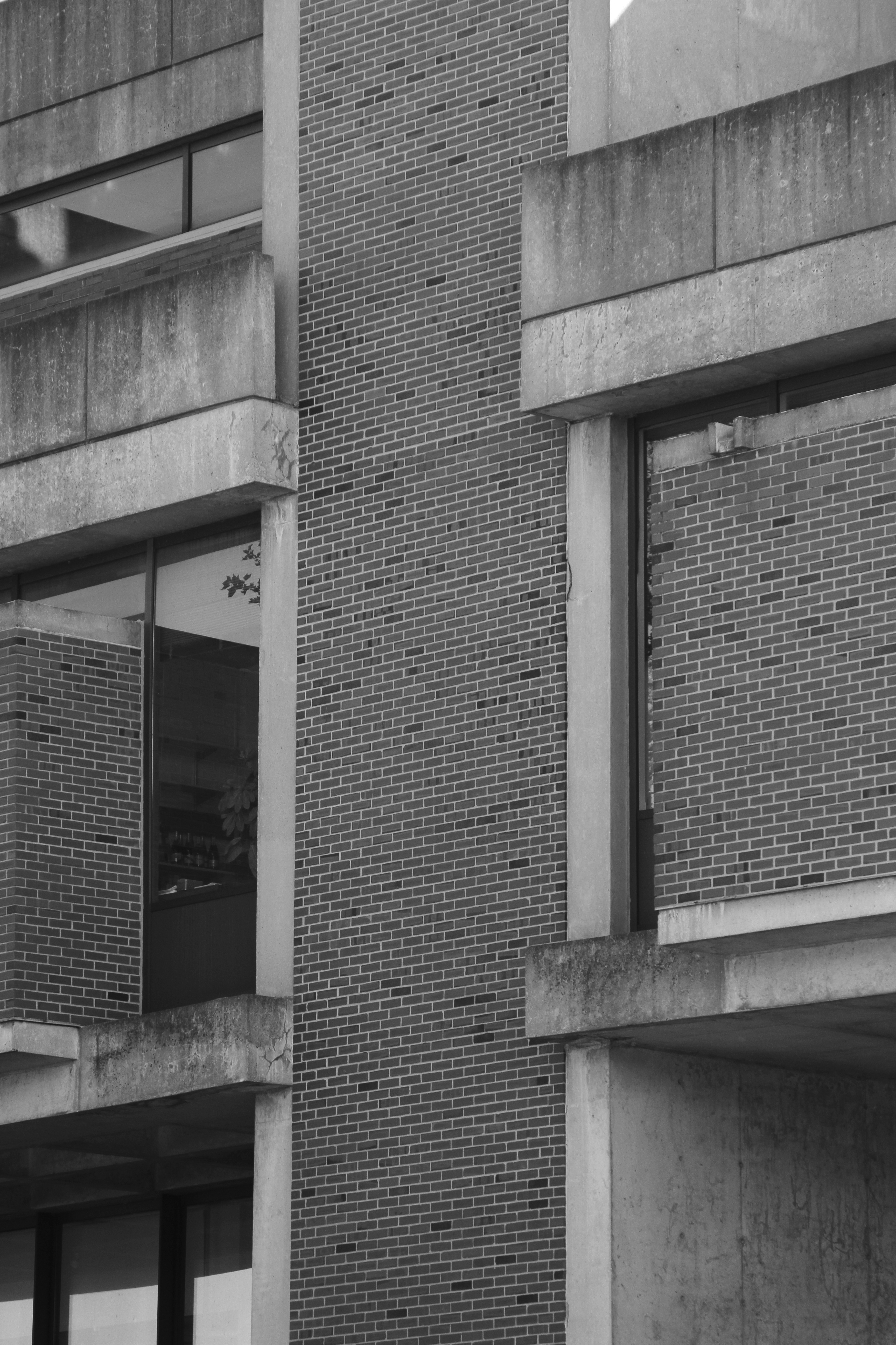
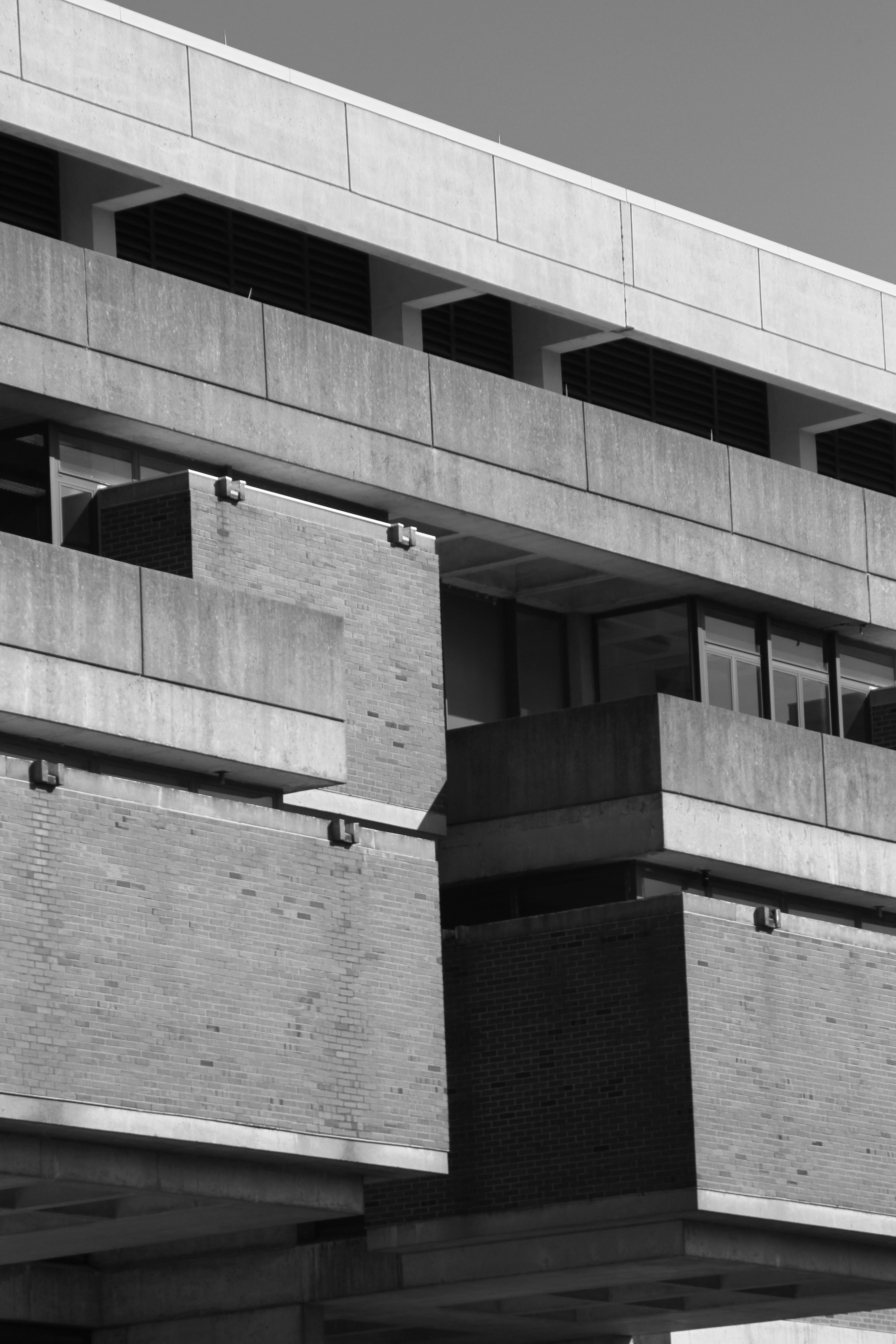
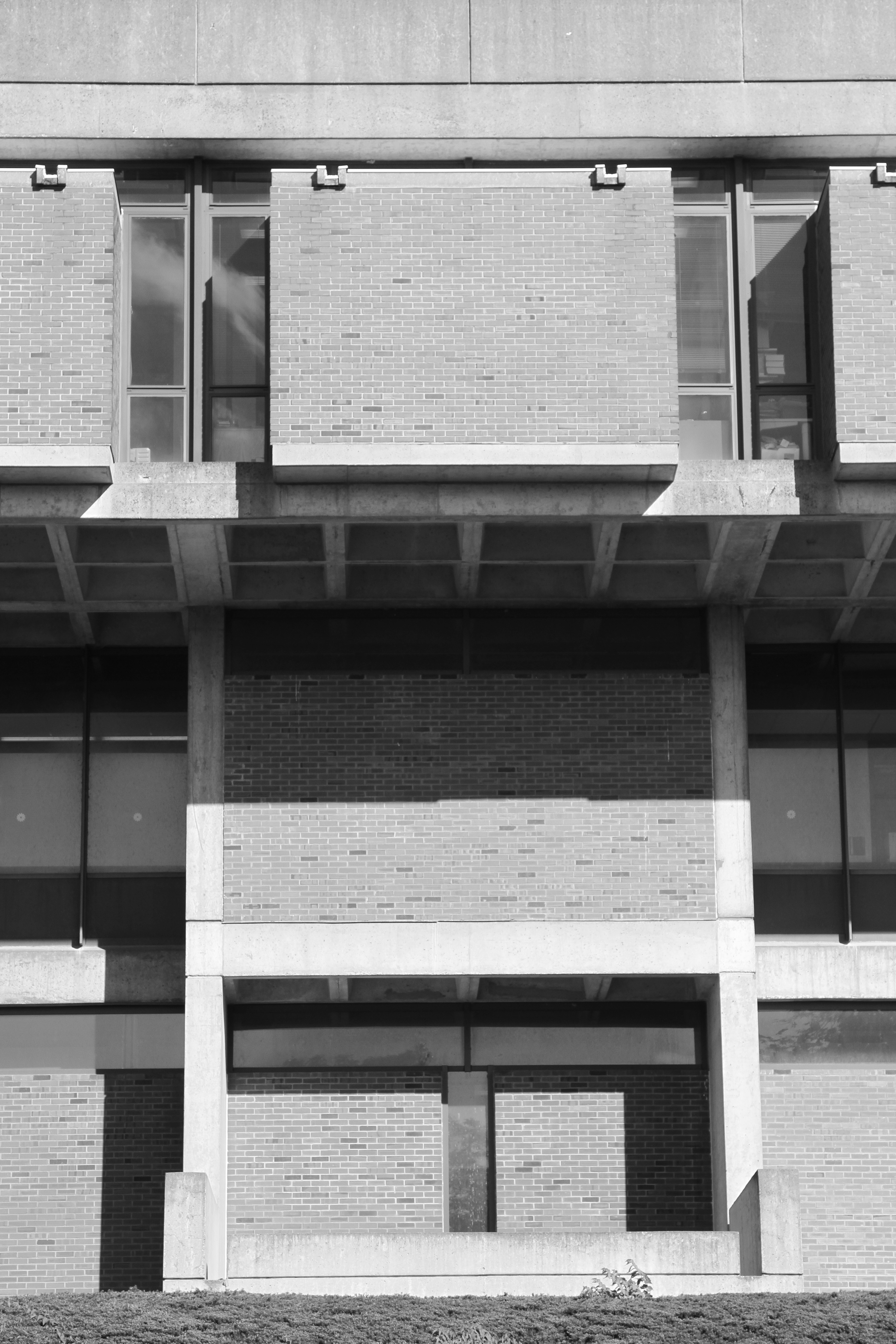
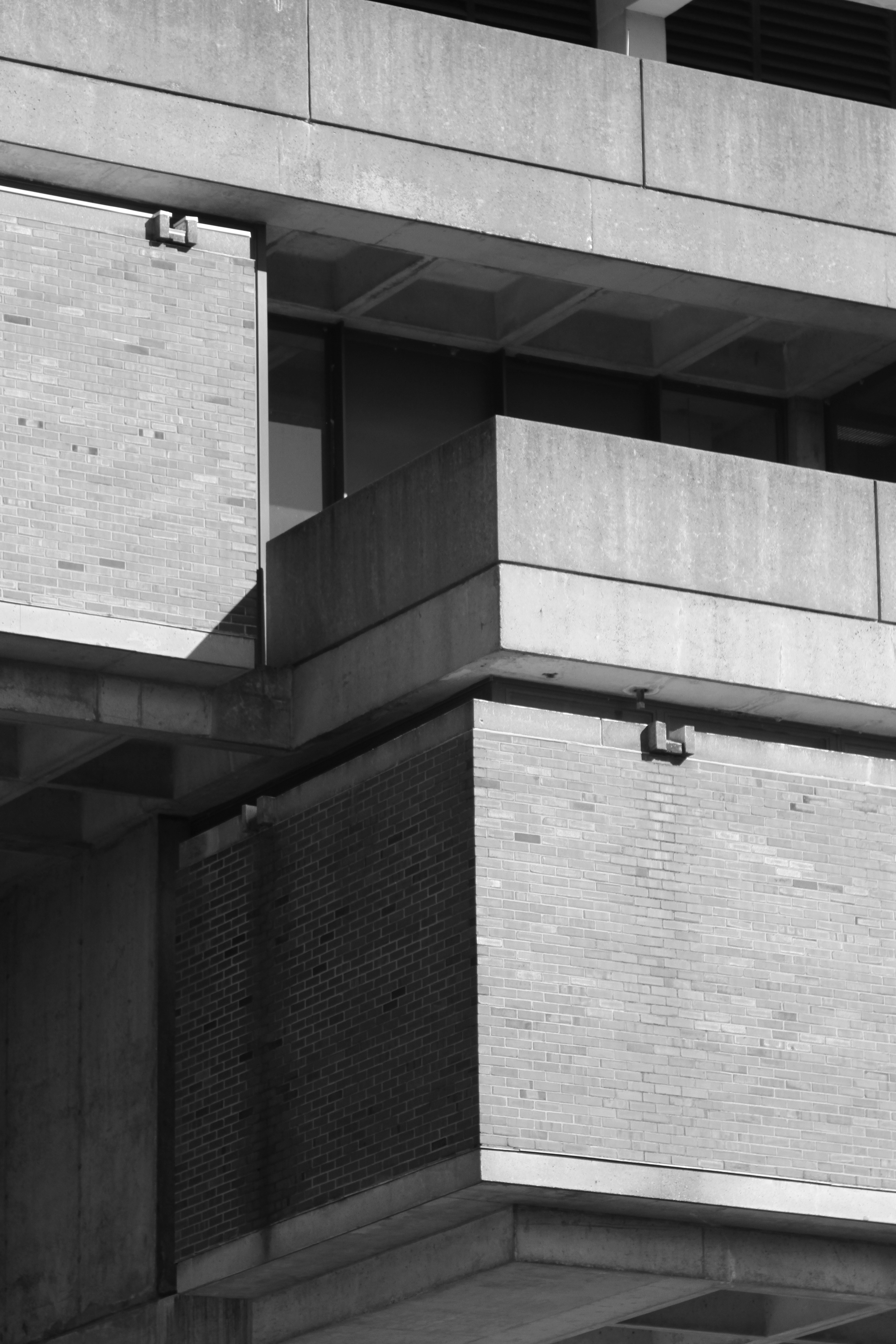
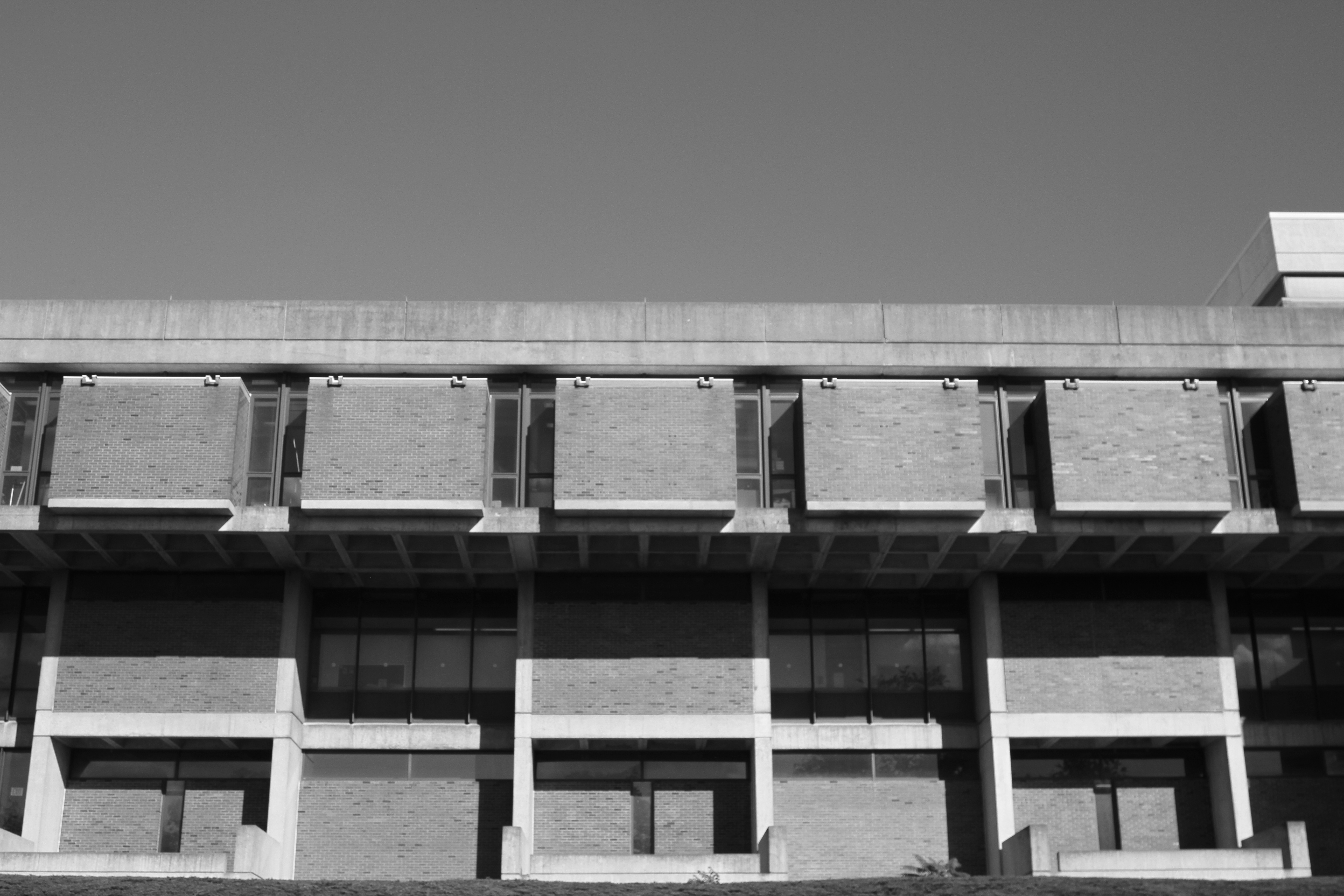
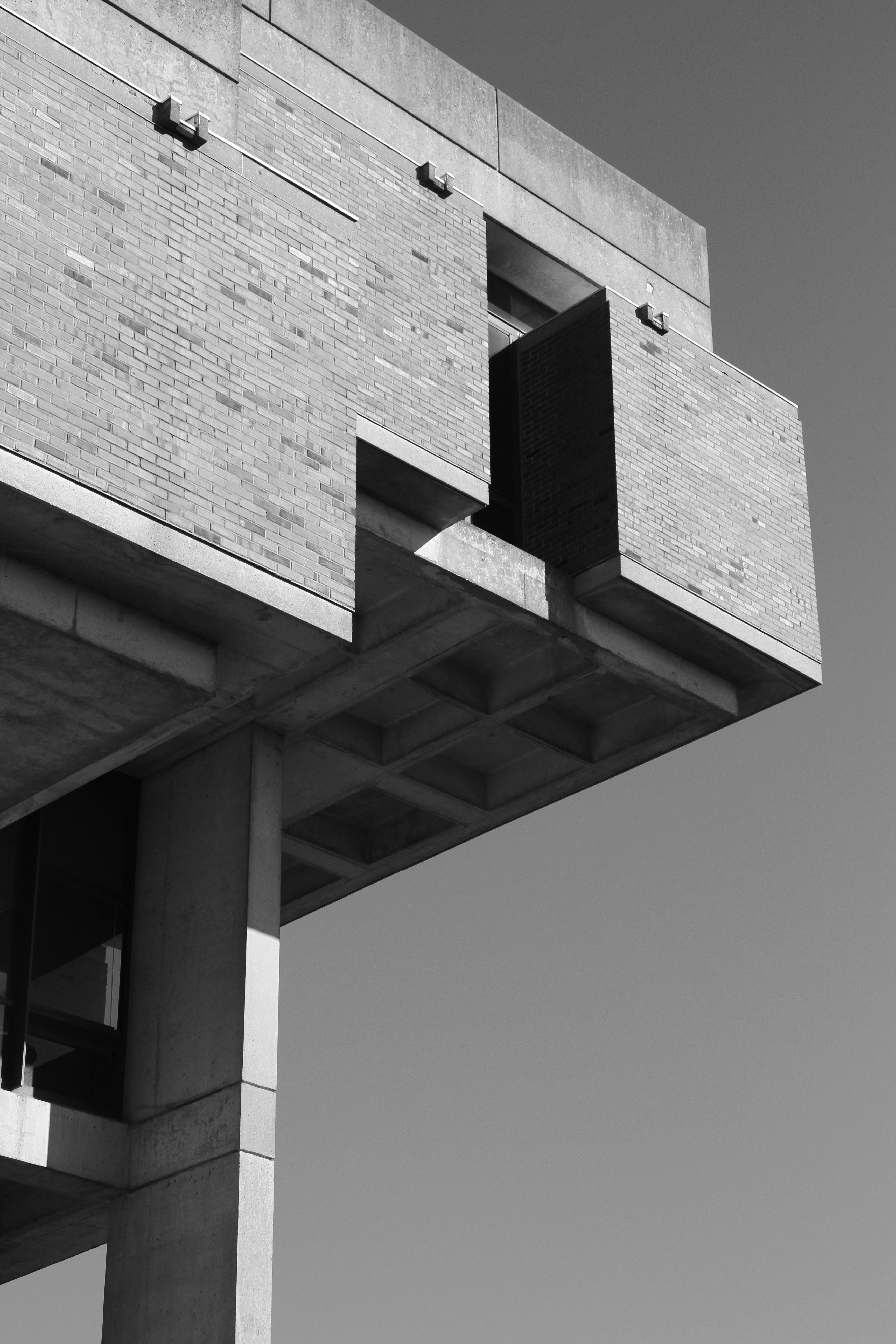
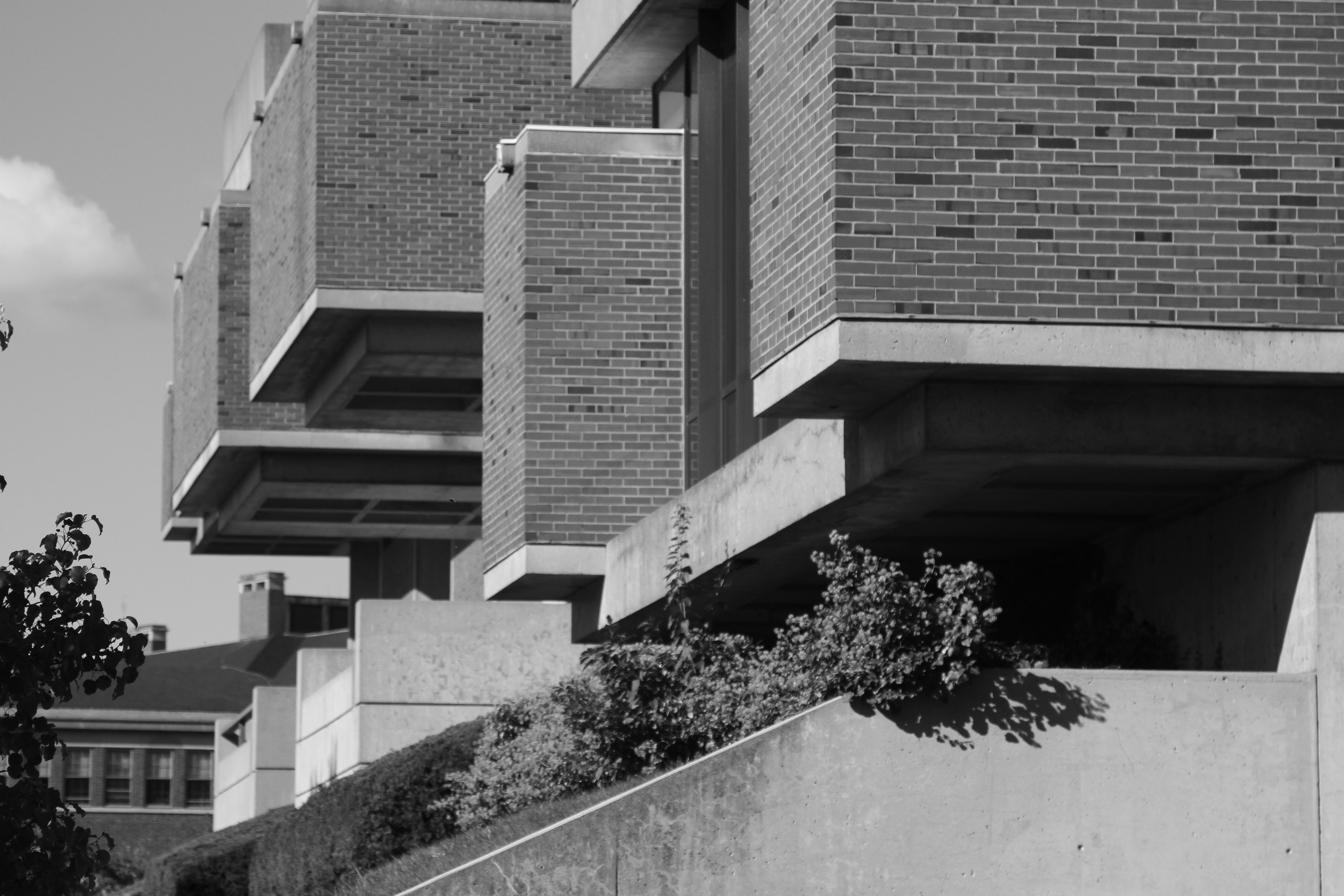
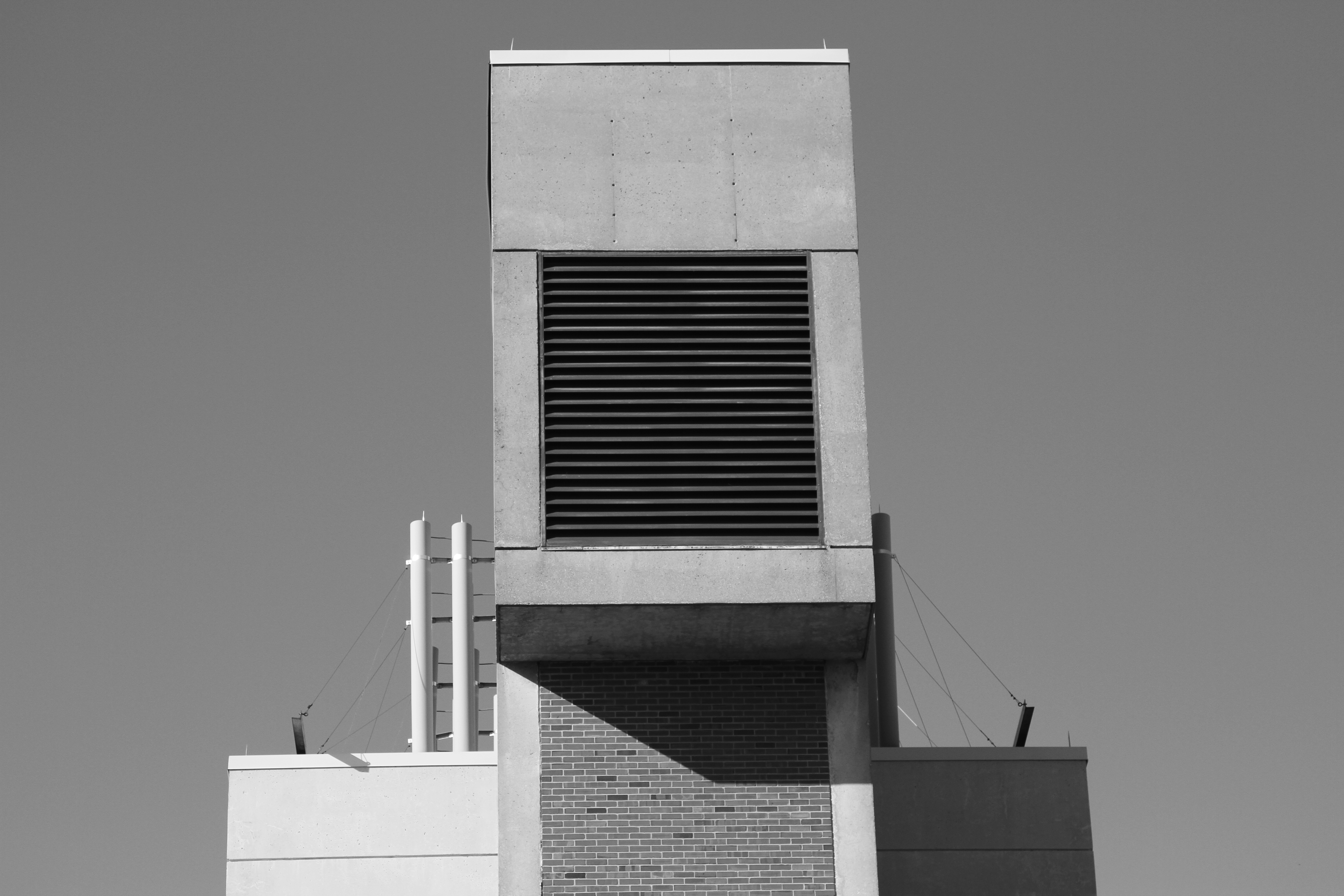
We do have a couple ivy-covered brick buildings on campus outside the main academic quad (which is a wonderful architectural complex) and neither of these catch the slightest of interest from anybody. They simply can’t shine. Their half-hearted historical allusions were ill thought about and executed. Hutchinson is for me a beautiful expression of pre-cast concrete, the material being one with the form. Buildings like Hutchinson are not built anymore. In today’s campuses there is a tendency towards washed-away glass store-fronts and the like, and less permanent, bold solid forms.

Hutchinson Hall is an example of the ever decreasing list of so-called “brutalist” architecture, which was until very recently regarded as inhumane and ugly in its entirety. Built during the 60s and 70s, some scholars have proposed that this is the kind of architecture that universities hoped would offer some greater form of resistance against the student movements of the time. I could not find any public evidence of this in the case of Hutchinson Hall. After looking at the documents available at the Rare Books and Special Collections department, the main concern of the university had seem to acquire enough space for the chemical and biological sciences; a fire resistant, and structurally sound structure in case something went wrong in the labs.

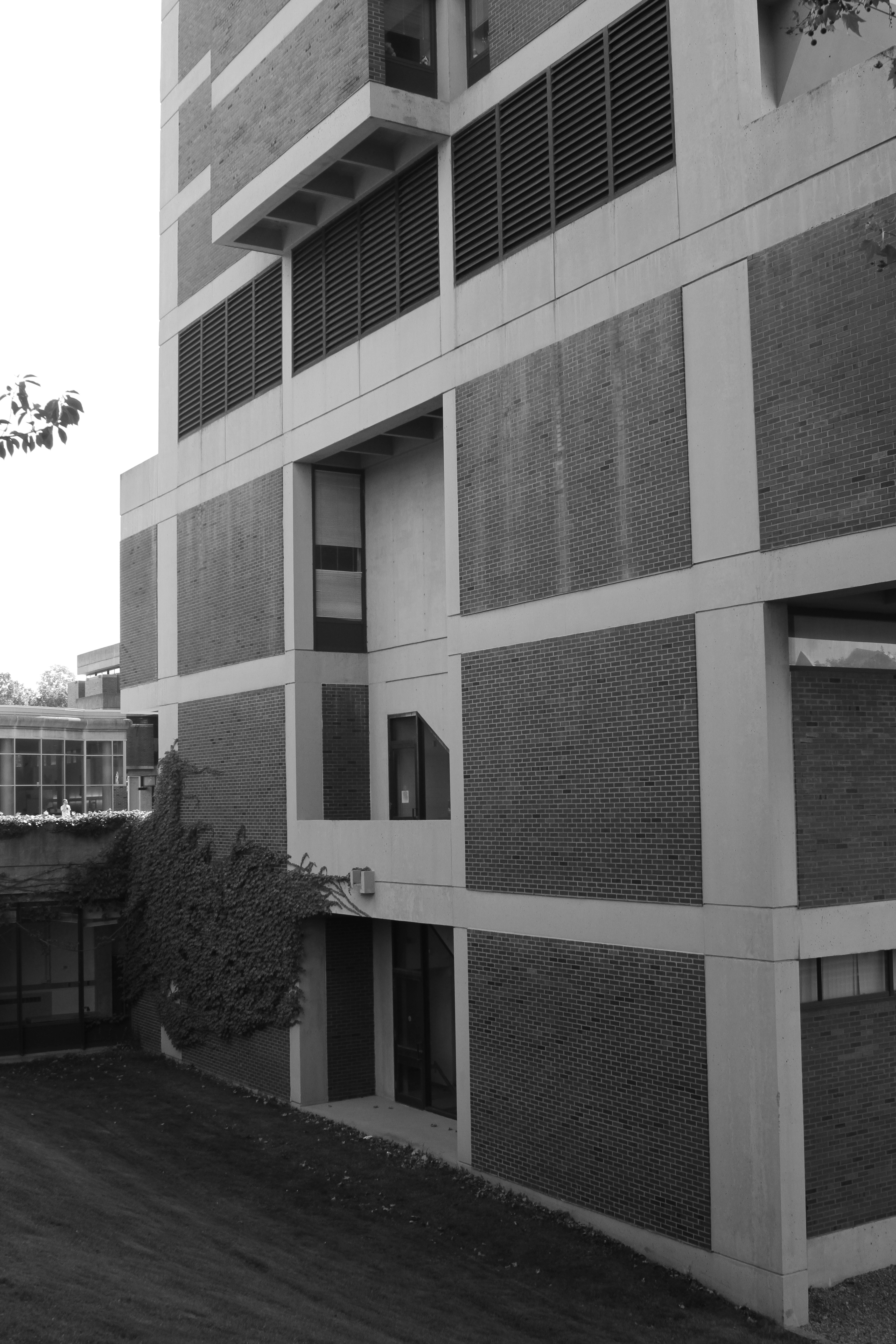
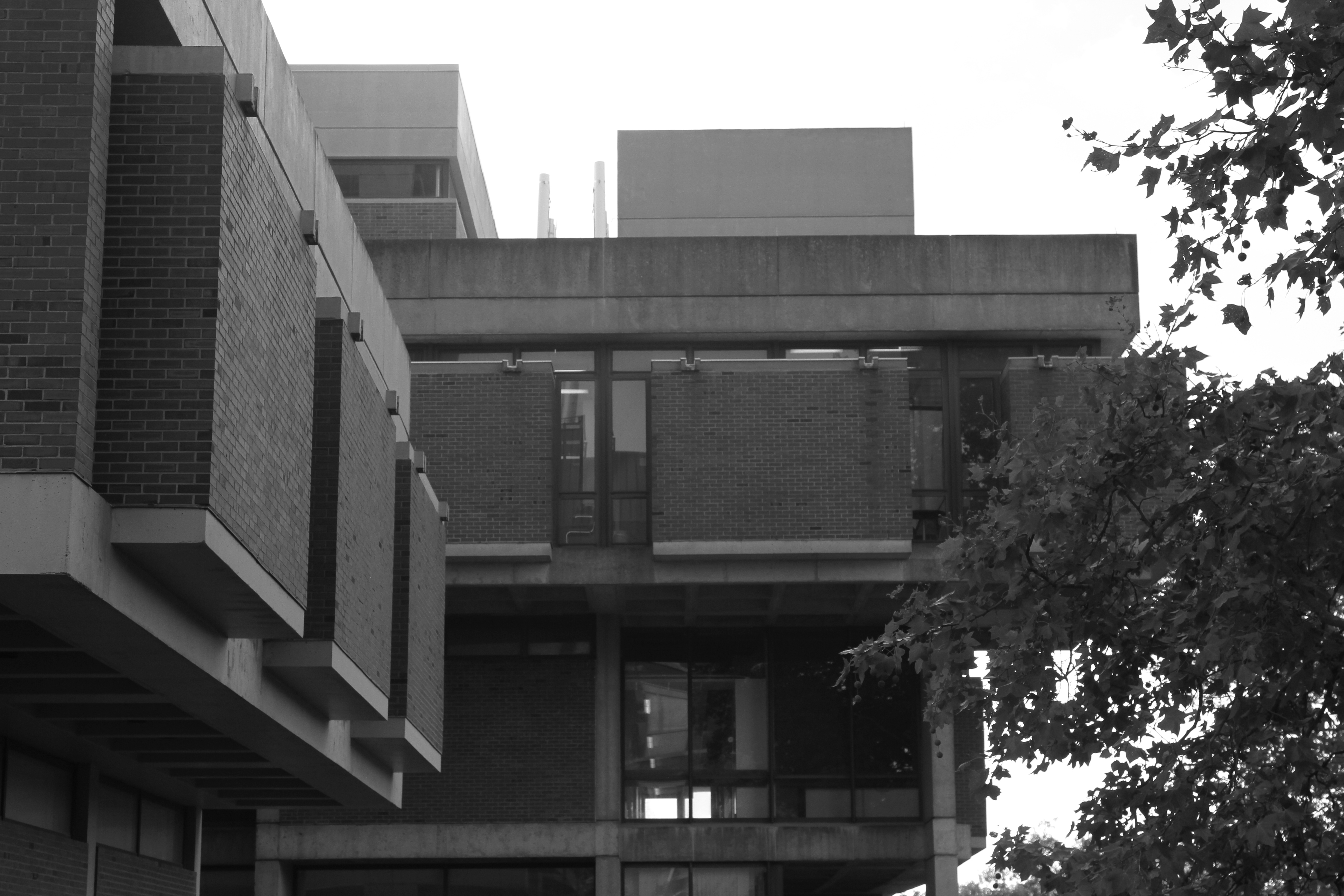
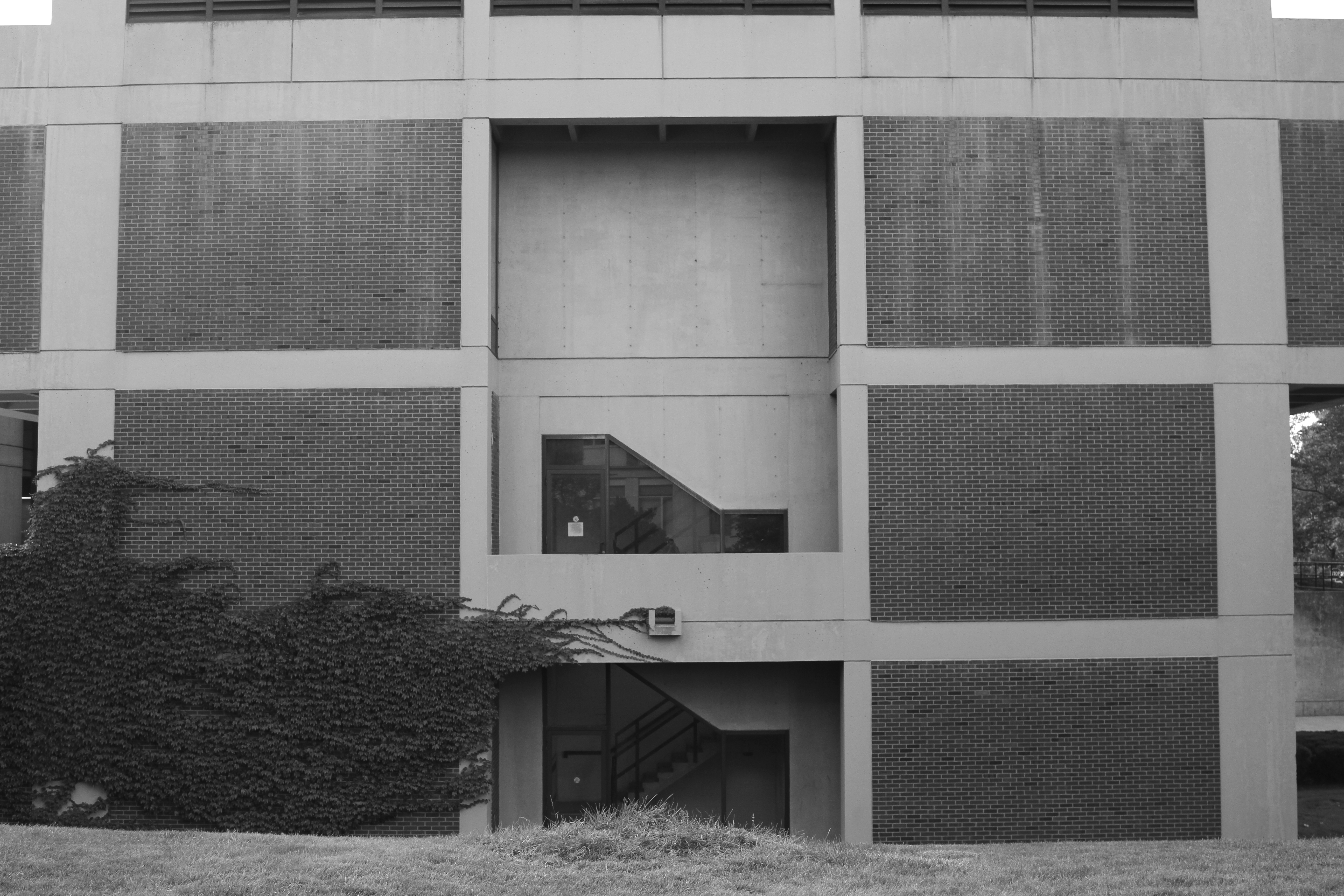
To me, the theme of this style is that of volume and shadow. In my exhibition drawing, I plan to incorporate the very lucid three-dimensionality of this building and the play of light throughout the days and seasons across the building.


(Flashback) Video Art and Wilson Commons

architecture, art, college, video art

Even though my serious research of Wilson Commons started just last semester, my interest and fascination with this building started a while back. For my first project in my video art class more than a year ago, I did a one minute in-camera cut video. Using fairly old tape cameras, we were required to create a final product without using any editing software. This is the result:

Week Plan: A Möbius Strip?

architecture, art, college, digital art, drawing, pattern

I recently submit the piece below to an undergraduate art show her in my school. Last year my work was one of the elected pieces for the exhibition but this year I was not lucky enough. Nonetheless, I consider this piece to be quite a step forward in my research involving the graphic representation of space.

HartnettJuriedExhibition_Pinera_WeekPlan

What if a psychologist, instead of asking you to write your week’s activities in a log, presumably to “optimize” you’re time management, asked you instead to write down, or rather, draft, the spaces you occupy during that week? How about “space optimization”? What’s the space in between? What’s the space within? Without?

With this proposition in mind, I set out to draft the spaces I occupied during a whole business week of my life, using only measuring tape and standard architectural software to create a “floor plan” of each day, Monday through Friday. To reduce my scope from global to doable, I eliminated the spaces where I spent less than 5 min. engaged in an activity. With this rule, hallways, roads, and parking lots were eliminated to create a fairly tight plan which was arranged according to the geographical position of each room or place in relation to the others.
My room and dorm bathroom happen to occupy the northernmost point of my plan. Usually, the library lies to the south while the food (dining halls) lie towards the East and center. Computer lab? West.
Once these plans are joined, they form a kind of Mobius strip, quite illustrative of the daily life of many. A spatial matrix from which there is no escape. The repetition is obvious and almost impossible to escape.
What kinds of spatial patterns exist in each week, for each person? Where do we actually exist?
How do the “powers of architecture,” affect us without our knowledge? What does a wall, or a window, or a column does to our daily life? How can we change the spatial discourse on a personal, citizen level? What would we see, and understand, by looking at our “week plan”?
There is much knowledge to be found in the realm of spaces, if only we look. And measure.
Week Plan

Intro to Drawing: The Nude Drawing

art, college, drawing

I don’t know about other art schools, but nude drawing seems to be a very rare thing these days, and as far as I know, nobody has done it before in my school as part of the art program.

I felt truly lucky to be able to experience nude drawing. As I sketched the model before me, I learned a lot not only about drawing, but about beauty and the human body. Our model, who was a professional dedicated to modelling for artistic purposes, was by no means a magazine cover girl. She was real. No Photoshop, no fancy lighting, no  make-up or surgery, and of course, no clothes.

What a beauty.

Every time she struck a new pose, a felt a rush of delight as the skin, molded by the muscles beneath, acquired new depths, new forms and shadows. The nude human body suddenly became monumental to me, and supremely aesthetic. I was suddenly aware that the endless images we get from the internet and the magazines are indeed very flat, and unreal. That the faces and bodies we see there are neither beautiful or ugly, they simply do not exist, and for all they matter, are incomparable in truth and effect on our existence to the woman in front of me.

Yuri Romayenko, on first becoming the first human to travel in space, said after coming back to Earth that the cosmos was like a magnet. Once you’ve been there, all you can think of is how to get back.

Well, nude drawing is similar. Once you’ve done it, all you can think of is how/when to do it again.

Here are some of my “better” sketches from the three sessions we had with our model in Professor X’s class–the first time I truly saw the human figure.

NudeI NudeII NudeIIIB NudeIVB NudeLargeB NudeVB NudeVIA

Visual Essay: Yoshitoshi’s “Heron Maiden” and Appropriation Art

appropriation, art, college

Taiso Yoshitoshi was a legendary Japanese print-maker. He distinguished himself for his thematic: traditional Japanese legends. Demons, warriors, maidens… His prints are characterized by their rich color, complex compositions and high level of detail.  Here is a great website to learn more about him.

When discussed in class last semester, I dwelt in the notion of flatness that these prints convey because of their composition. As an exercise of appropriation art, I decided to dig further into this idea of flatness and “nowhere space” that many of these prints present through their light background color gradations.

My subject? The Heron Maiden print.

My goal? To “locate” the maiden within its space in Yoshitoshi’s terms; that is, the flat environment of the print.

Following up is a reconstruction of my process, step by step. Enjoy.

36g02

img002

img003


HeronFront

HeronBack

Heronmaiden1

Heron and Maiden in Space

Heron Maiden Space Study


Interventions III

art, college, intervention

The final installment in my interventions series, and, I must say, my favorite.

This piece had to be done in a space we considered as “personal.” I decided to take the meaning of personal liberally and so selected the Art and Art History Department floor as my place to intervene, the reason being the fact that I spend quite a lot of time there, and a lot of important memories have been forged within these walls.

The problem with the department is that it presents an incredibly institutionalized, boring facade. I believe that if there’s a department that should stand out visually for fundamental reasons that is the art department.  So I went to work and this is what I did:

ART PARASITE

ArtParasite1

ArtParasite2

ArtParasite3

ArtParasite4

ArtParasite5

ArtParasite6

ArtParasite7

ArtParasite8

ArtParasite9

ArtParasite10

ArtParasite11

ArtParasiteFlagship

ArtParasiteFlagship2

The tinfoil pseudo-organic structures make people have an above average visual and physical engagement with what’s normally a very plain environment, more akin to a prison than an art department. Scattered across the floors, walls, doors and furniture of this passage, the tinfoil structures are an outgrowth of the building’s necessity to become something special after so much regularity. They do not make the space prettier, but more interesting.

The point is to get a reaction from people who usually get anesthetized by this kind of environment. If people laugh, get pissed off, wonder what’s wrong, or otherwise just look twice at this environment, I consider it a success. If in this closer inspection, people find something new about this formerly ignored space, that’s some valuable bonus points for me!


Architect like a what?

architecture, art, college

So where does the title of the blog comes from?

Last semester I was a Teaching Assistant for a intro course to Architecture. For the last class my professor and I were trying to figure out a slightly funnier way of ending the course. We came up with the idea of “architectural cocktail talk:” things you need to know to mingle with architects and the like.

So we were googling stuff like “talk like an architect,” and “architecture fun talk,” and one of our hits led us here: “If We Talked About Architecture Like We Talk About Writing.”

Well, seems like what they did there was to replace typical quotes by writers and their trade with words like “architecture,” “building,” and the like.

And so we have “Architect like a motherfucker.” 

Well, after the initial burst of laughter, I thought a little more about it.

Architect like a …. ?

The phrase really leaves open the mode of doing architecture as well as the profile of whoever is doing it. Indeed, architecture is such a great and diverse field, with so many subdivisions, connections, and niches, it is impossible to really tell what someone with an architecture background or degree will actually do in the future.

Of course, society expects us to build buildings, which is what we are sort of trained for (but not really, you need an internship for that).

But like a New York Times Architecture critic once said, “architects are the last Renaissance men alive.”

We are introduced to almost every field in the humanities, as well as some mathematical sciences. Not only that, we are tasked with creating this so-called “functional-art,” which turns out to be the most ambiguous and toughest thing in the world if you take it seriously.

Thus, with so much diversity within the field, it is not surprising that most architect don’t build. They write books, direct movies, plays, become furniture designers, fashion designers, artists, etc. And yet they all share architecture as a central, recurring theme; a sort of ethos of their existence.

They architect differently.

My fate is not sealed yet. I do not yet know where will architecture lead me. For now, I’ll explore everything that comes my way. One day, I architect like a sketching artist. Another day, I architect like a web programmer. Sometimes, I architect like a writer, and so on.

I guess I haven’t architect-ed like a motherfucker but sounds like something I’d like to do on Spring Break.

Interventions II

art, college, intervention

I’d like to share my second intervention art project. This intervention had to be done in a commercial space and had to have a “magnanimous” quality to it. In other words, we had to give something back.

ART, NOT BUSINESS

FromSageToCollegeTownwithLove1


FromSageToCollegeTownwithLove2

FromSageToCollegeTownwithLove3

FromSageToCollegeTownwithLove4


I decided to carry out this intervention at the art supplies section of our university bookstore, which is known for its high prices. My goal was to make a commentary on those prices by making a gift to the bookstore: a cardboard and paper model of our flat , squared art center on campus with a message written on the top. This message was to be a letter from the Art Center (a building) to the Bookstore (another building).

In the letter, the Art Center asks the Bookstore why the prices on art supplies are so high, given that most art students struggle to cover those expenses. It makes a formal request to lower these prices and finishes off with a sharp remark:

“We are here to make art, not business.” 

I ignore the fate of my gift, but my task being that of a messenger and nothing else, I considered my job done once I left the model on top of the drawing boards for sale.

Comments?

Interventions I

art, college, intervention

I am finally taking an art class that involves making things, which I was not doing often enough. By making things, I mean building objects that have an impact in the community, the way art should be. So far I had been involved in very secluded, “indoors art” which spins inside the classroom and then dies. I have finally come out.

The first major assignment involved the creation of three so called “interventions.” Each intervention had a couple of parameters that set some boundaries and challenges for us to work with. This is my first work in a series of three.

FOLLOW YOUR IPHONE

The brief was to create an intervention with political tones and in a very public space.

FollowYourHeart1

FollowYourHeart2

FollowYourHeart3

FollowYourHeart4

FollowYourHeart5

FollowYourHeart6

FollowYourHeart7

FollowYourHeart8

FollowYourHeartPoster

The piece is a commentary on the smartphone walking culture of the second decade of the 21st century. Inside the tunnels of the university (which you can admire in the pictures above) there is no visual input for the user other than blank, awful walls, random activity posters, and other people walking past, ahead or behind him/her. The only viable option to avoid eye contact is to stare at your phone and be absorbed (or pretend to be absorbed) by your own business.

My piece is a series of posters that capture the profile of such action. A white, self centered figure walks while looking at his phone, while the real “outer” world remains in the dark, of no interest. The figure is slightly offset to the right, to indicate our fast pace and disregard for the external.

The composition as a whole intends to provide a visual continuity throughout the tunnels that forces the user to recognize the message as they move, most likely, with their phone in their hand. The “aha” moment comes just as they reach the end of the visual transition.

The title, “Follow your iPhone,” comes from Steve Jobs’ commencement speech to Stanford graduates, where he advises them to “follow their hearts.” The current social-technological situation reflects quite ironically on his advice.

The one comment I directly received (as I put the posters up) was from a girl who took Digital Art with me a year ago.

“It makes so much sense.”

That was exactly what I wanted to achieve. Sense.

It took some time…

architecture, art, college

I’ve felt the need for a regular blog for a time now. My thinking was that if I was gonna have such a thing, I should also do it myself (write the code and all that).

Unfortunately, time is one of the many things I don’t have for spare so this will have to do it for now while I work on a truly personal website for my portfolio.

What’s this blog about then? My art and studies: architecture, cityscapes, media, data… and anything somehow connected to that.

I am Pedro and I am an Art and Art History student at the University of Rochester.

Welcome.