All the Arts Under One Roof

architecture, art, design, digital art, frame, pattern

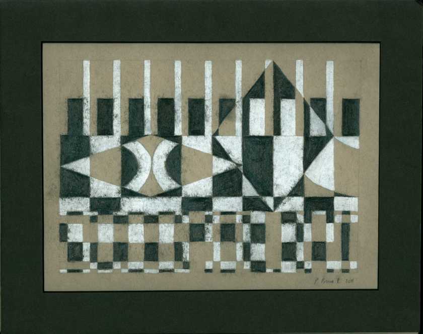
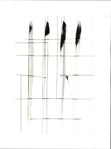
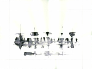
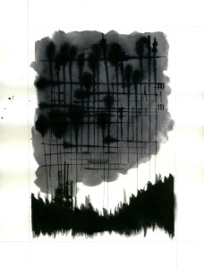
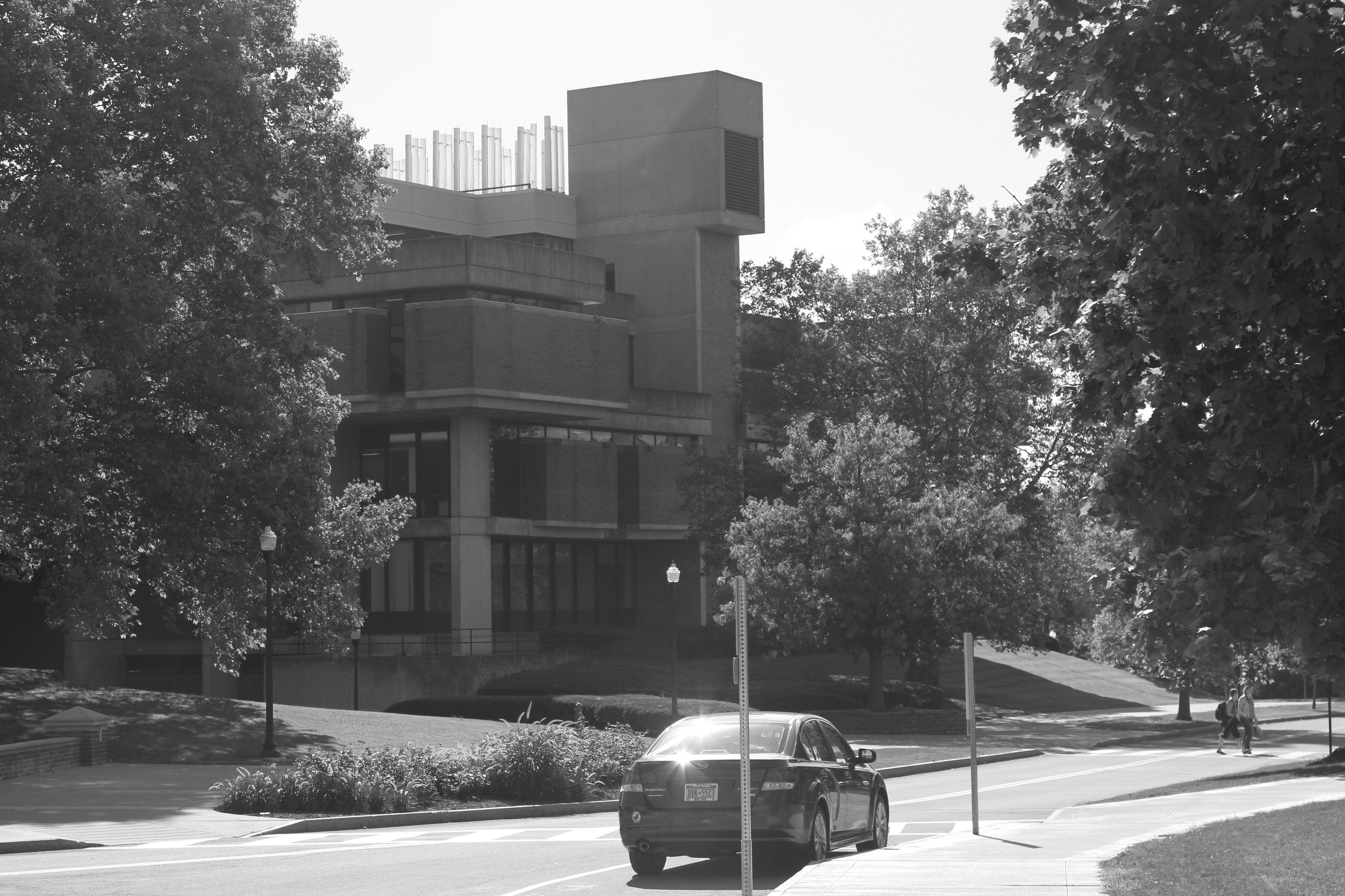
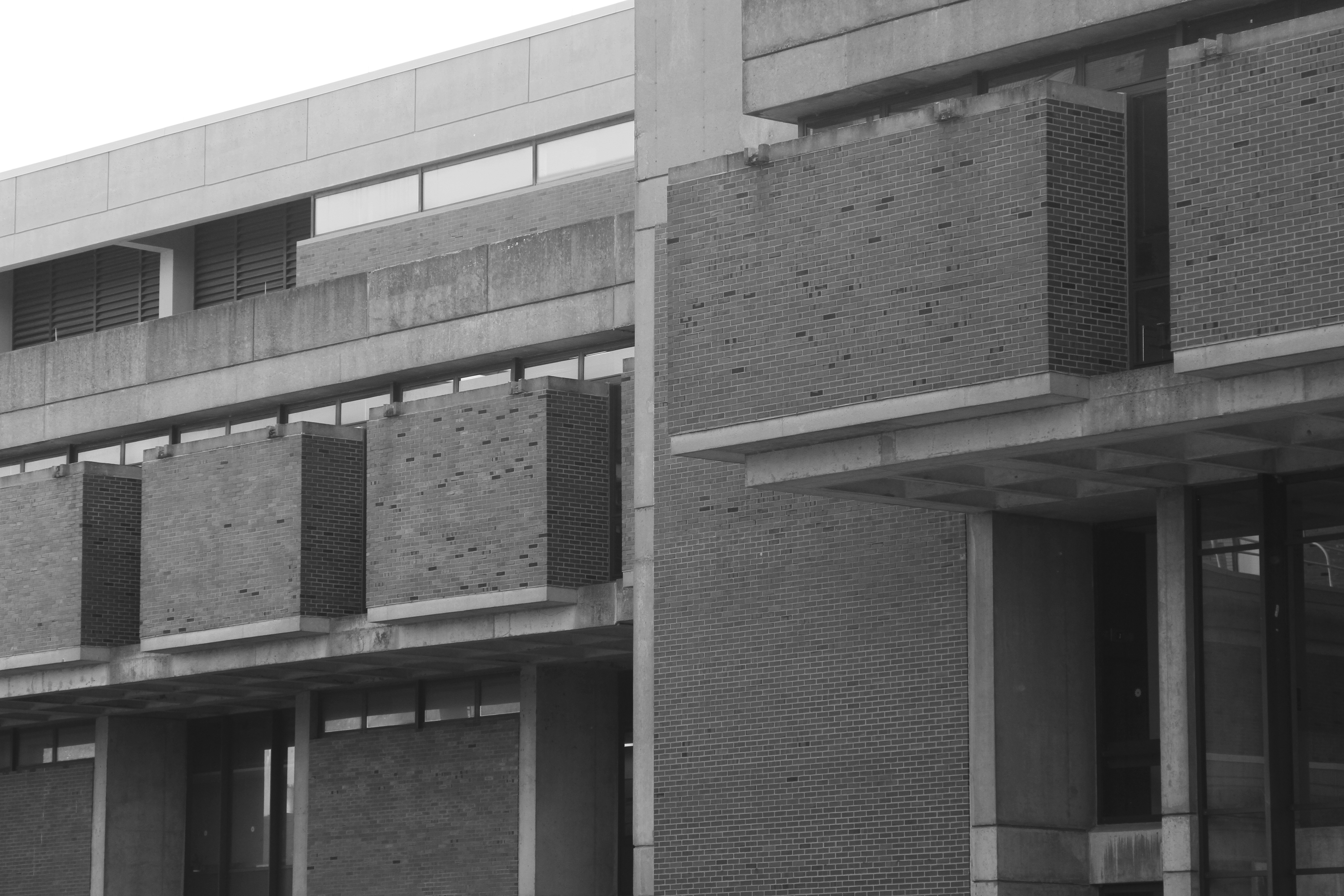
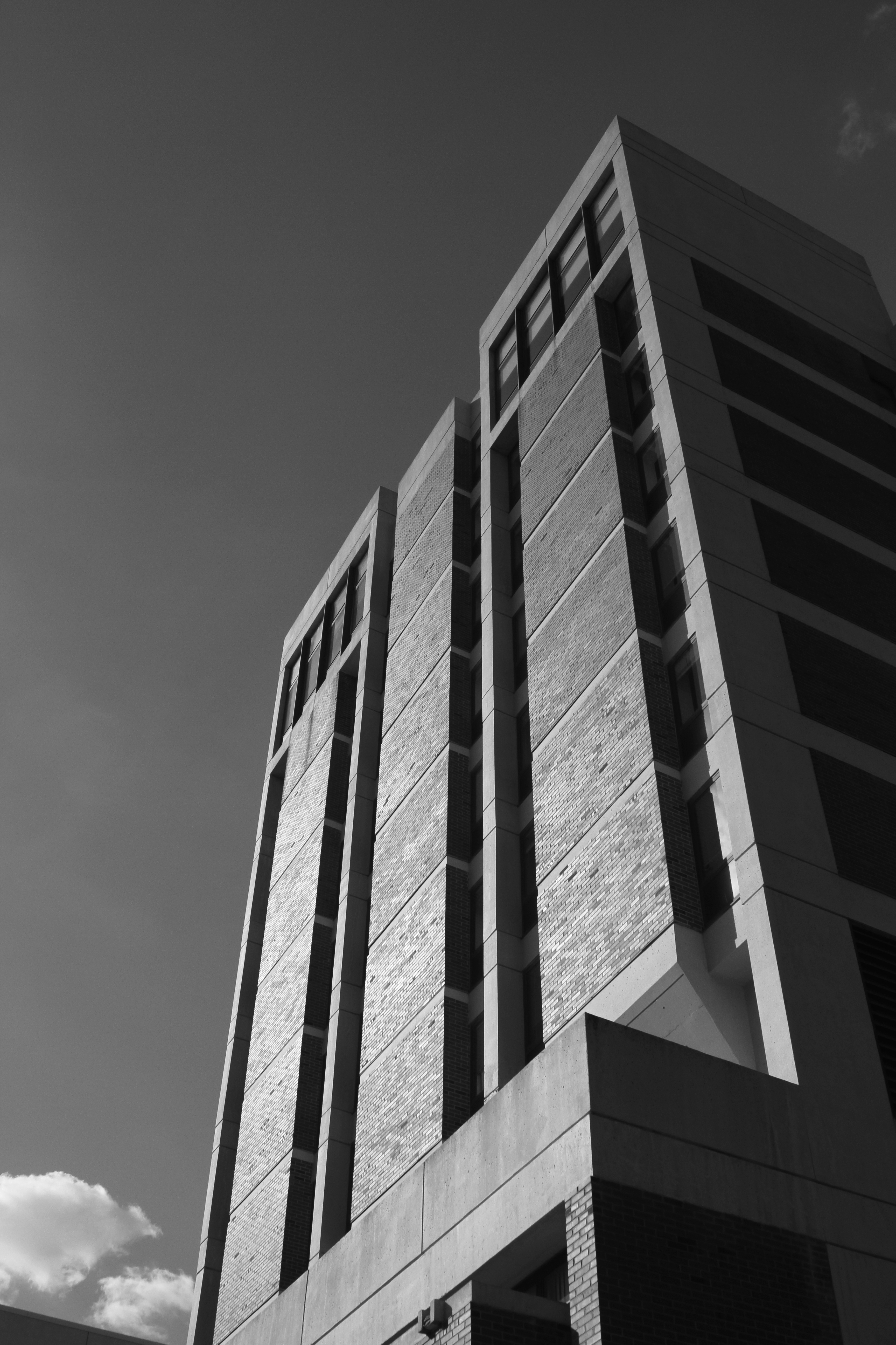
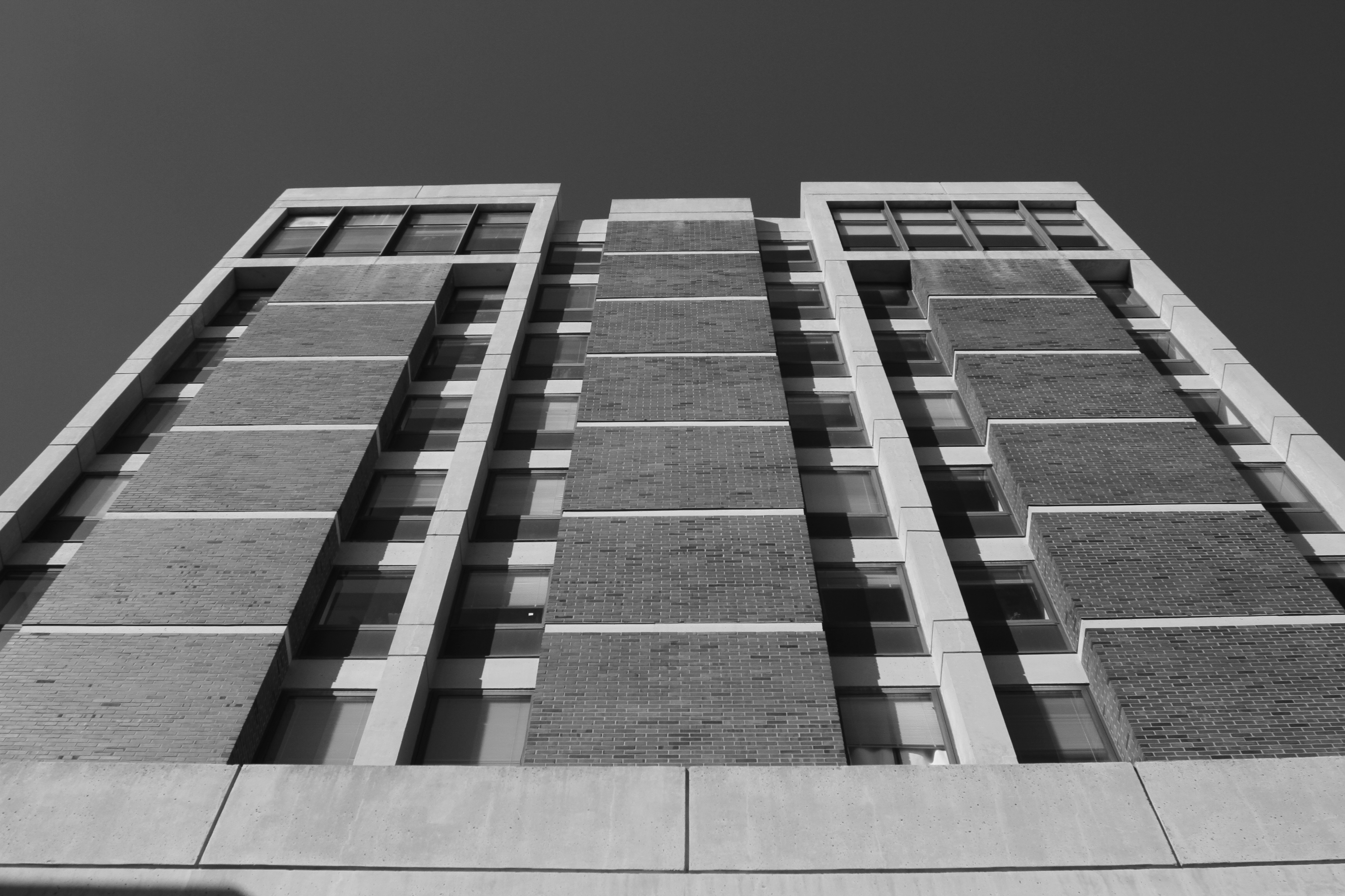
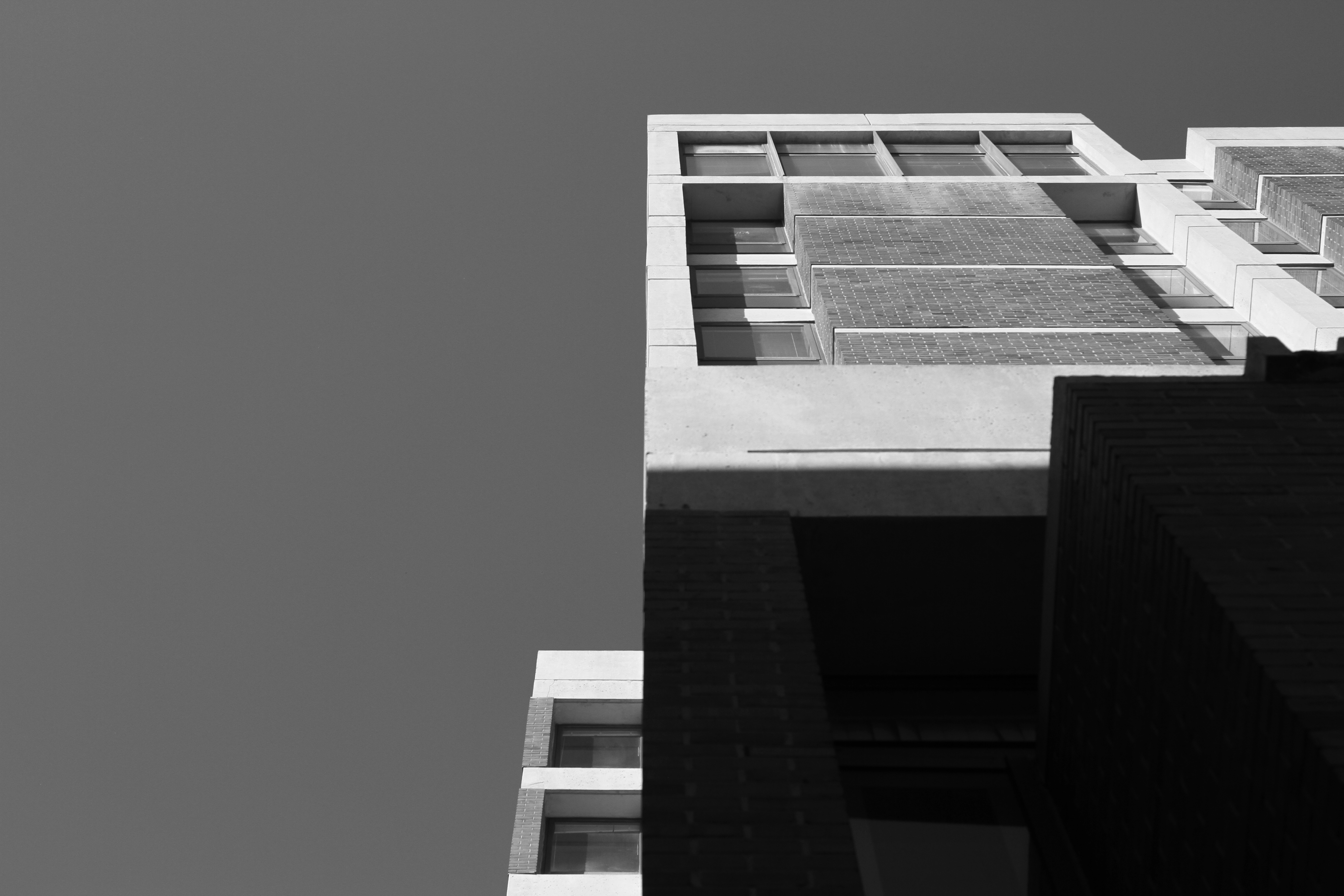
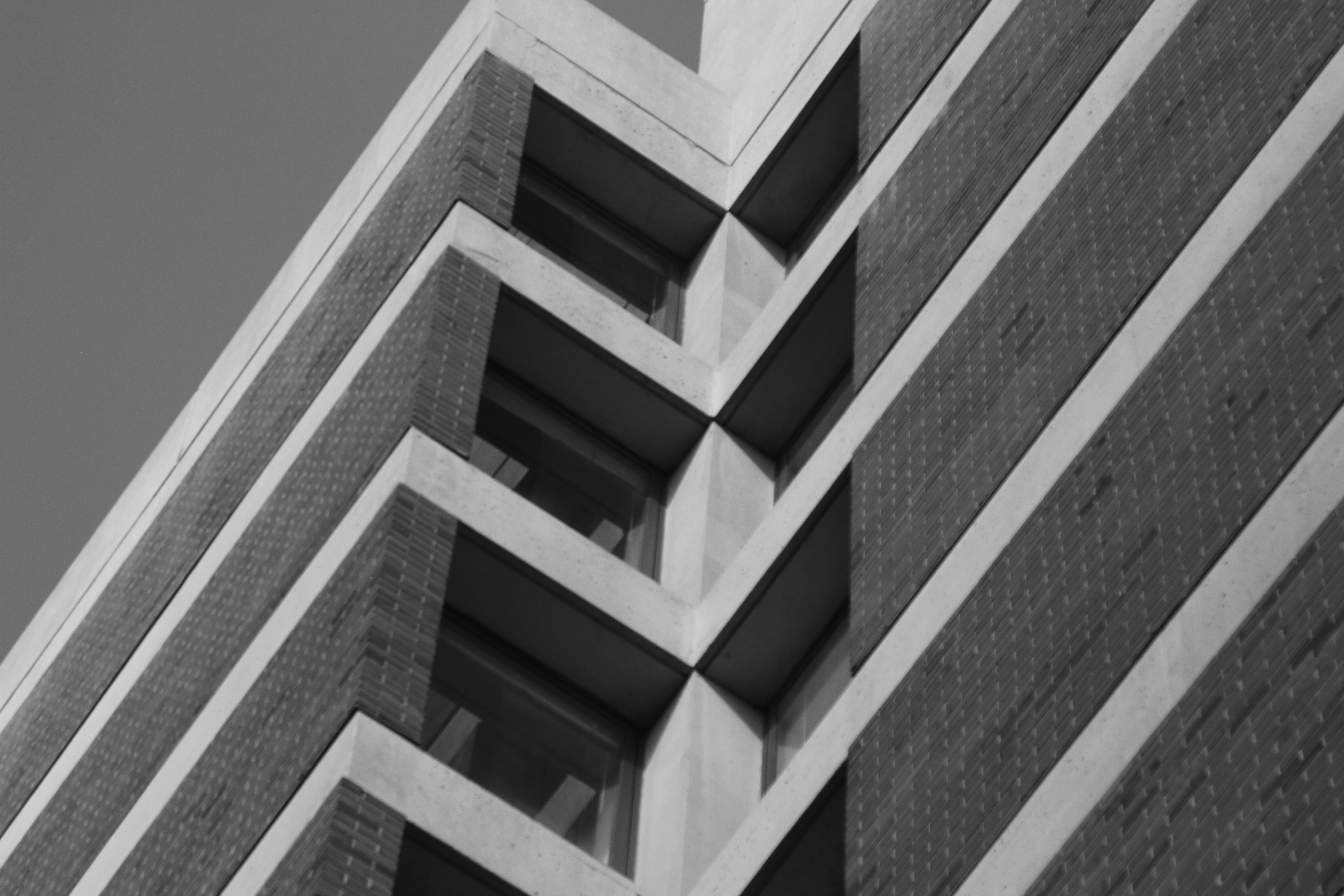
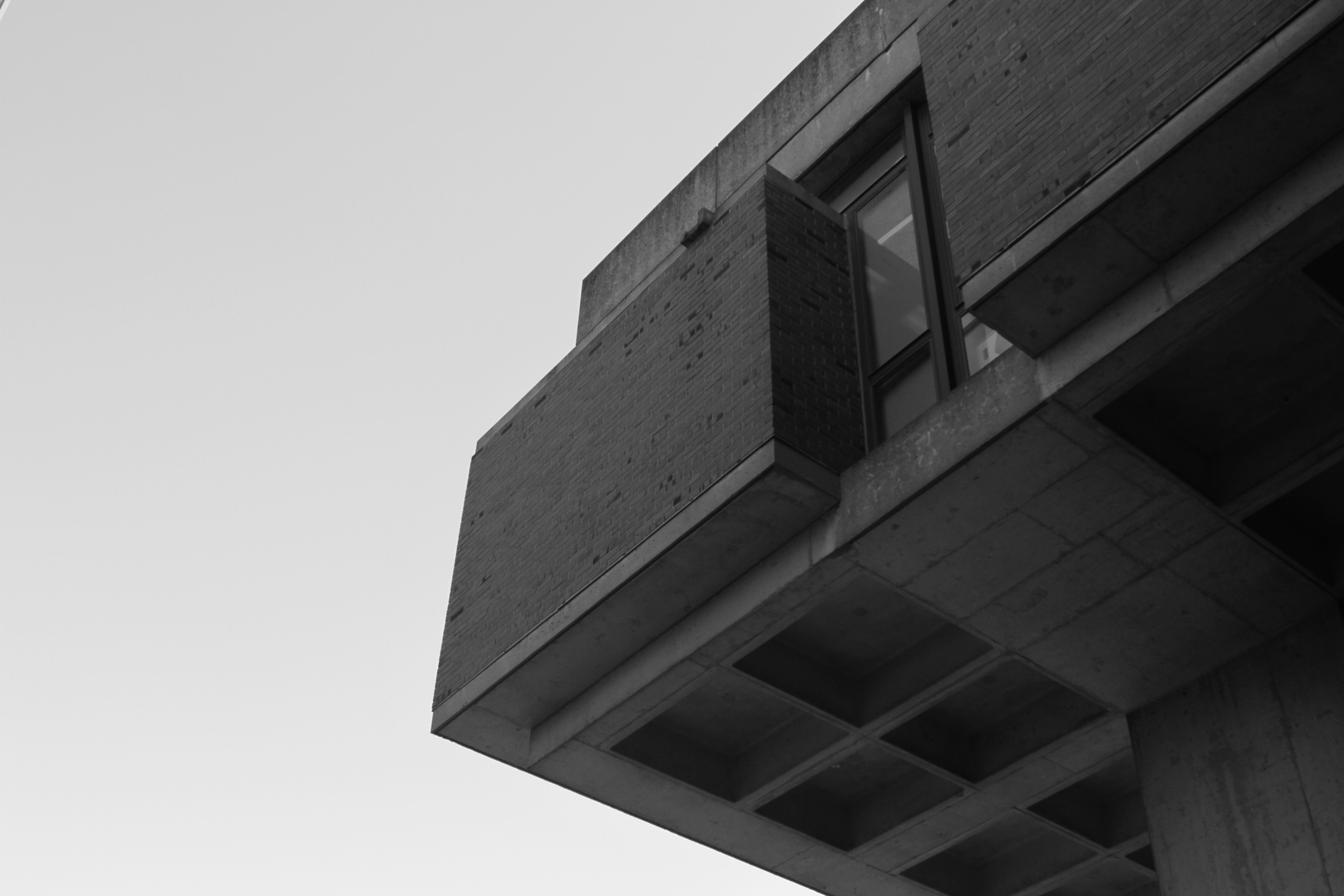
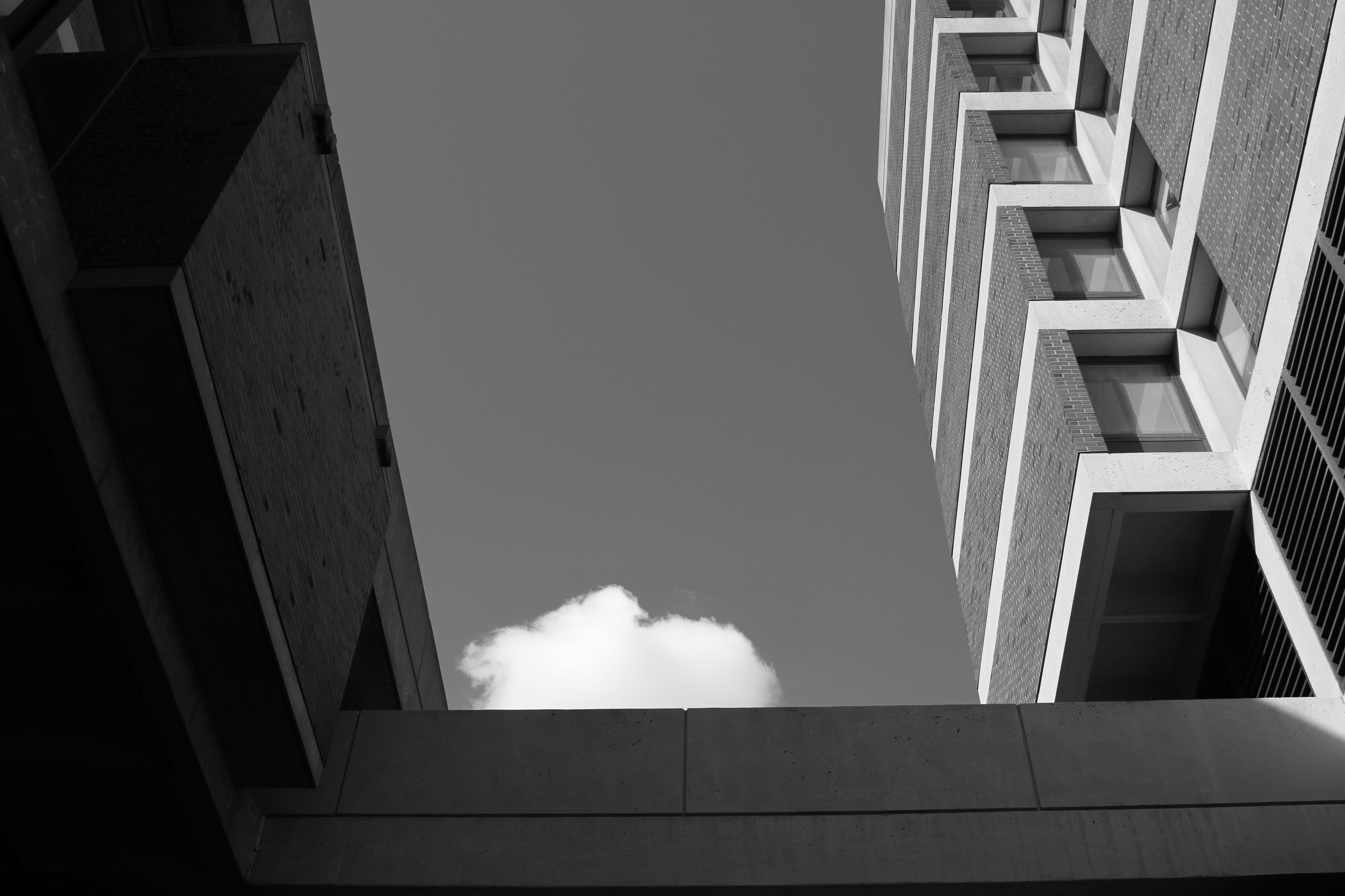
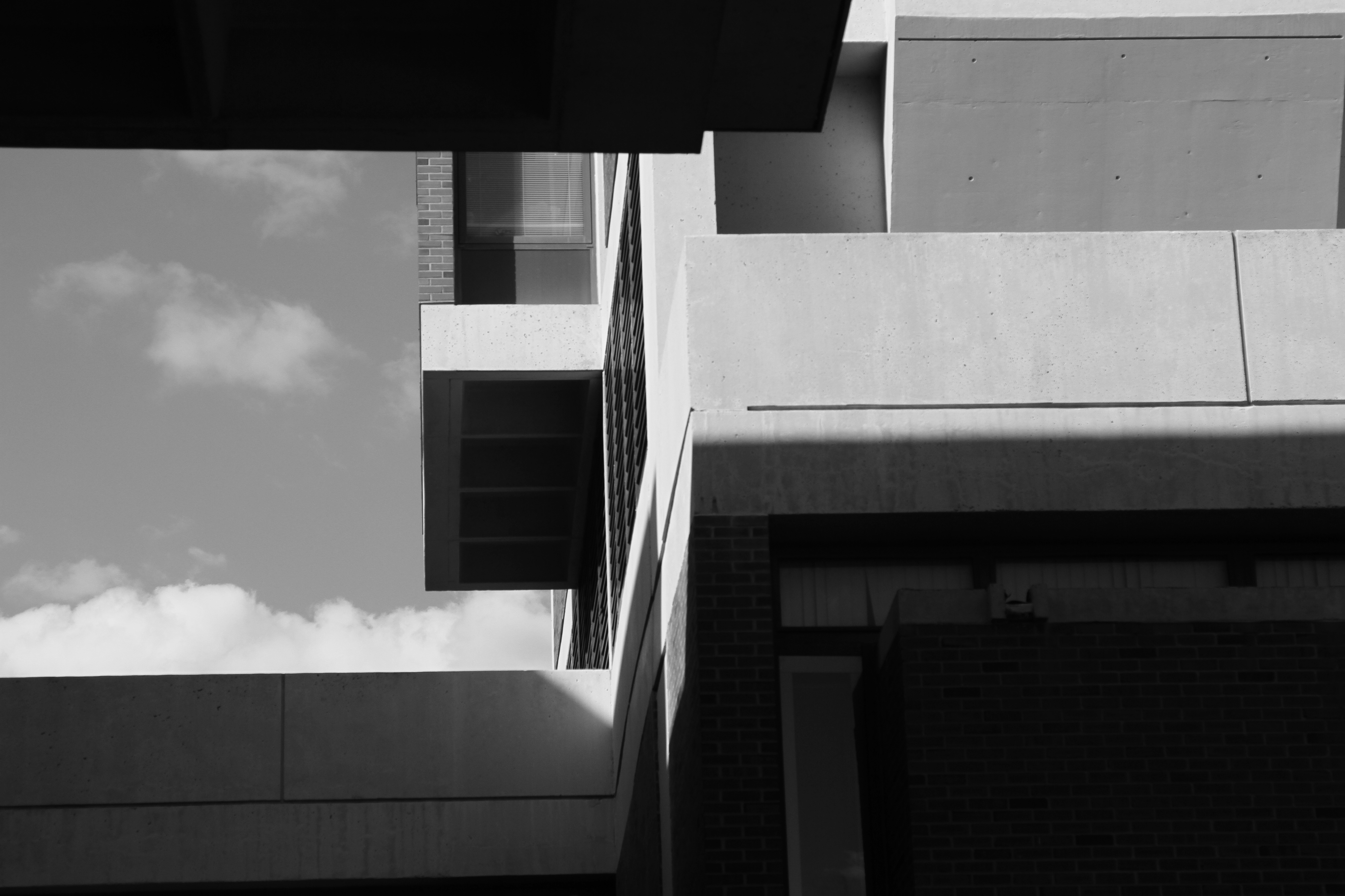
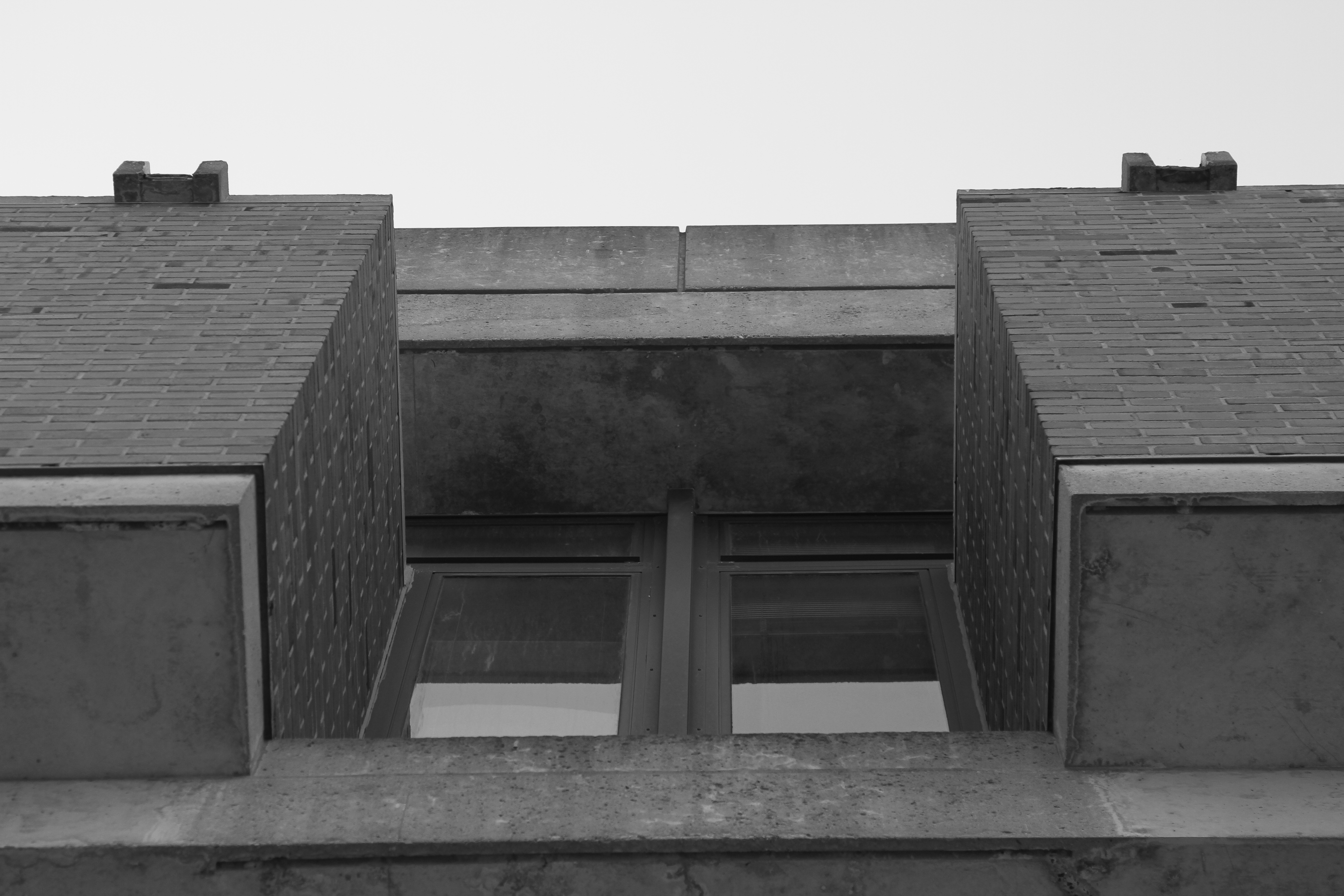
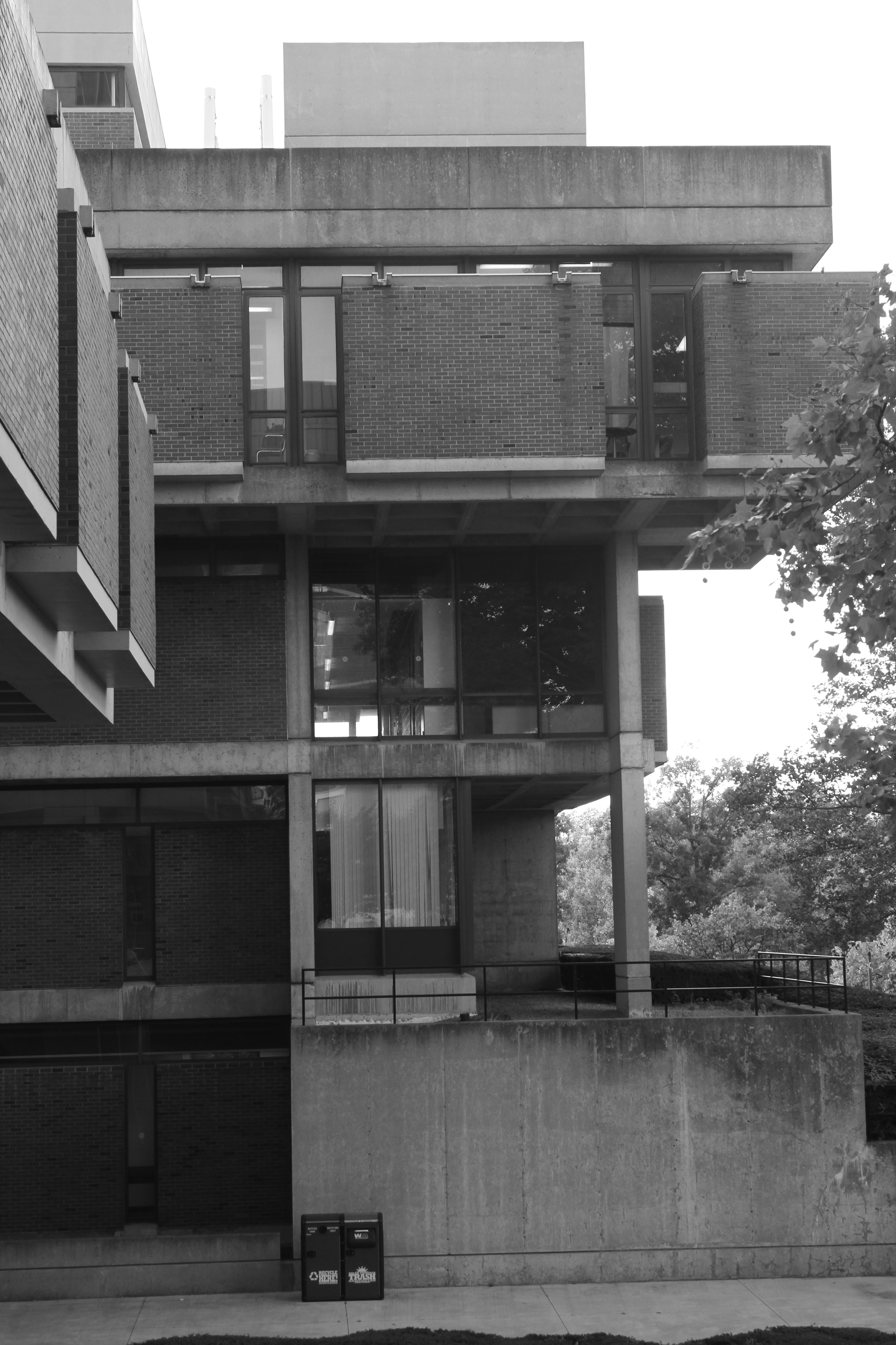
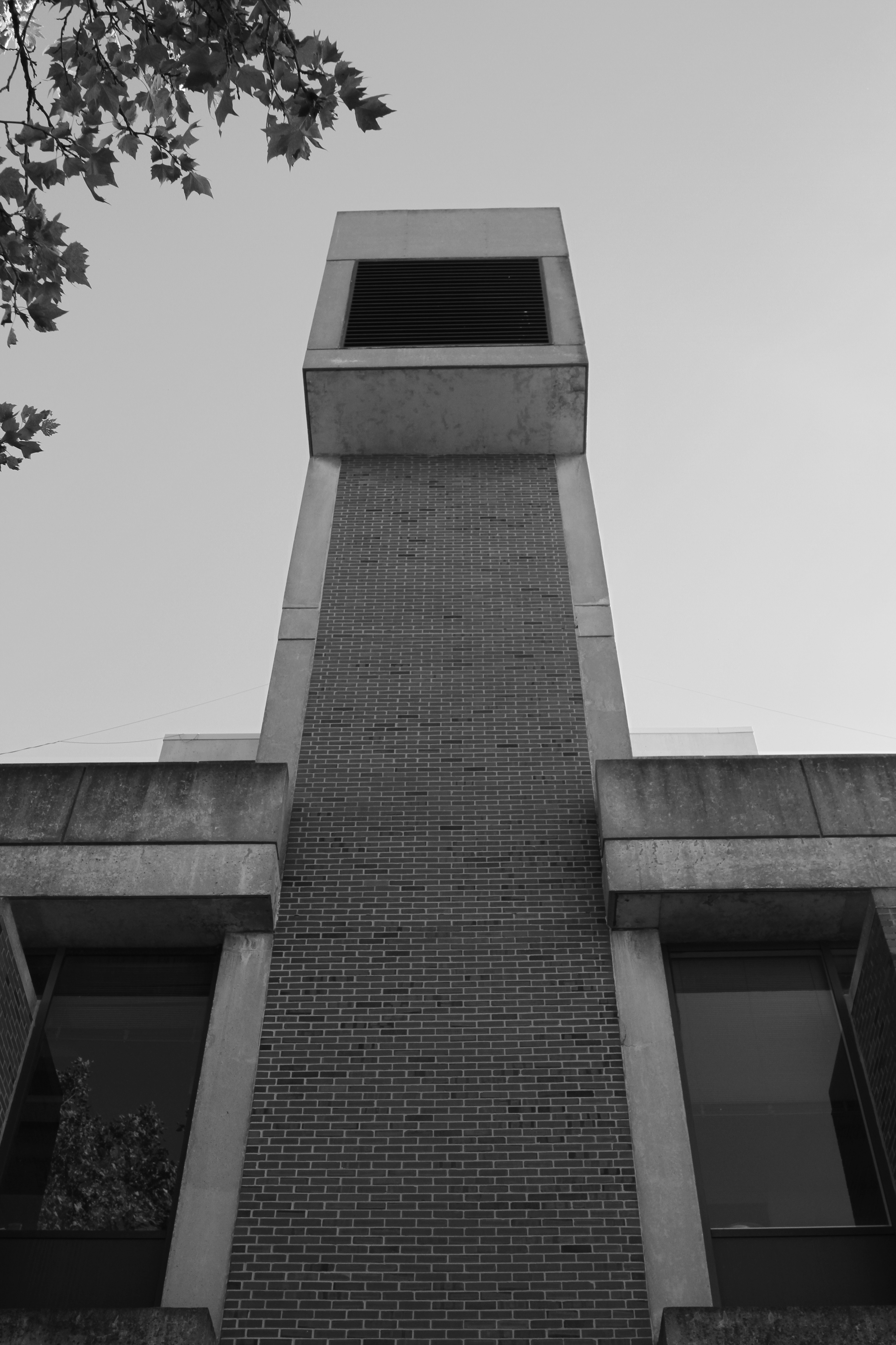
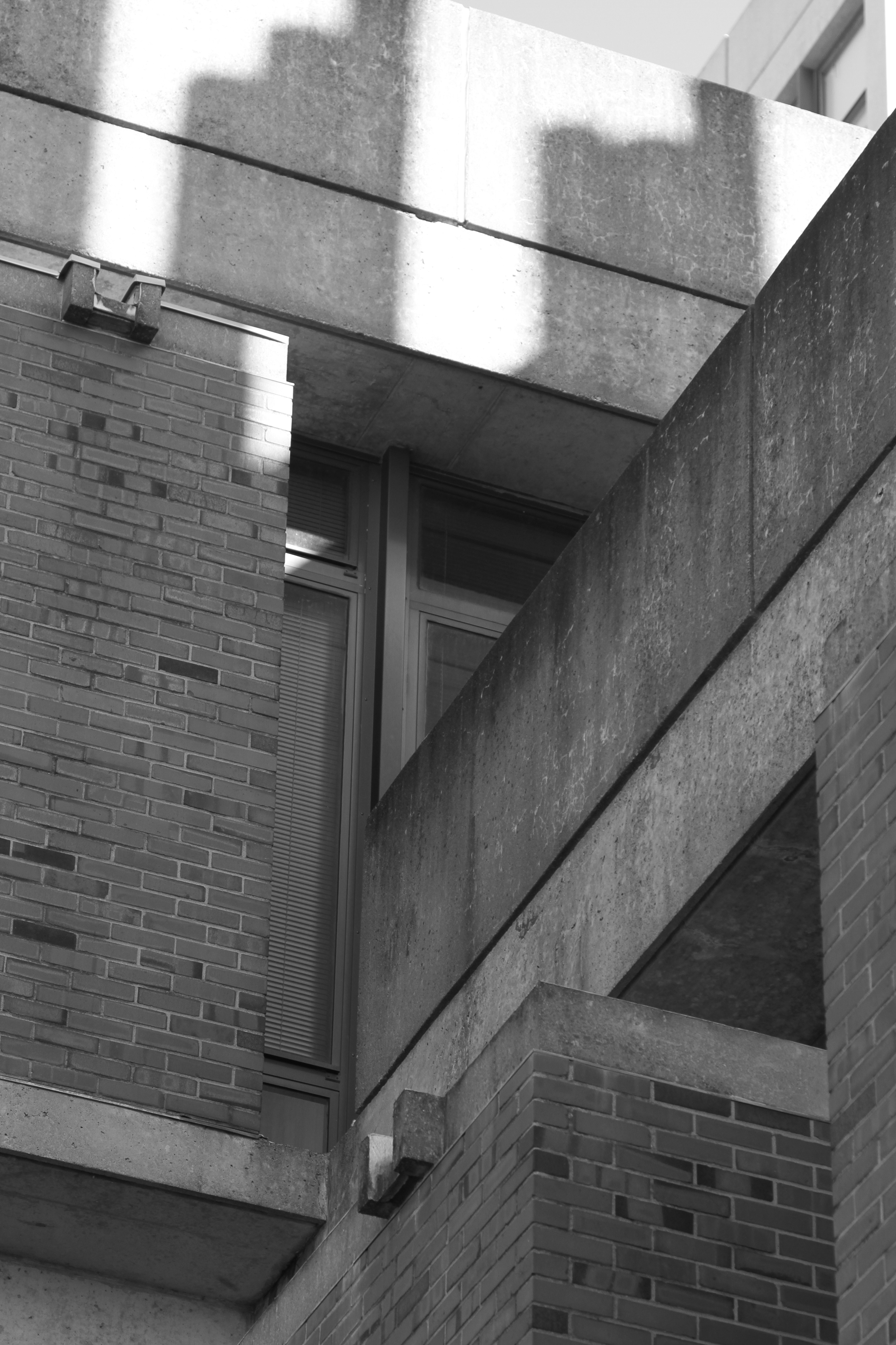
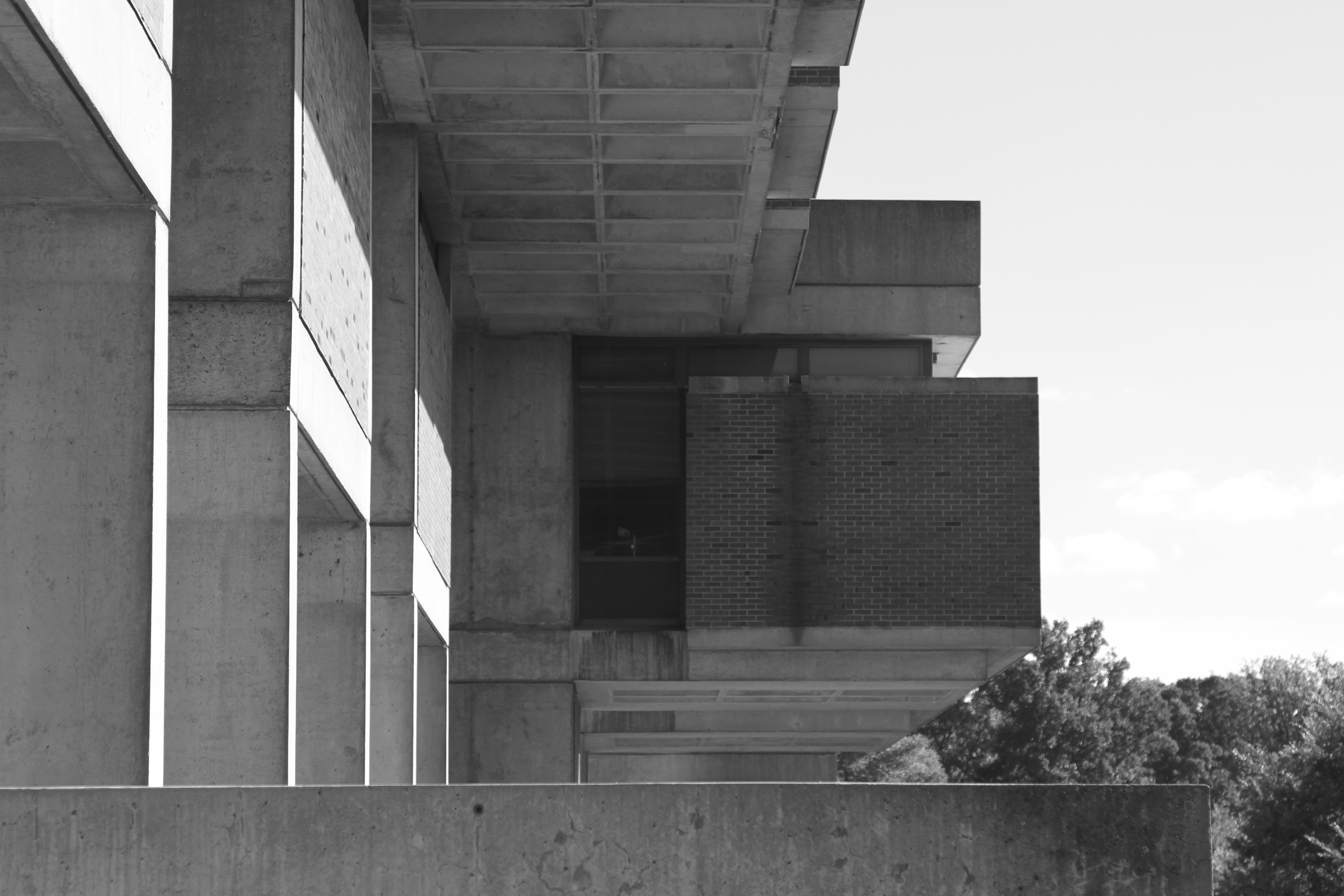
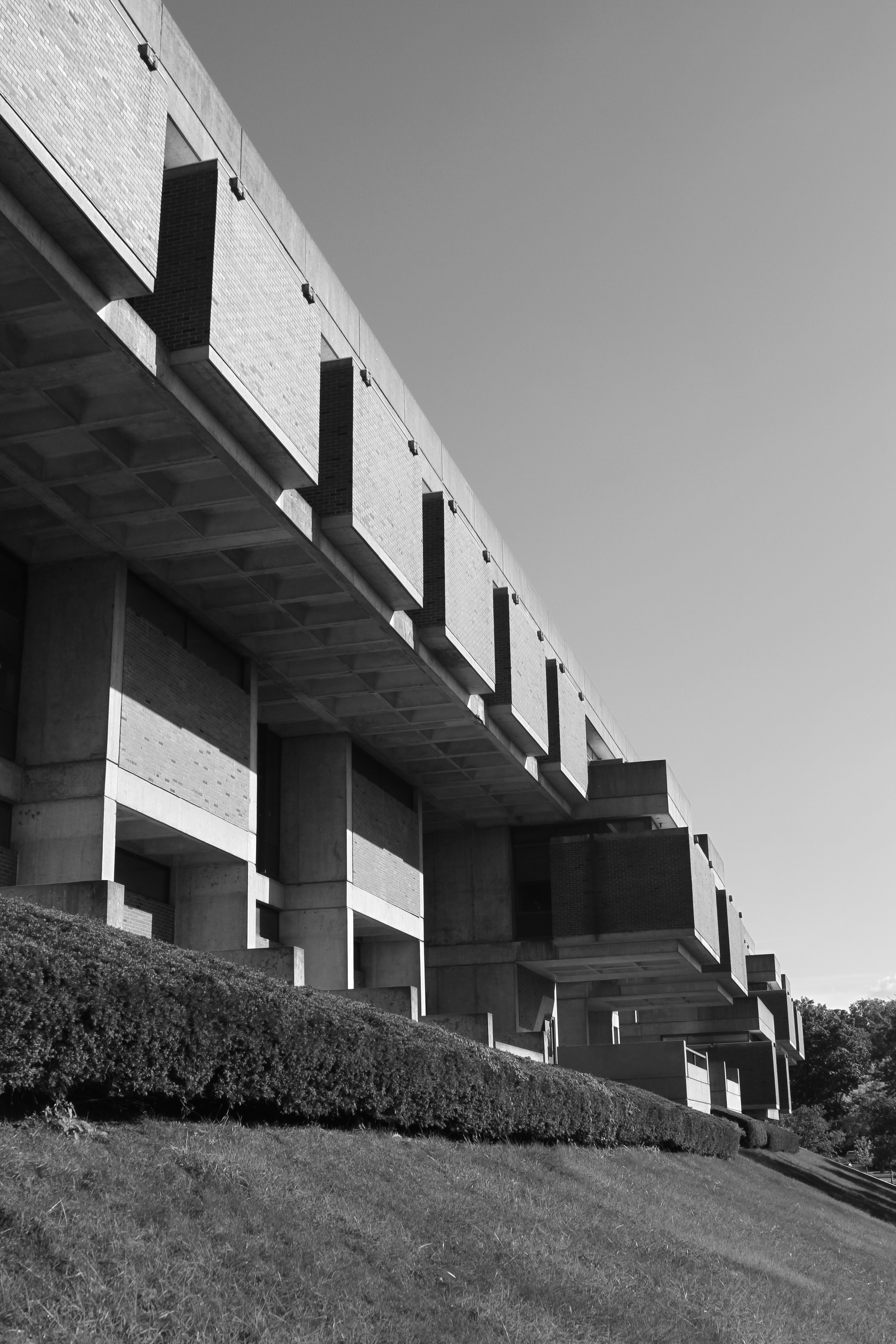
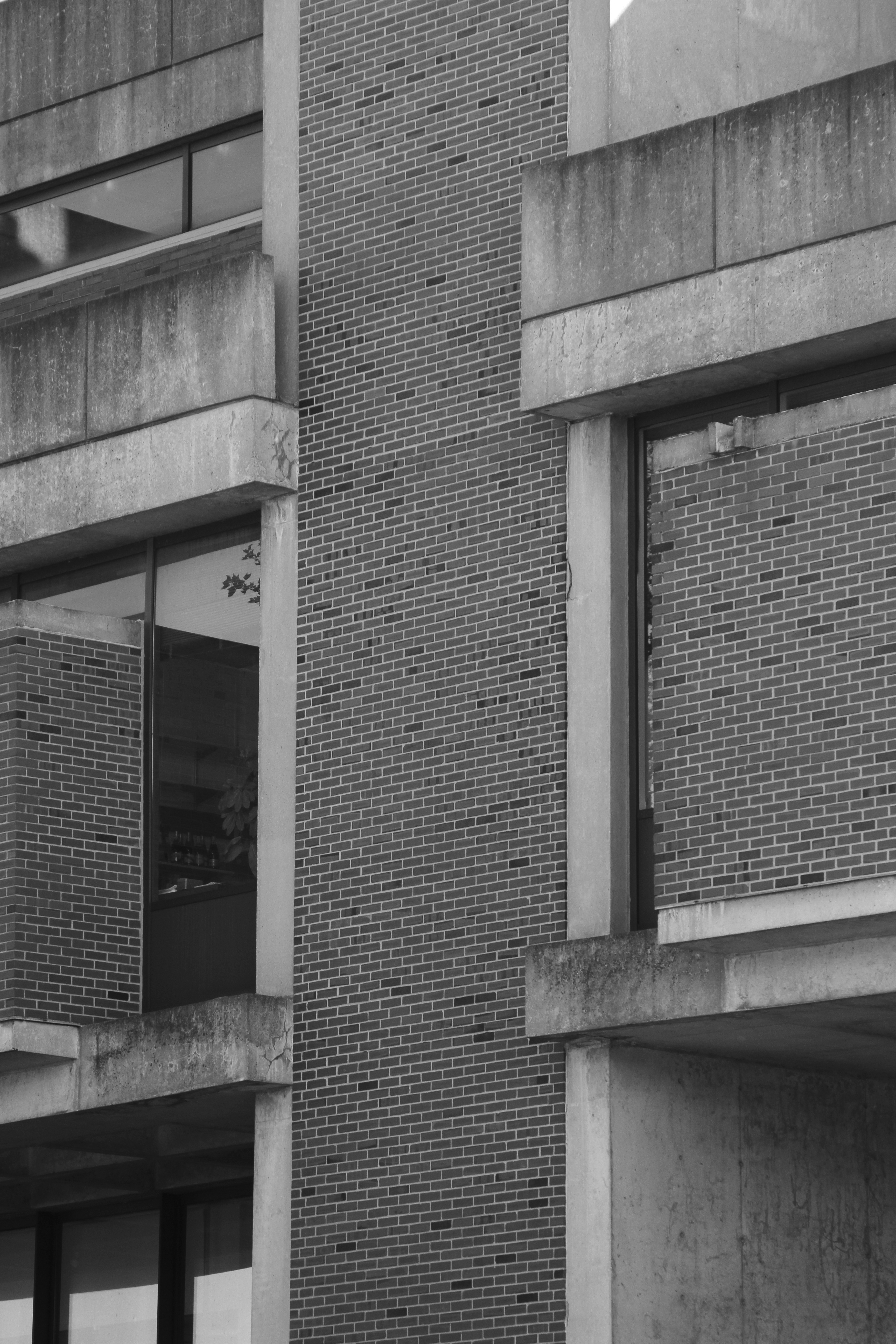
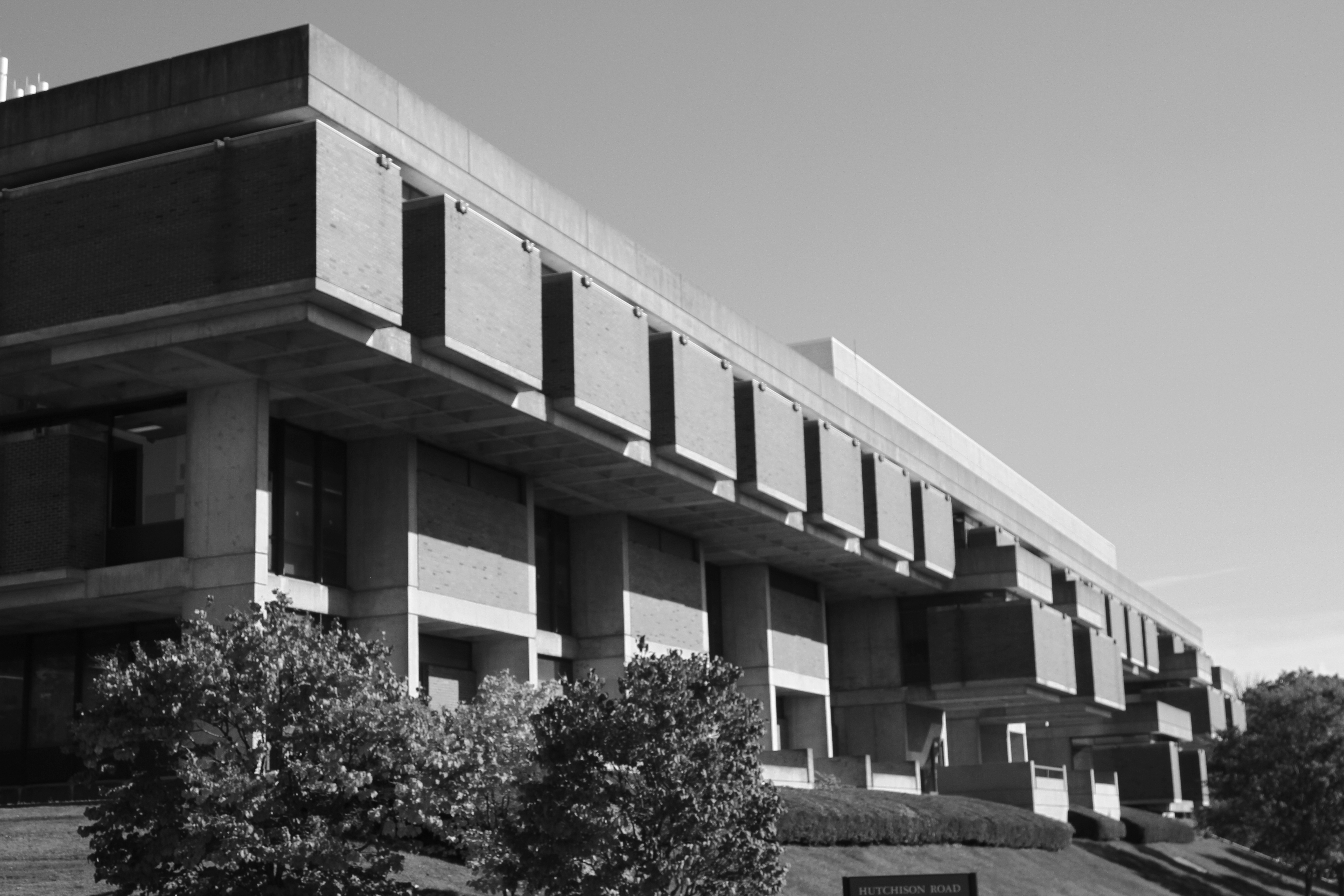
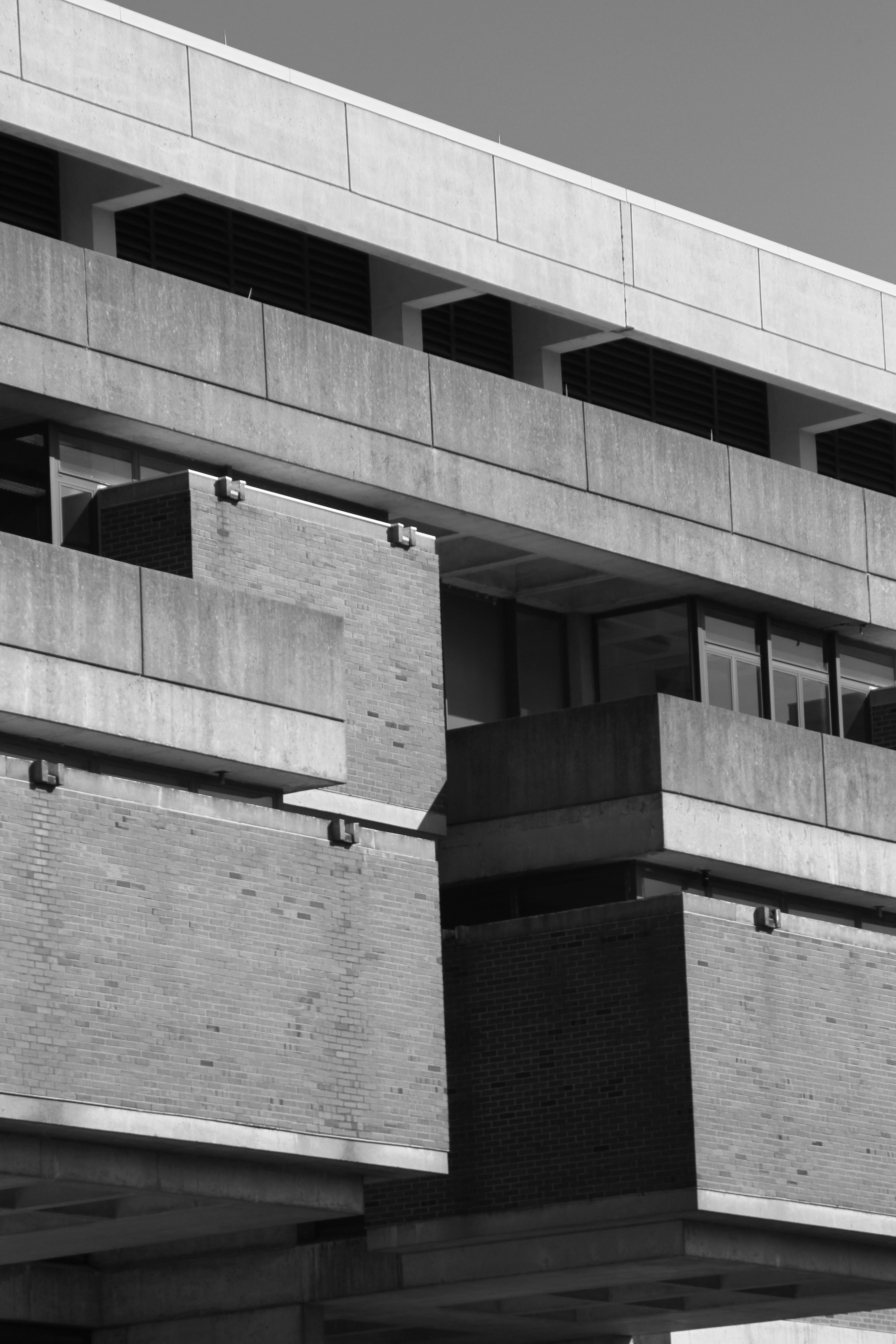
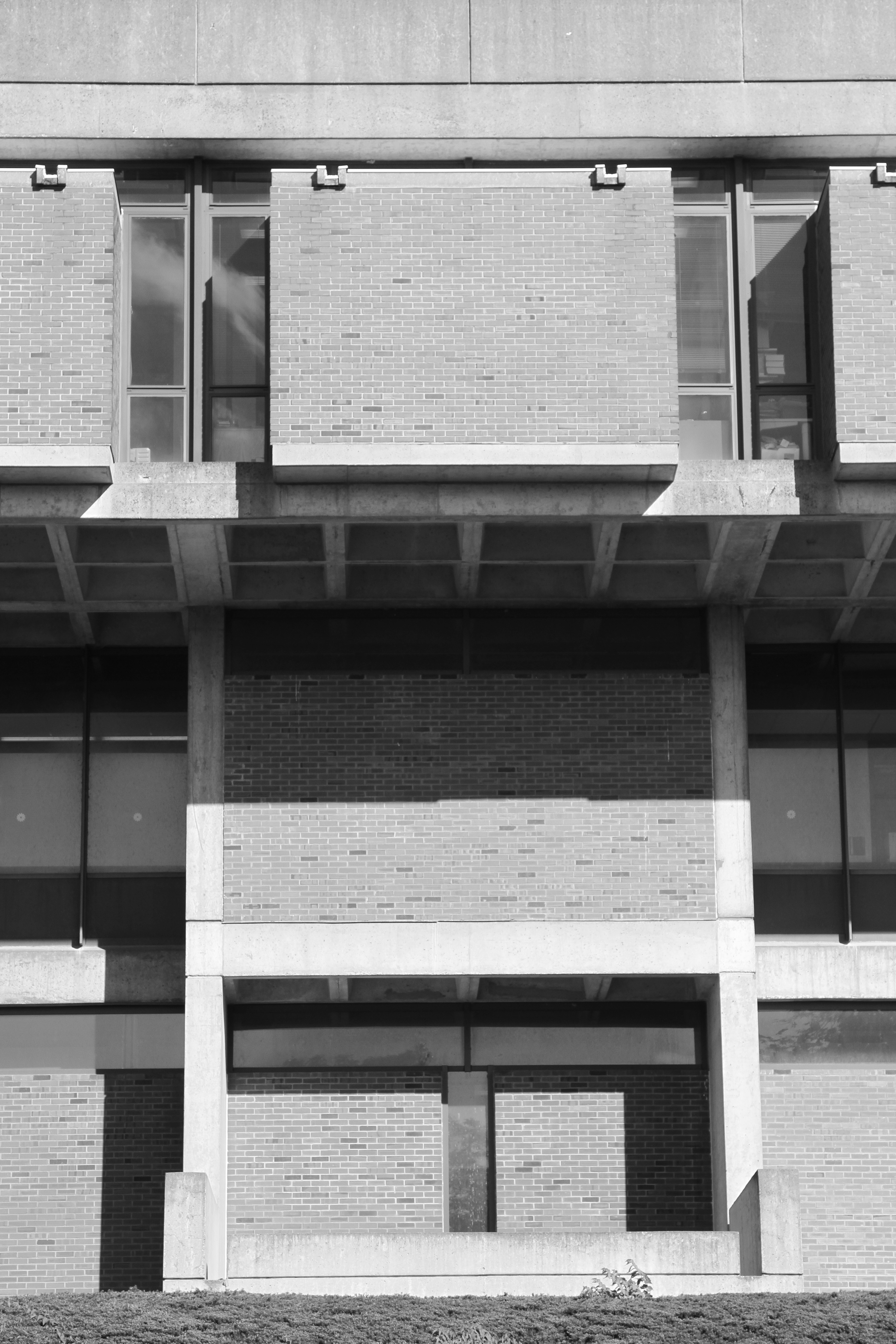
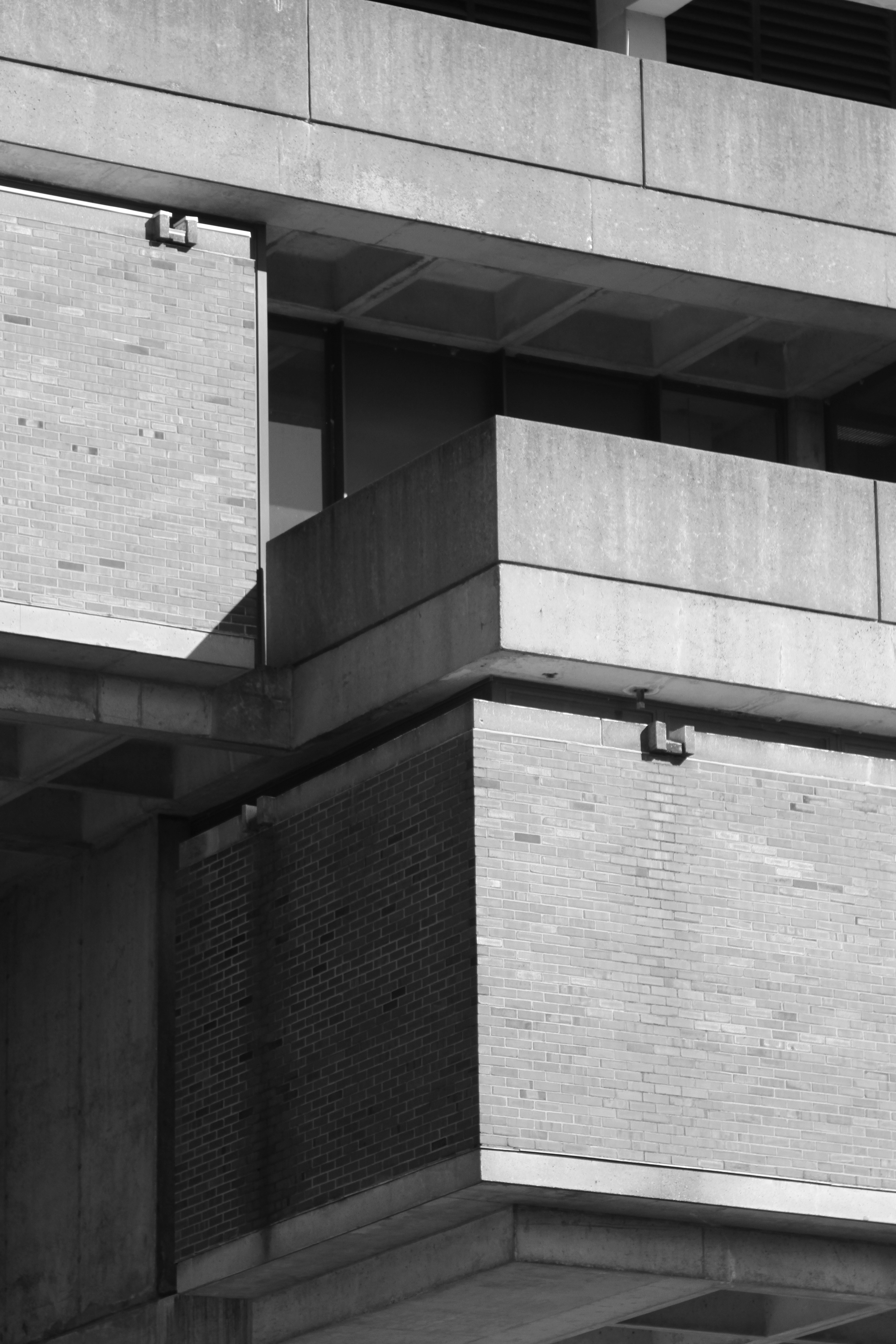
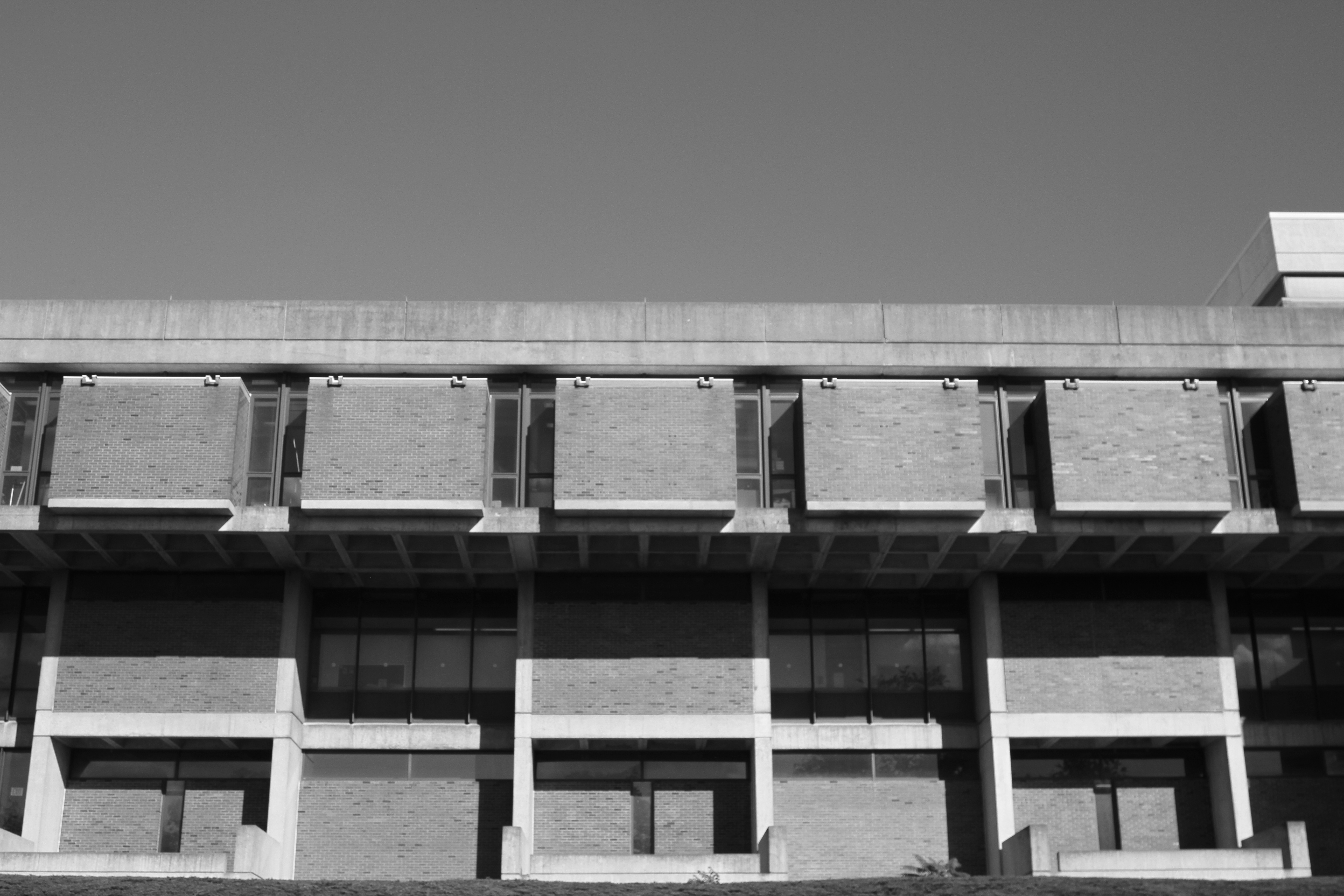
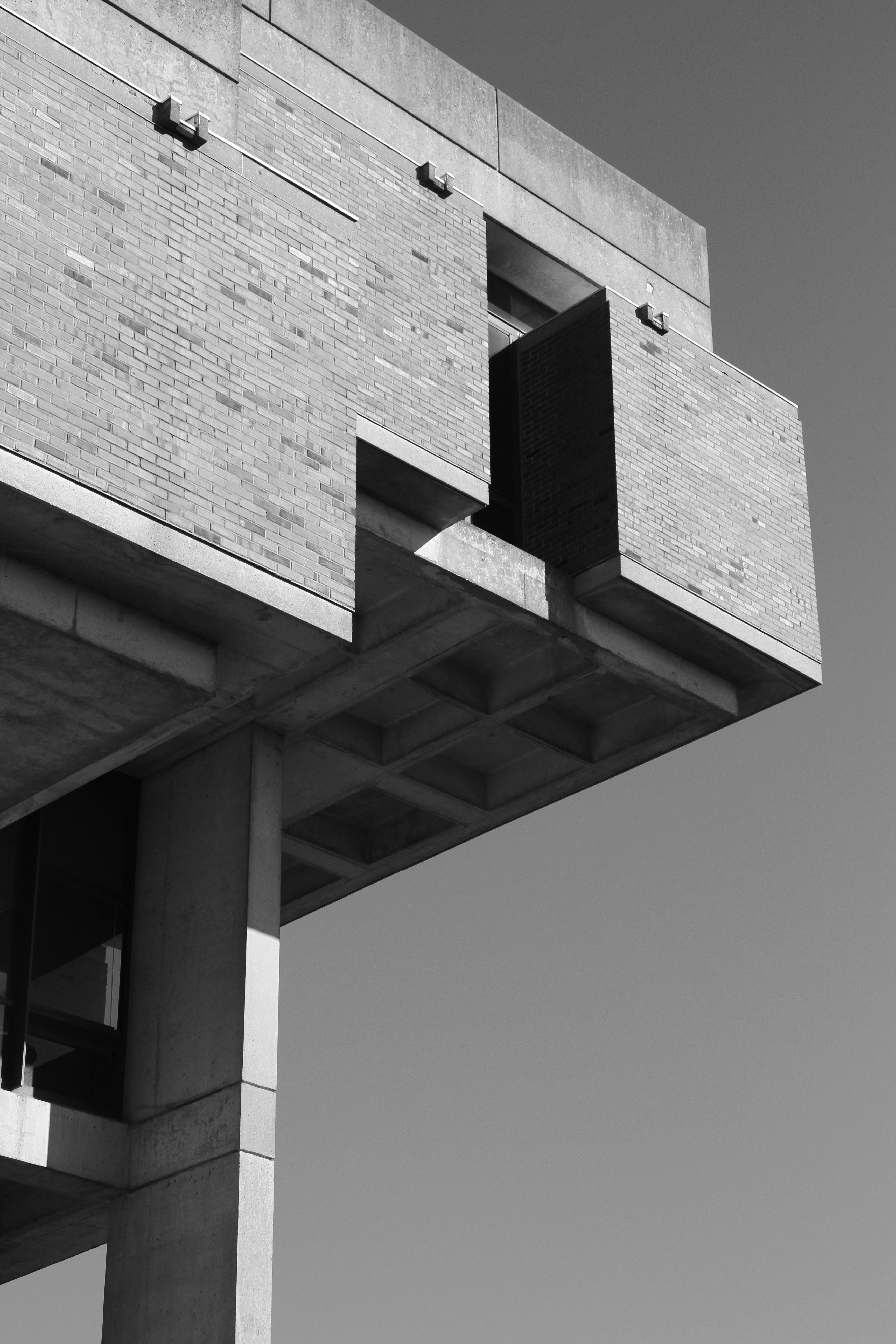
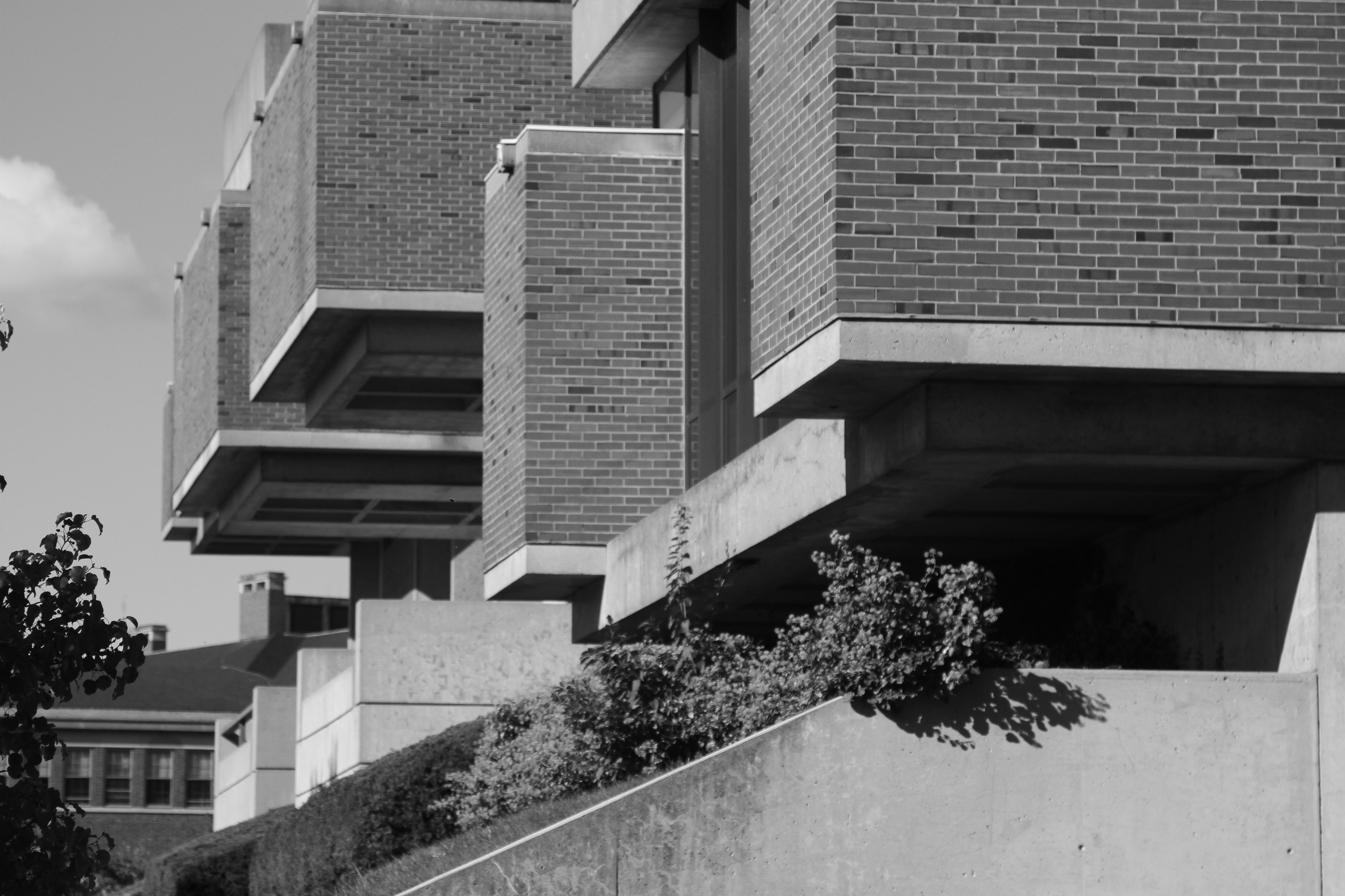
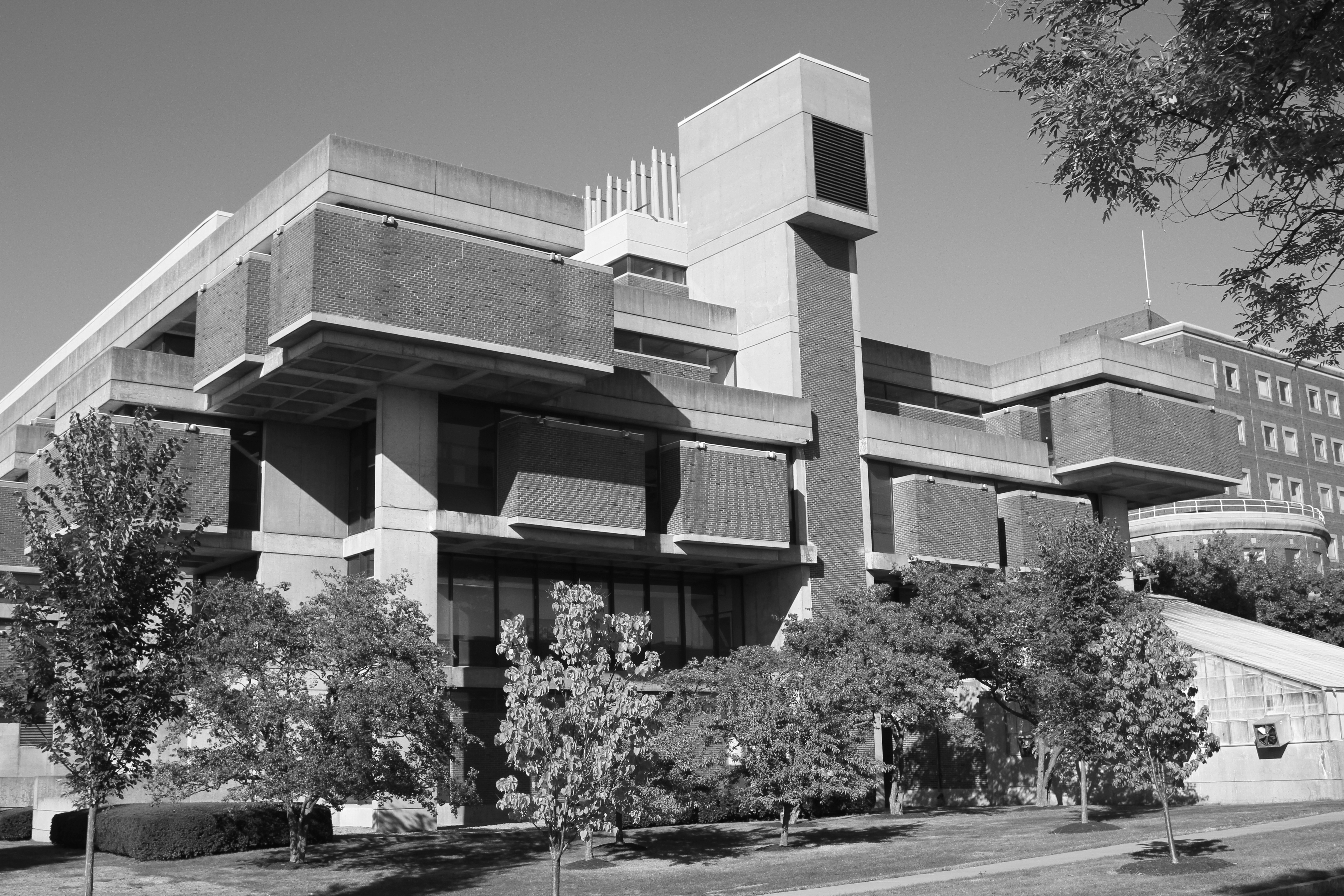
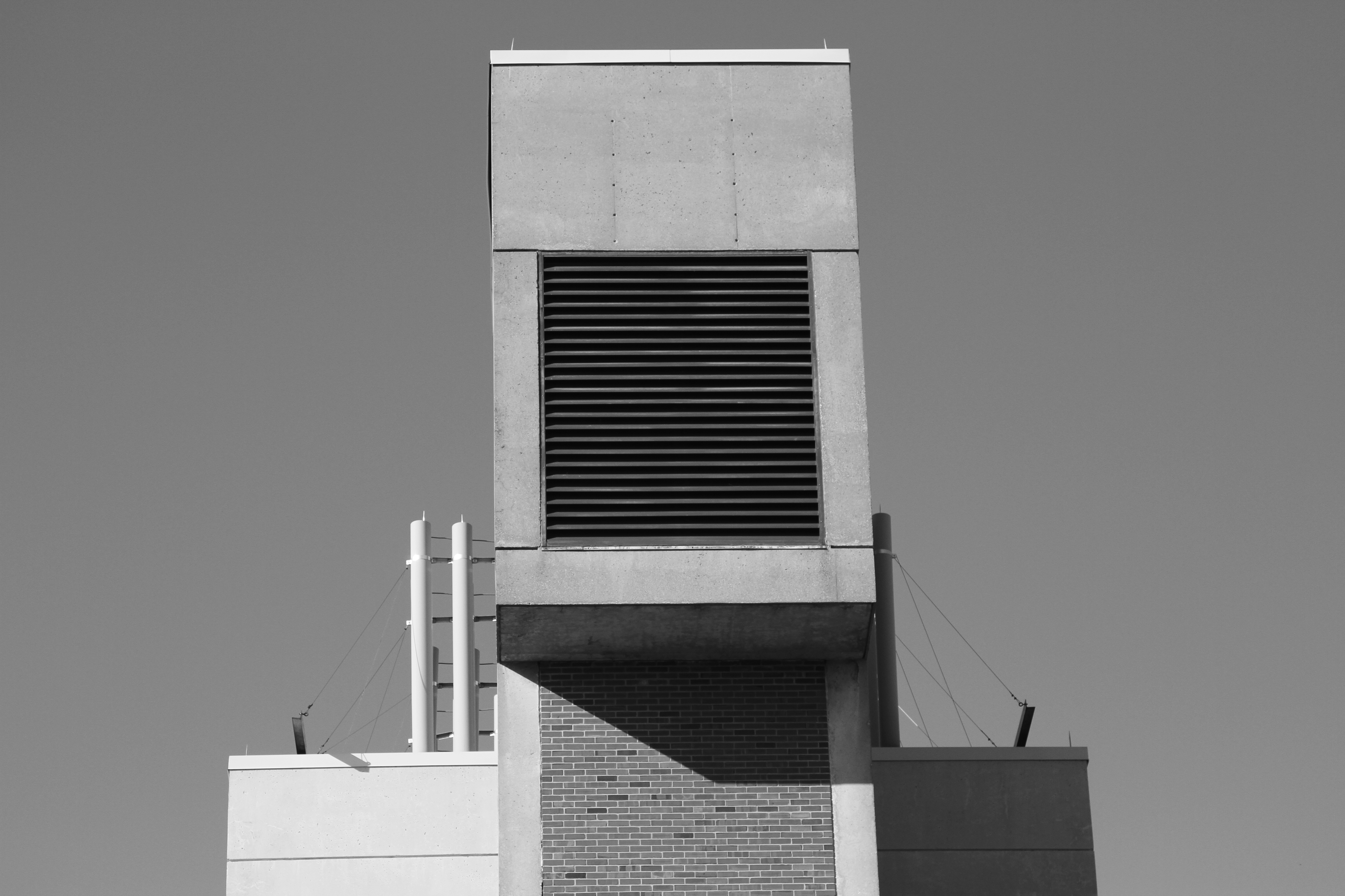
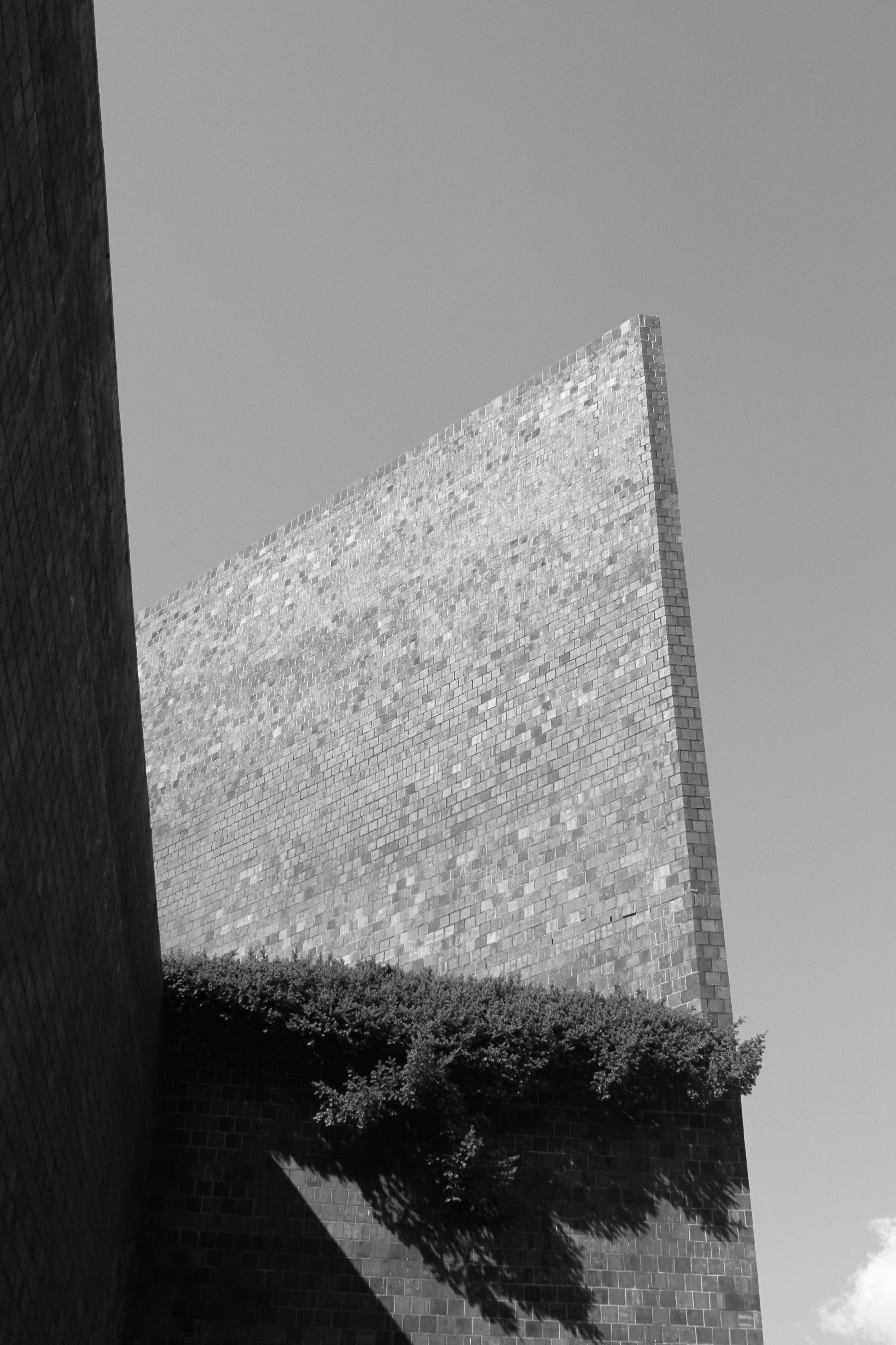
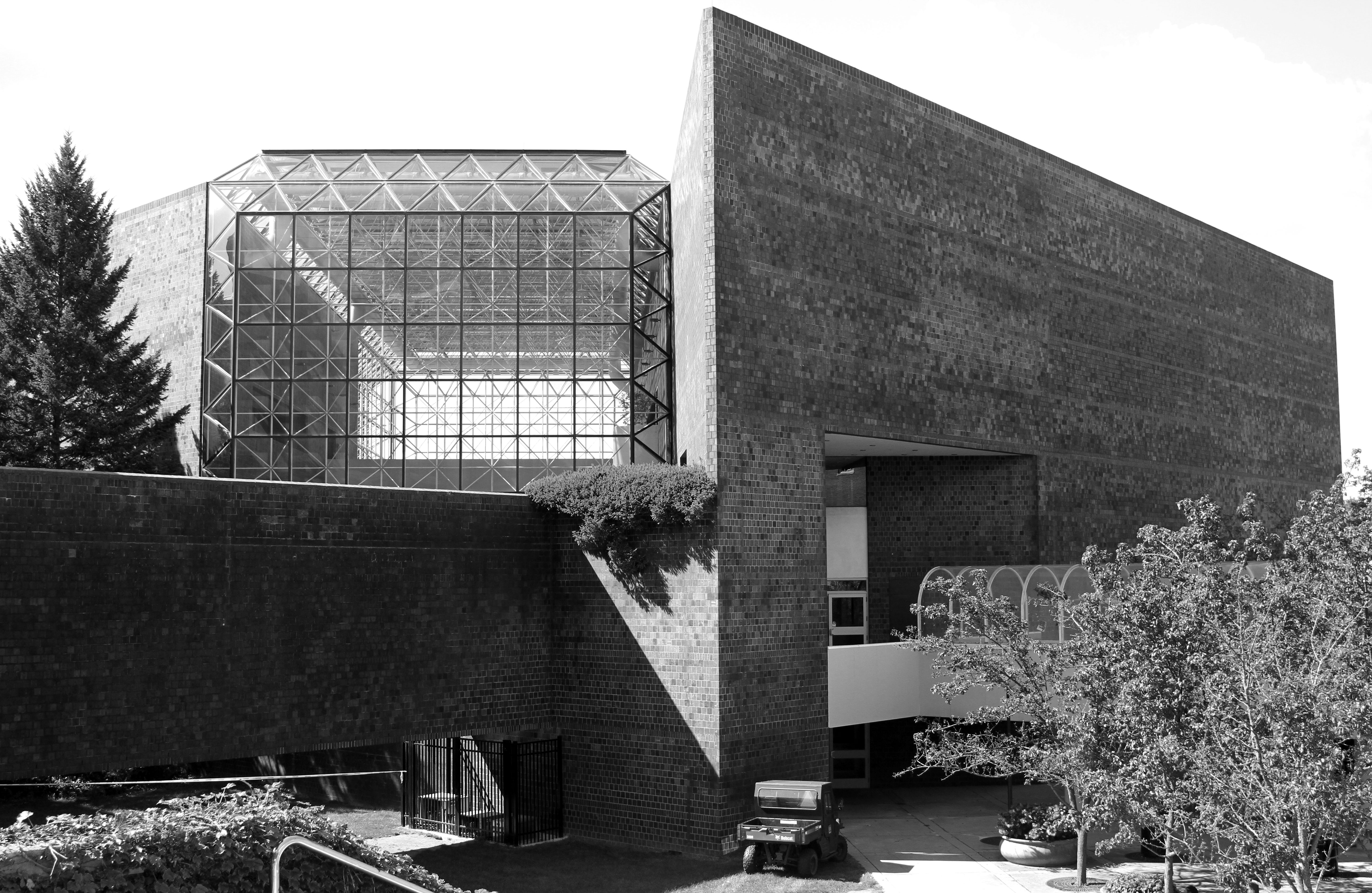
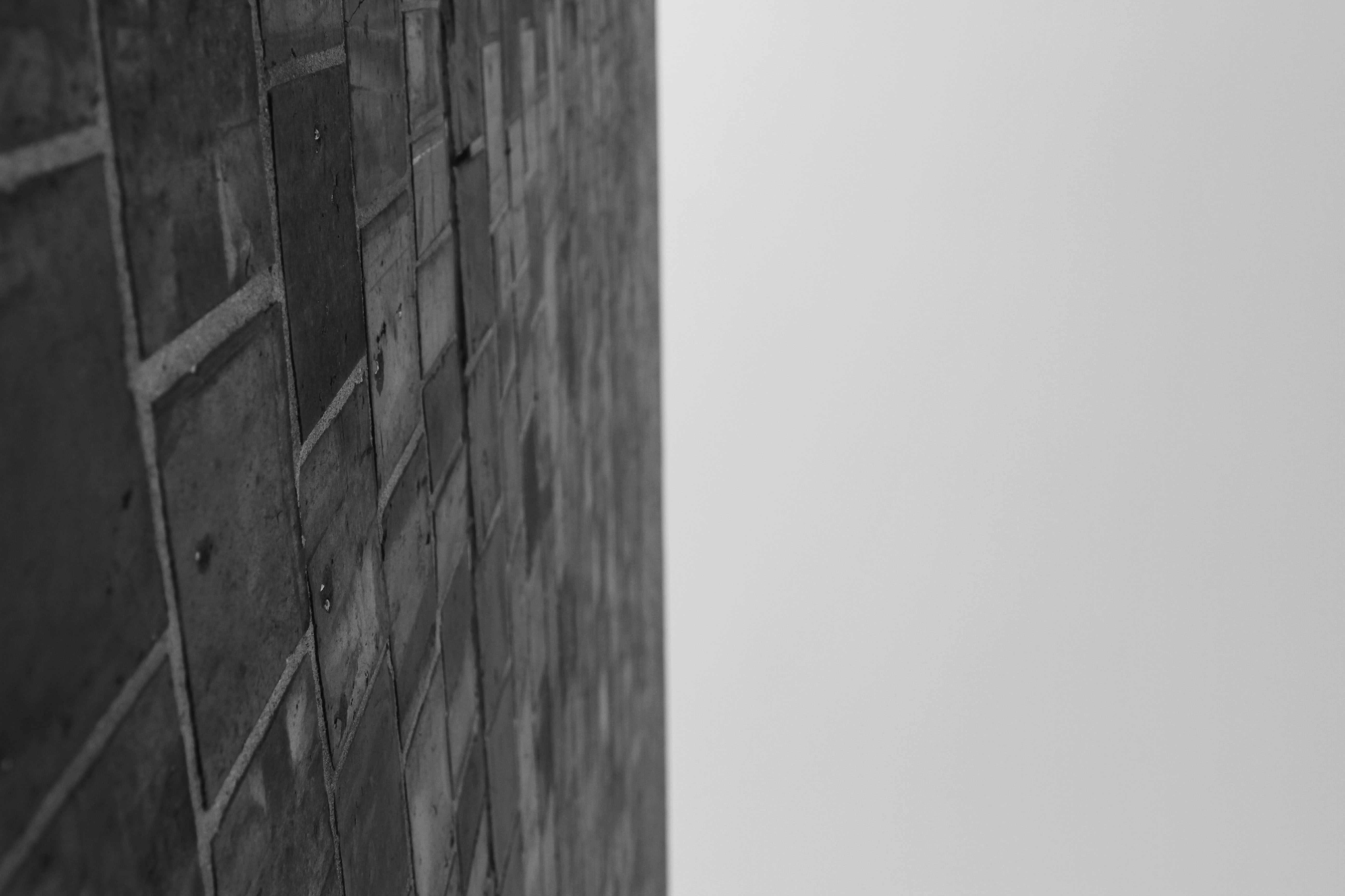
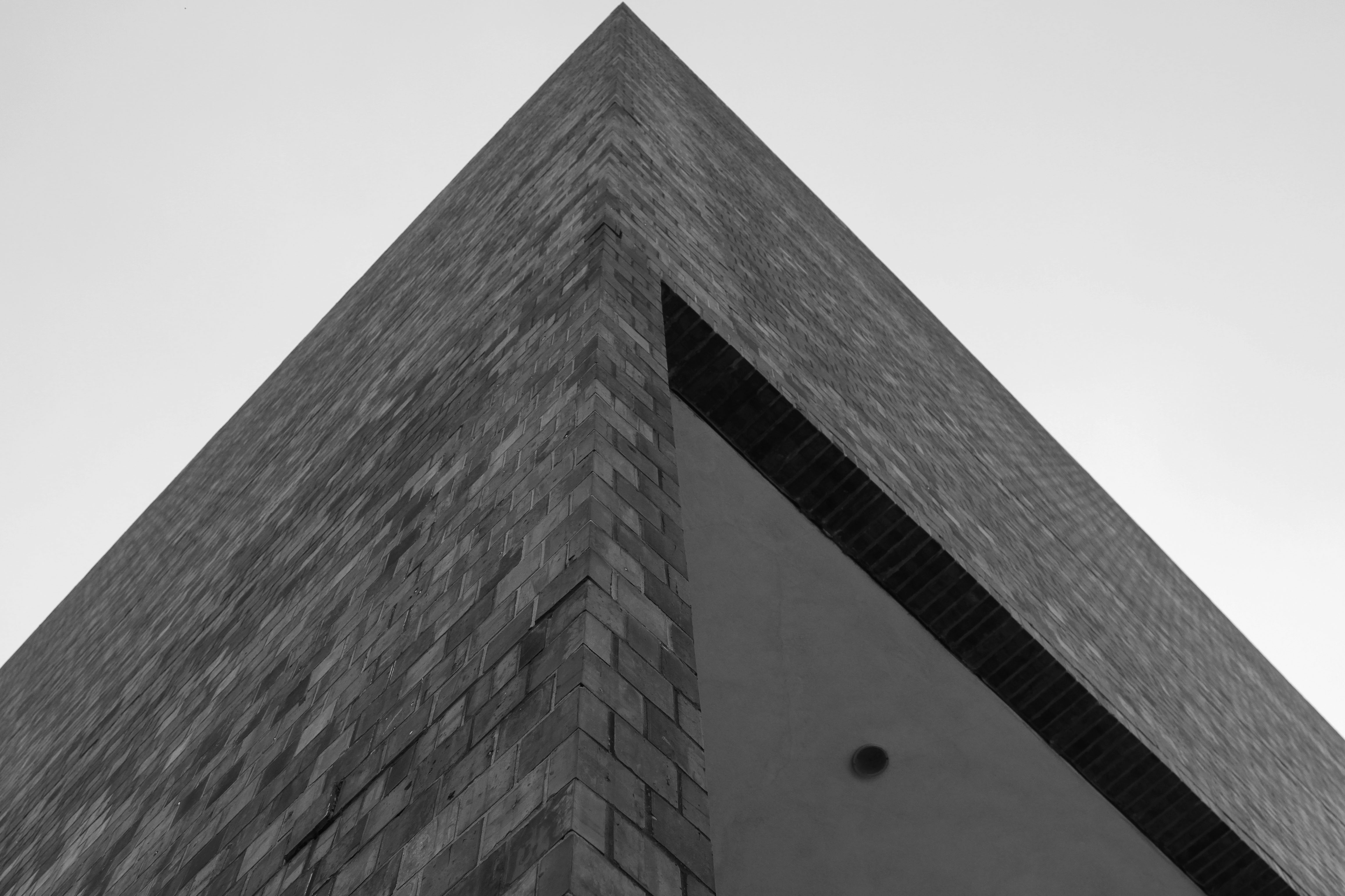
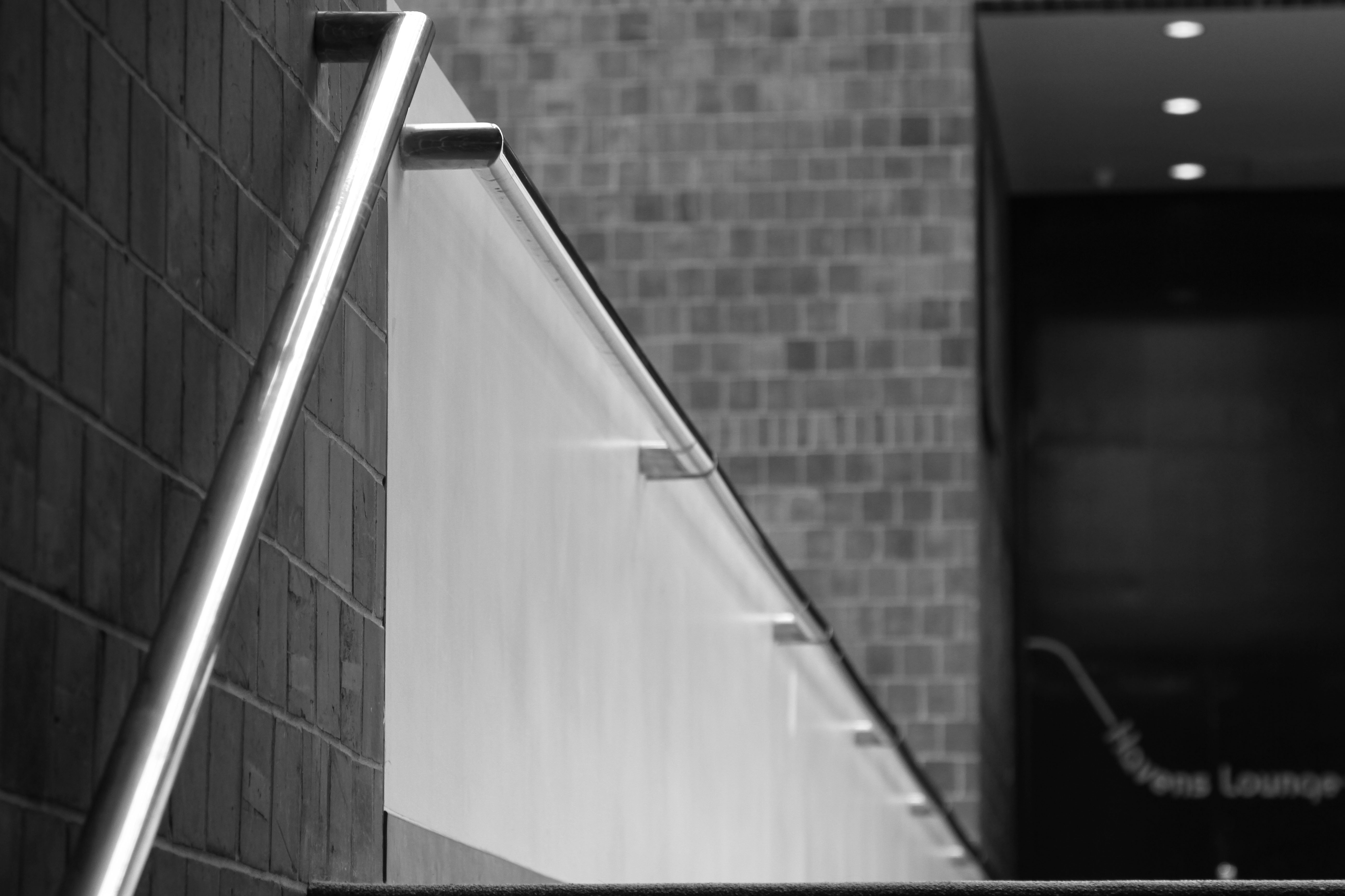
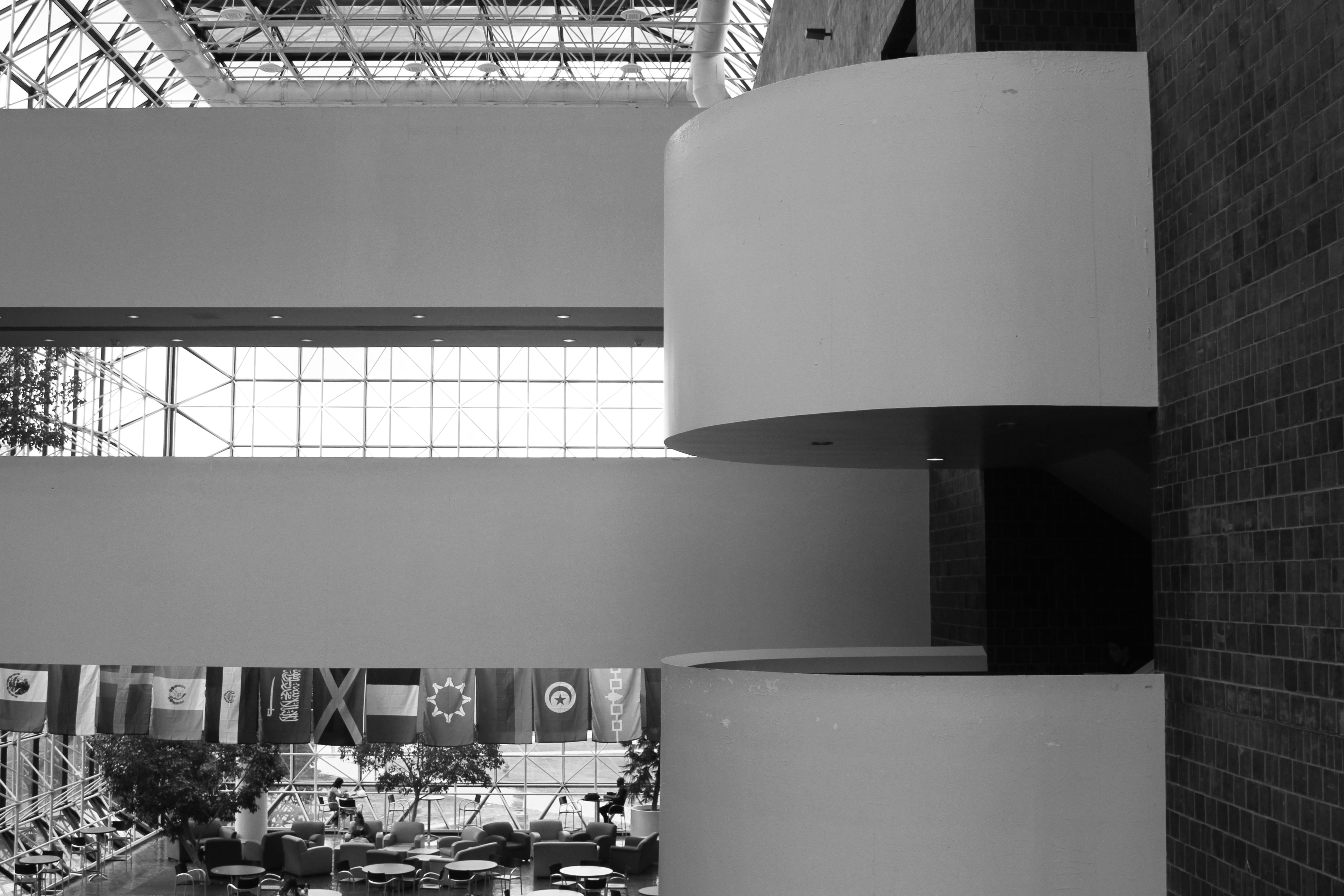
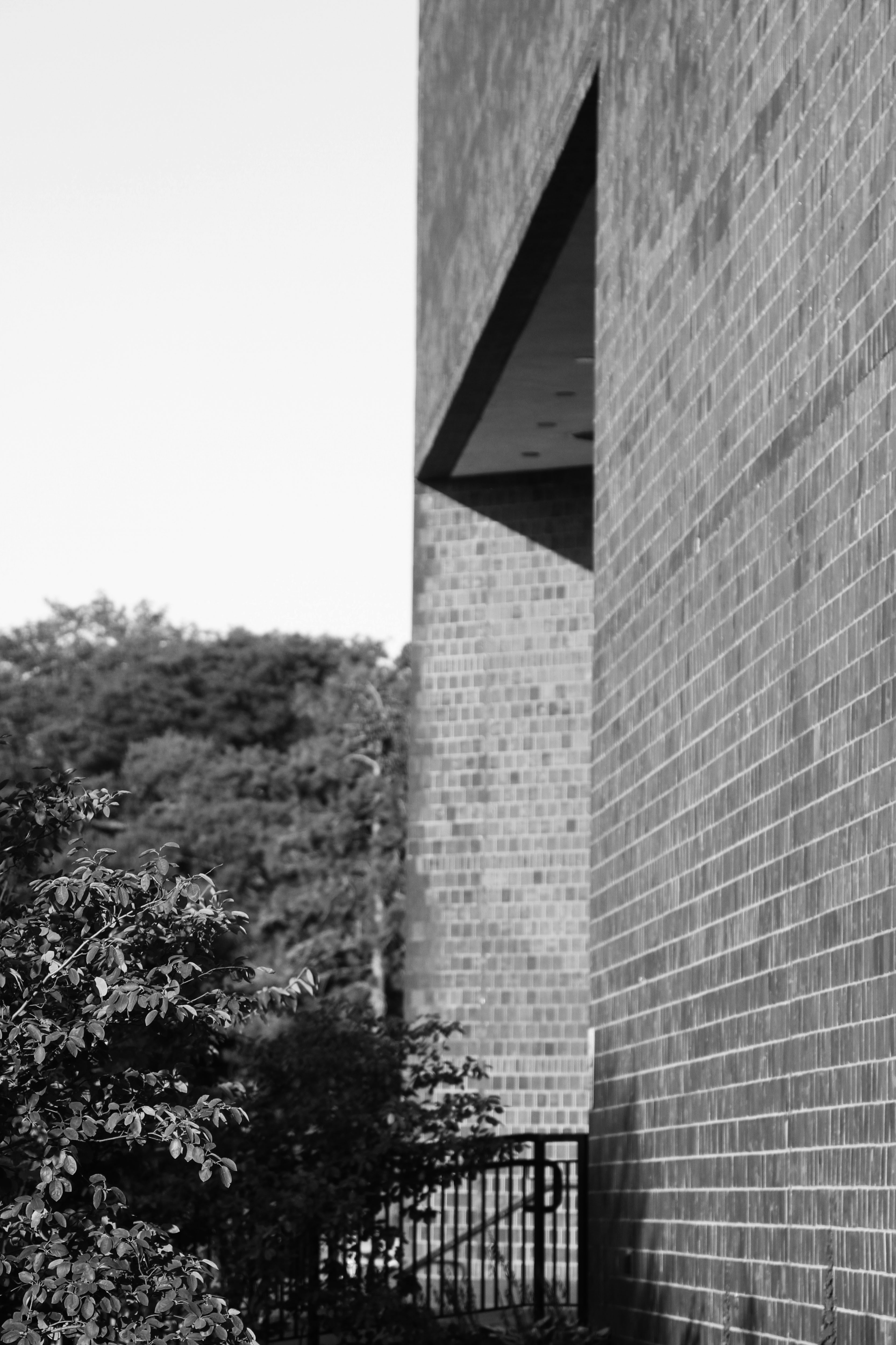
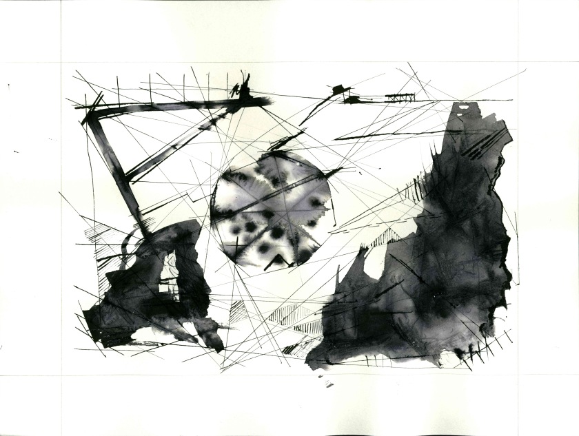
This is the last assigned project of my undergraduate program. The task was to re-work a previous project from one of our earlier studio courses with the purpose of build on upon it (rather than fixing or improving it). I chose a simple drawing exercise I did in my drawing class; an orthogonal projection of a building (Sage Art Center).

Orthogonal projections are interesting to me because they don’t represent the object as in a perspective, but rather describe it, and in a way, abstract it or reconfigure our understanding of it. The idea of showing architecture in a way different from how we commonly perceive it fascinates me.

Layout2 sage universes (1) SAGE

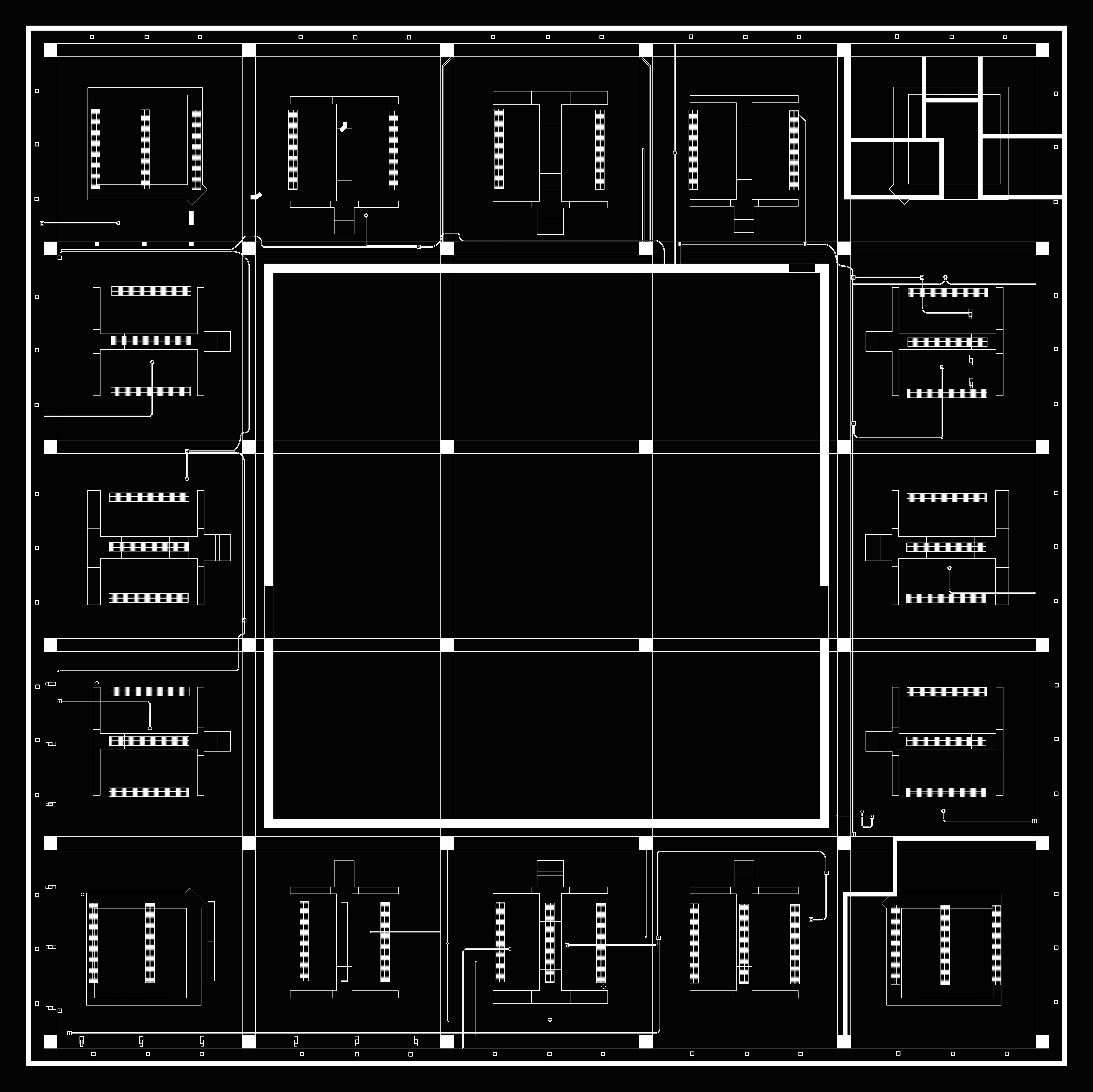
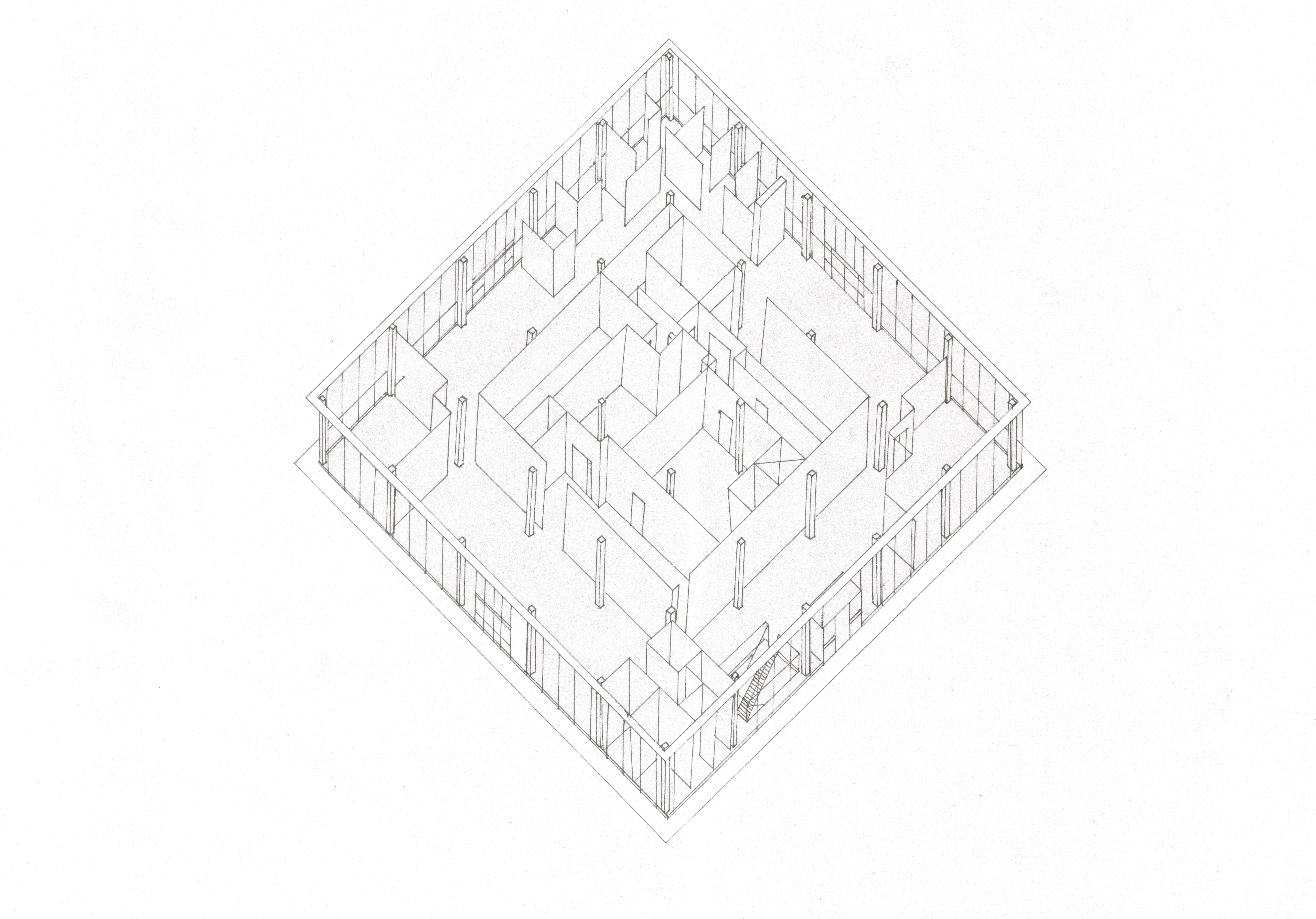
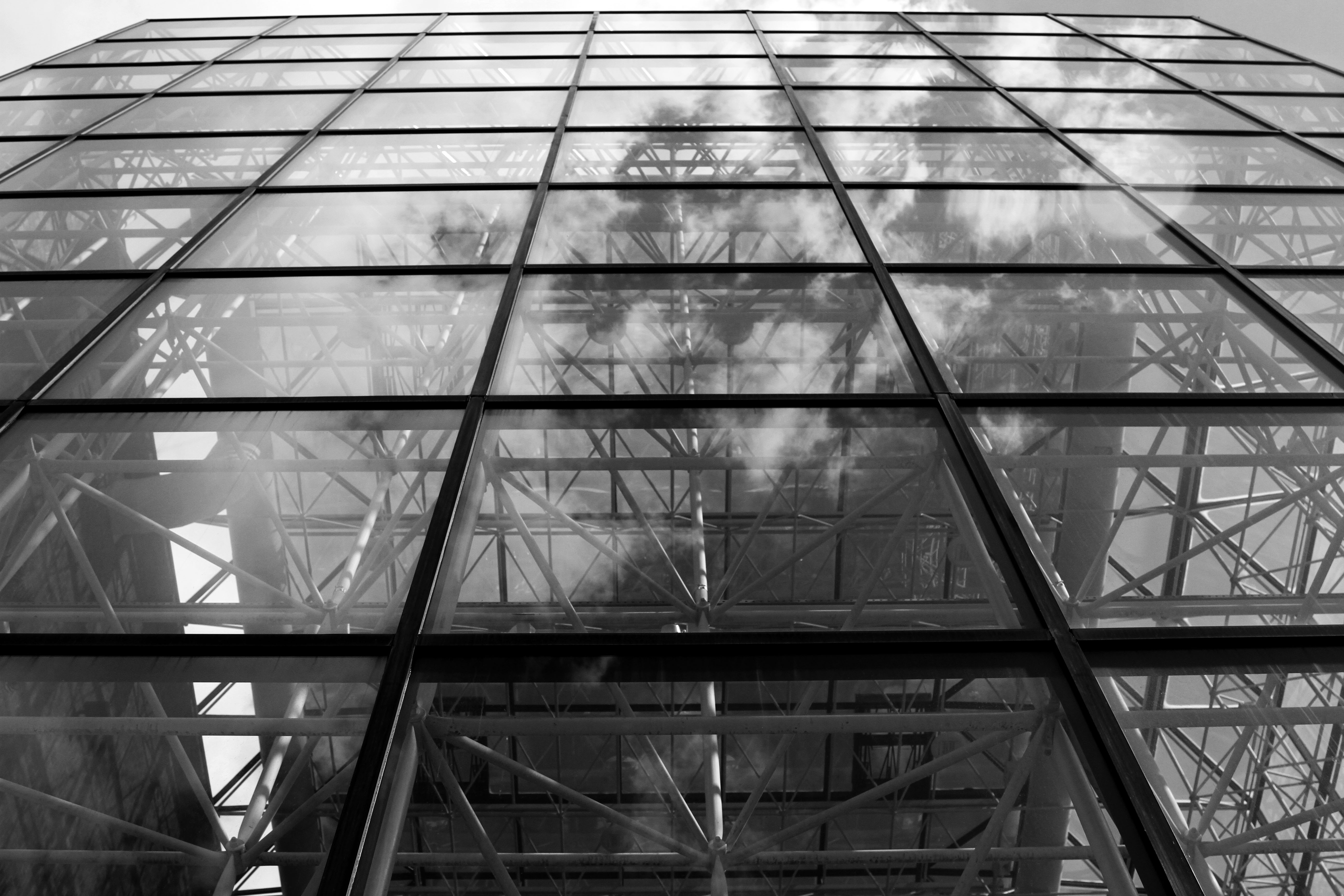
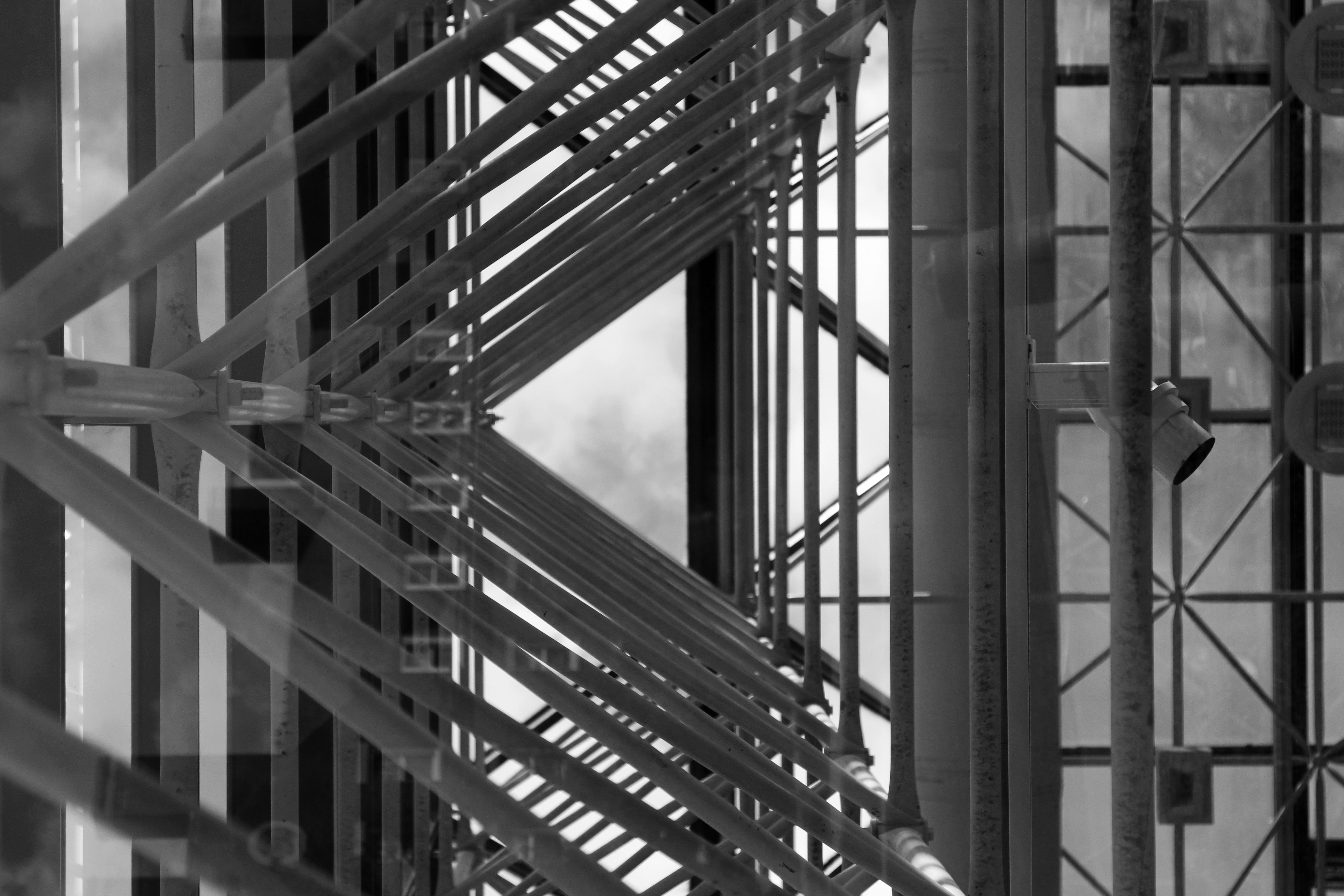
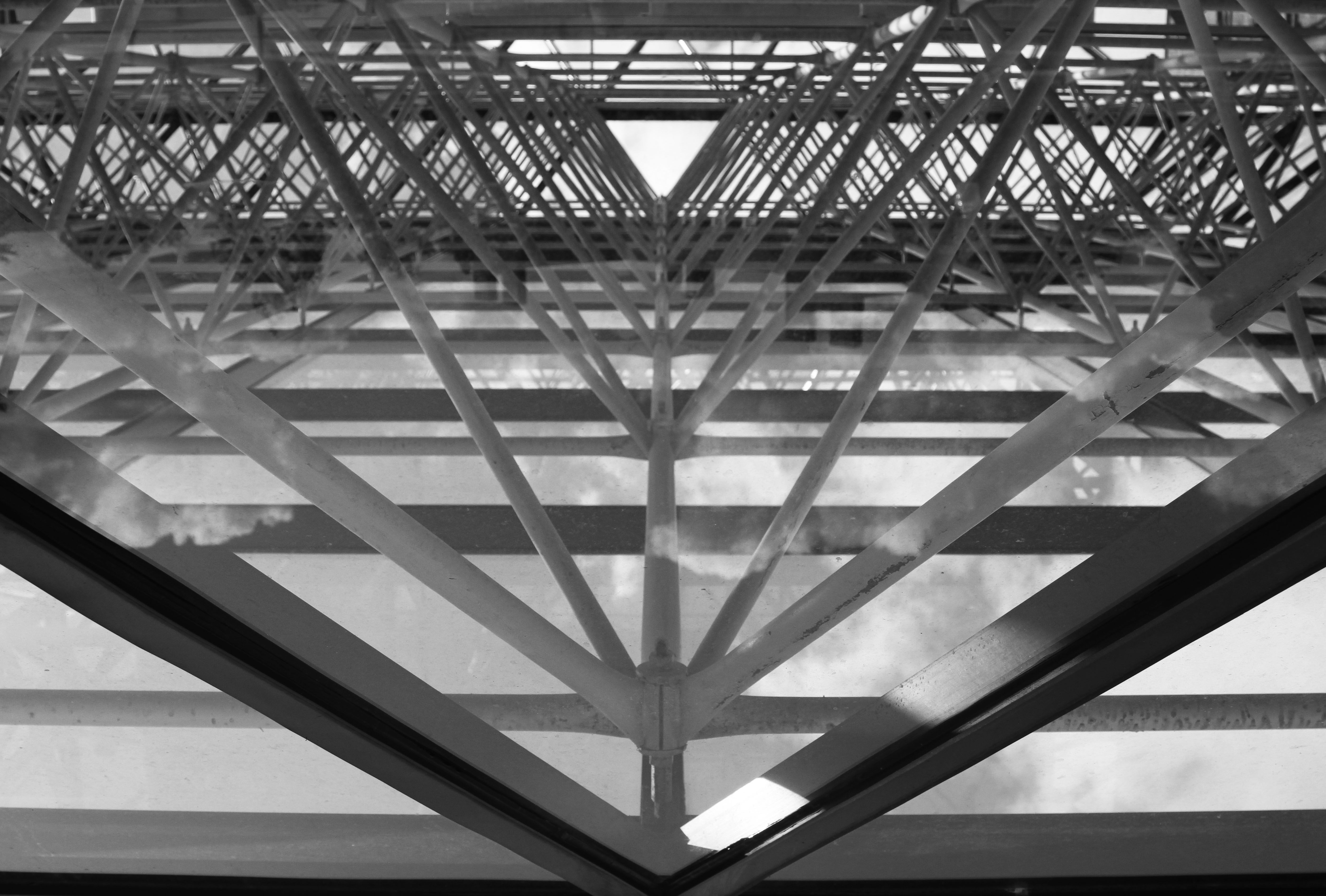
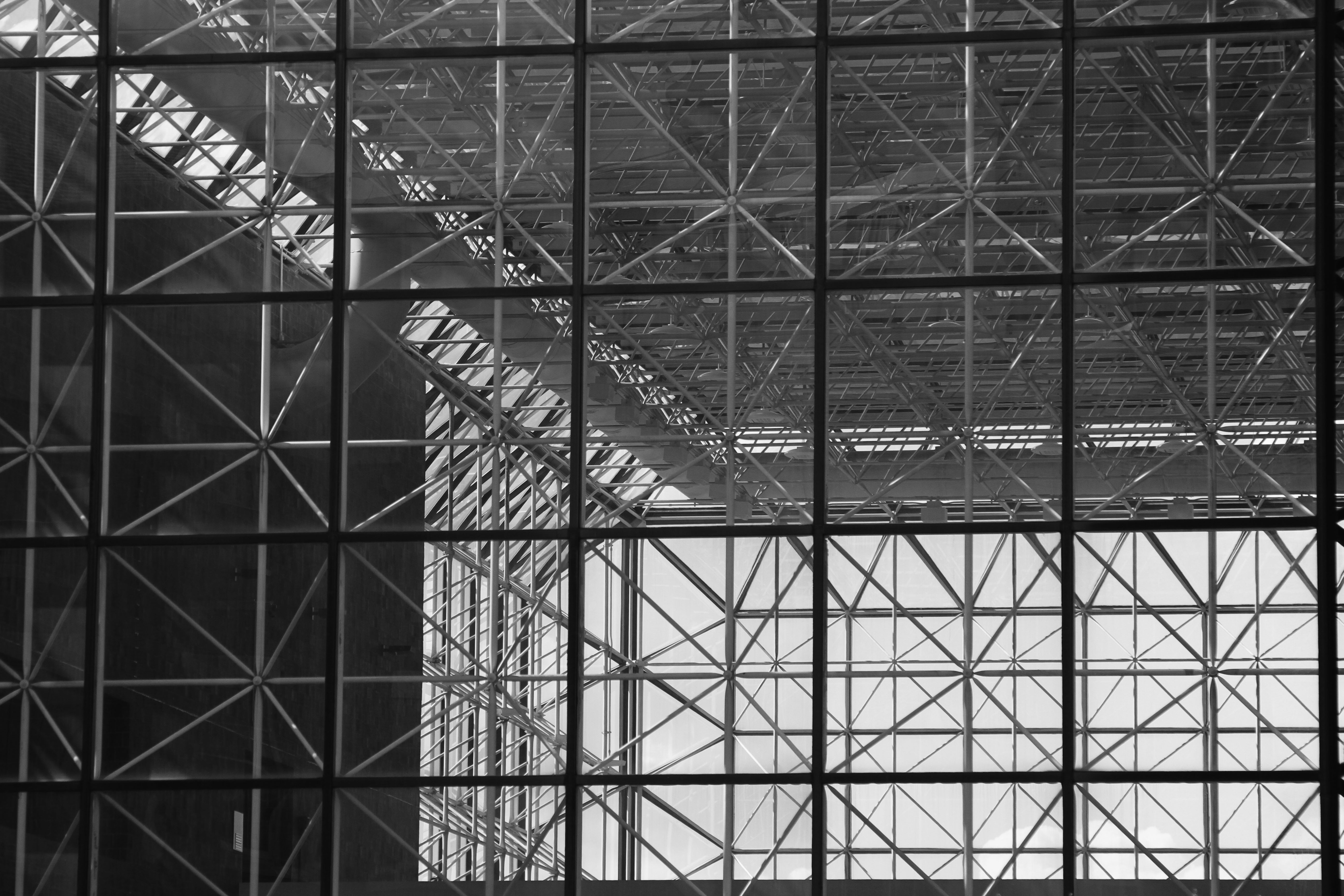
I decided to accurately draw the ceiling plan of Sage Art Center, which is essentially an open plan building consisting of 25 columns, and

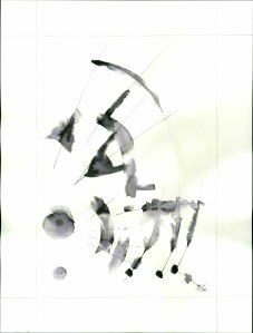
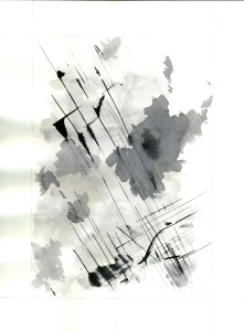
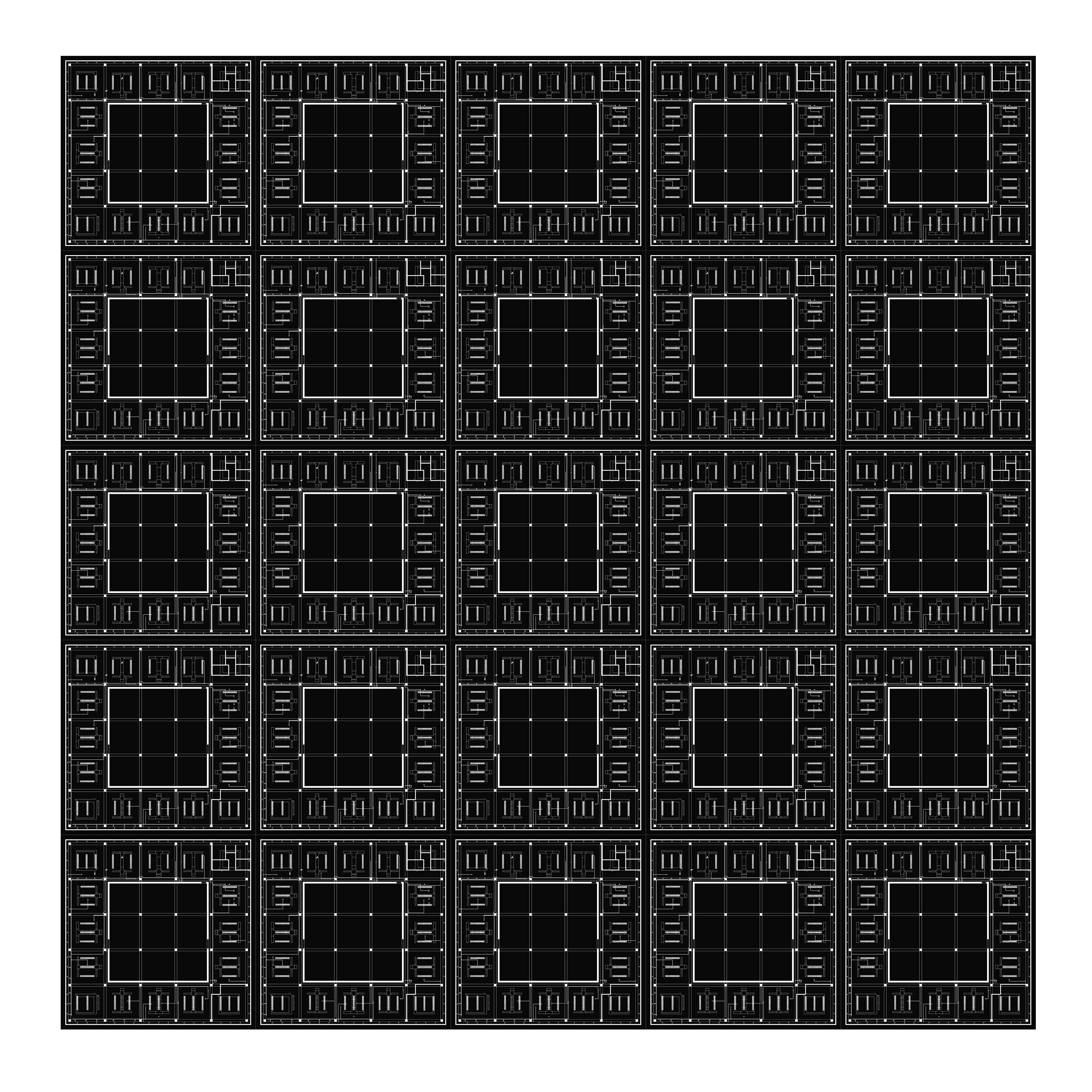
My goal was to further abstract something that is already abstract and unnoticed–a building/architecture. I like to graphically interpret architecture in an effort to show viewers unseen or unthought-kiof aspects/possibilities of a building they regularly use and perhaps (probably) barely notice.

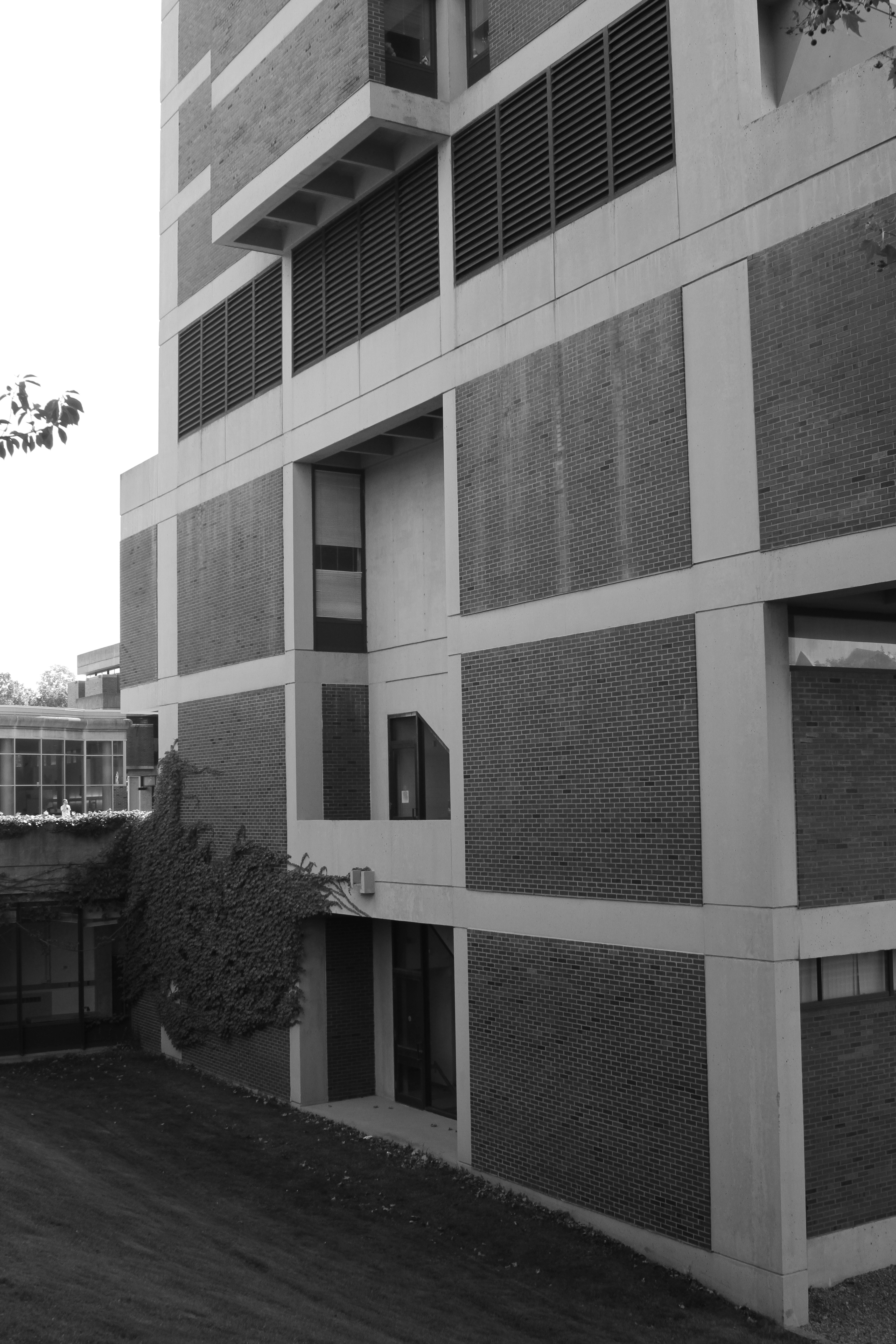
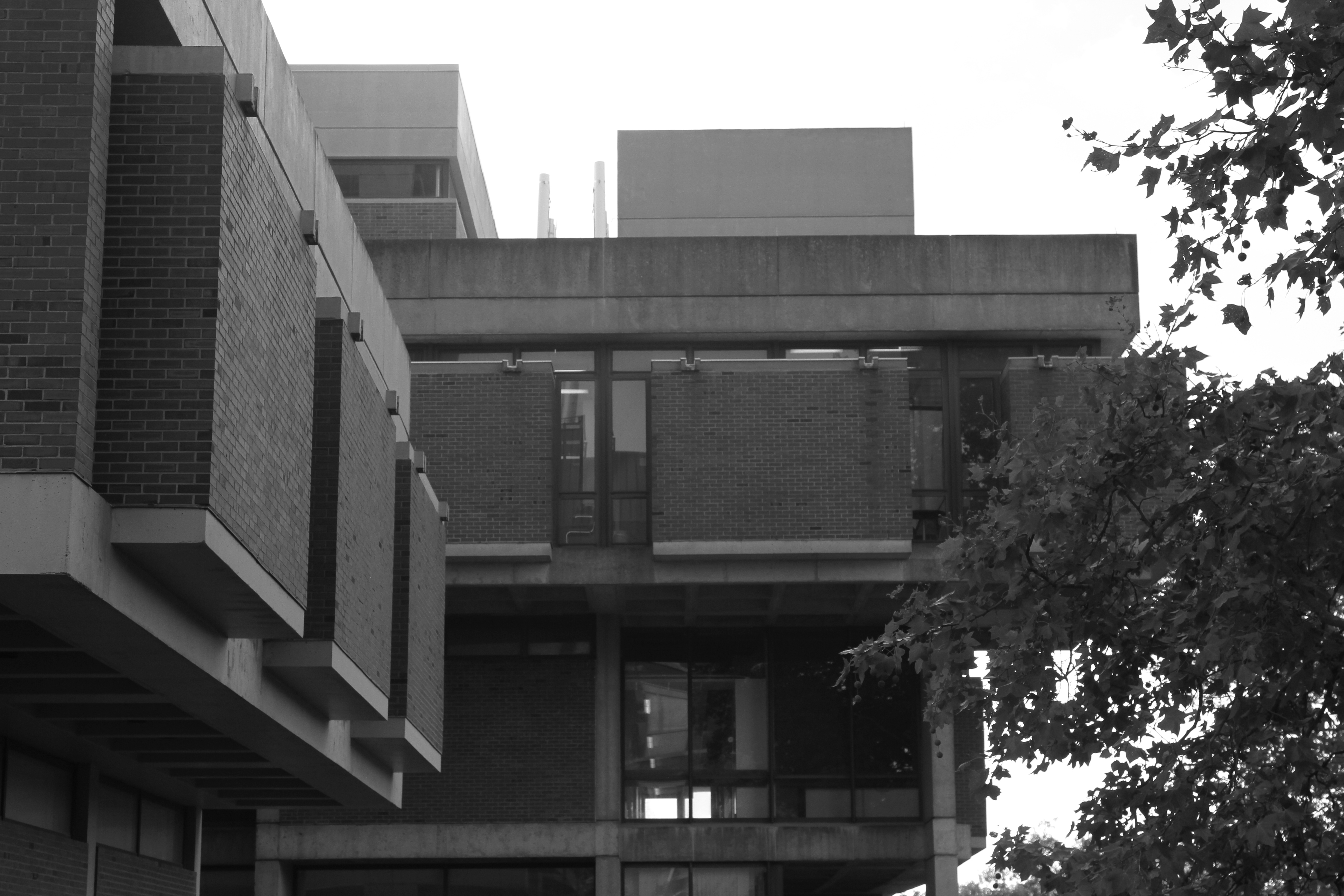
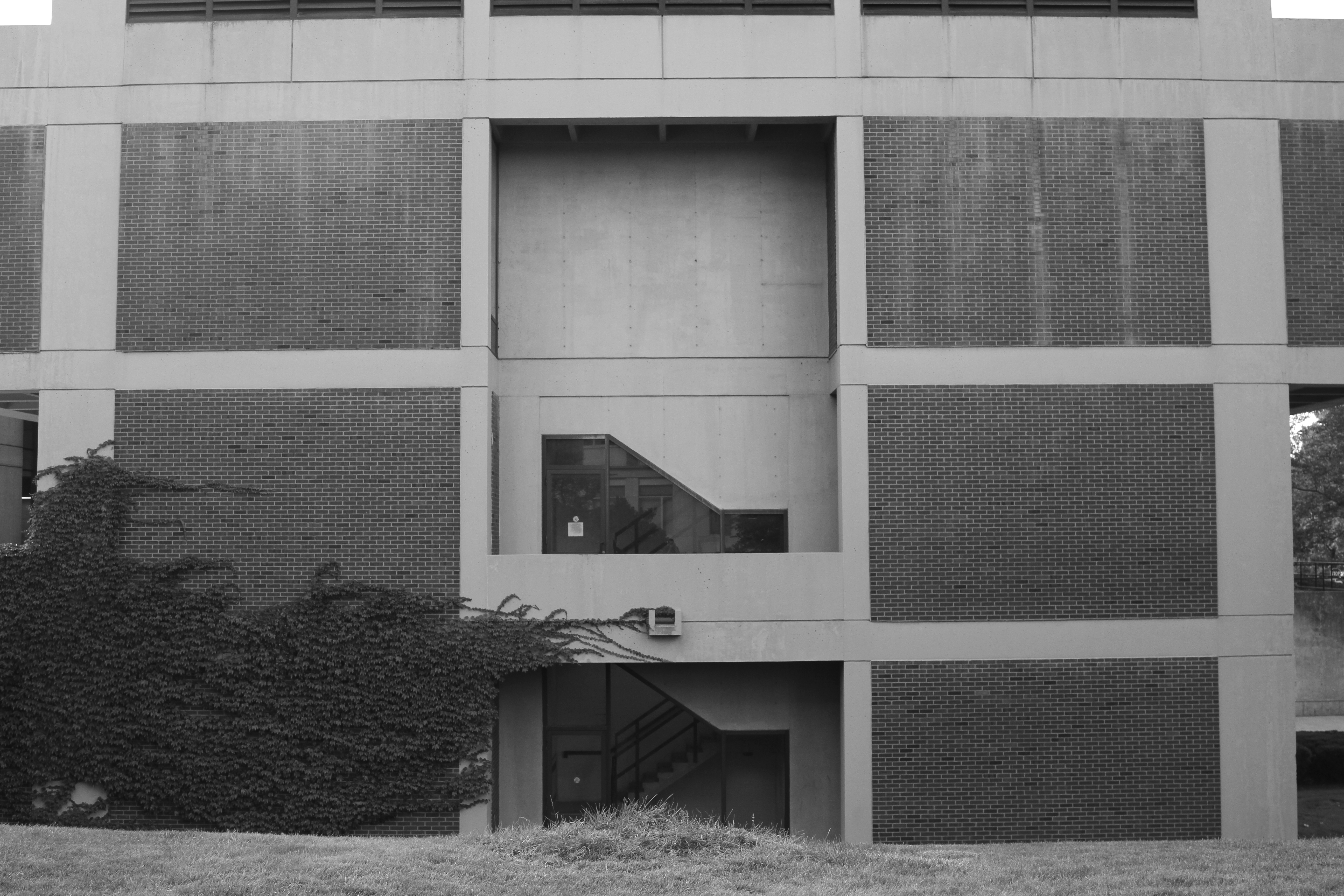
At the same time, I like geometry and patterns, and architecture is all about that. Sage is a perfect square with multiple geometries embedded in the form of column grids, mechanical chases, light fixtures, etc. Perhaps people can look at the ceiling and its elements (for the first time) as things other than random utilitarian interventions, and find some order and even beauty in what at first seems like an undefined structural chaos.

The Poetics of Space II: College Brutalism

architecture, college, design, photography

The second building I want to represent as part of my honors thesis exhibition is Hutchinson Hall, also known as “the battleship,” and its vertical peer, Hylan Tower.

Here are my photographic studies so far (discussion after the pictures).

IMG_1990

IMG_1994

IMG_1997

IMG_1998

IMG_2000

IMG_2003

IMG_2007

IMG_2012

IMG_2014

IMG_2016

IMG_2021

IMG_2028

IMG_2029

IMG_2054

IMG_2061

IMG_2062

IMG_2067

IMG_2070

IMG_2074

IMG_2076

IMG_2079

IMG_2084

IMG_2085

IMG_2093

IMG_2114

IMG_2124

IMG_2132

IMG_2139

I have witnessed many negative remarks by students and faculty about this building. They wonder why do we need a bomb shelter on campus, and why couldn’t they do an ivy-covered brick building instead, with little stone cornices and details on the corners.

We do have a couple ivy-covered brick buildings on campus outside the main academic quad (which is a wonderful architectural complex) and neither of these catch the slightest of interest from anybody. They simply can’t shine. Their half-hearted historical allusions were ill thought about and executed. Hutchinson is for me a beautiful expression of pre-cast concrete, the material being one with the form. Buildings like Hutchinson are not built anymore. In today’s campuses there is a tendency towards washed-away glass store-fronts and the like, and less permanent, bold solid forms.

Hutchinson Hall is an example of the ever decreasing list of so-called “brutalist” architecture, which was until very recently regarded as inhumane and ugly in its entirety. Built during the 60s and 70s, some scholars have proposed that this is the kind of architecture that universities hoped would offer some greater form of resistance against the student movements of the time. I could not find any public evidence of this in the case of Hutchinson Hall. After looking at the documents available at the Rare Books and Special Collections department, the main concern of the university had seem to acquire enough space for the chemical and biological sciences; a fire resistant, and structurally sound structure in case something went wrong in the labs.

To me, the theme of this style is that of volume and shadow. In my exhibition drawing, I plan to incorporate the very lucid three-dimensionality of this building and the play of light throughout the days and seasons across the building.


(Flashback) A Take on Performance Art

Uncategorized

Power, language, instructions, phonetics, poetry.

This is my one and only attempt with performance art, also from a year ago.

I read, or rather dictate, a short poem by 20th century Spanish-Mexican poet Leon Felipe to my Spanish-ignorant volunteers. They must repeat what I say as best as they can.

Here is a transcript of the text, entitled “Decimos Todos.”

“Dice este hombre sencillo,

Antes que mi derecho,

pido mi sacrificio.

Tu, hombre elegido,

Ven aqui,

Sube sobre mis hombros,

Y ponte de puntillas,

Sobre mi craneo erguido.

Despues, hombre elegido,

Mi derecho sera tu sacrificio.

Que me digas honrada, y claramente

Lo que has visto,

Subido de puntillas,

Sobre mi craneo erguido.”

-Leon Felipe


(Flashback) Video Art and Wilson Commons

architecture, art, college, video art

Even though my serious research of Wilson Commons started just last semester, my interest and fascination with this building started a while back. For my first project in my video art class more than a year ago, I did a one minute in-camera cut video. Using fairly old tape cameras, we were required to create a final product without using any editing software. This is the result:

The Poetics of Space I: Wilson Commons

architecture, art, design, photography

The success of the masterpieces seems to lie not so much in their freedom from faults–indeed we tolerate the grossest errors in them all–but in the immense persuasiveness of a mind which has completely mastered its perspective.” – Virginia Woolf, “The Death of the Moth.

I have embarked in my school’s honors project. I envision myself creating several very large mix-media architectural drawings of symbolic buildings on campus. These drawings, while relying on the traditional techniques used by architects to describe buildings (floor plan, section, elevation, orthogonal and perspective projections, etc) are really meant to illustrate in literal and symbolic ways, those architectural elements–physical, historical, symbolic, functional, mythical, etc–that integrate these buildings and which are often overlooked, or not even thought-of. My plan is to create viciously detailed large scale drawings that will amaze their typical users and encourage them to look at them with new eyes, and encourage them to think about how these spaces are in fact affecting their bodies and minds on a daily basis.

One of the buildings I have in mind is the student union at the U of R. We call it Wilson Commons, and it was designed and constructed by the firm of I.M. Pei. Judged since the beginning of its existence, there is only one thing I can answer about its architectural value: considering its lack of “beauty,” its awkward functionality and multiple daily inconveniences, it is in the end, and aside from Rush Rhees Library and maybe another couple buildings, the only piece of Architecture (mind the capital A) on campus. It is, in other words, the complete fulfillment of an intellectual structure bestowed upon a physical structure; the full released intensity of a design. The integrity of the design survived gravity, budget and client–until they McDonaldized the food court 20 years later….

Here are my photographic studies for the drawing so far:

IMG_1609

IMG_1611 copy

IMG_1613 copy

IMG_1624 copy

IMG_1627

IMG_1642 copy

IMG_1647 copy

IMG_1648 copy

IMG_1649

IMG_1654 copy

IMG_1733 copy

IMG_1744 copy

IMG_1759 copy

IMG_1762 copy

IMG_1797 copy

IMG_1862 copy

WC1


Good Old Drawing: Cities; My City

art, drawing, frame

It’s been a while since I did a drawing project. It used to be my thing before I started college. Drawing, for hours, cities and buildings on paper, with black ink ( I never liked pencil drawings–too dirty).

Last weekend, I finally had the chance to do a fairly large drawing project (about 25 hours of work). A drawing of the main square of my hometown, Durango, Mexico.

A colonial city, 500 years old, founded by the Spanish conquistadors as a local settlement along the “Royal Road,” which connected Mexico City with Santa Fe, now in New Mexico. The main purpose of this road was the transportation of precious minerals from the New World to Spain.

My city, founded near an iron hill which was though to be made out of silver, is now a 500,000 population state capital. During the last decade, the government has been restoring and even rebuilding much of the colonial heritage of the city.

It is a lovely town embedded between the western sierra and the desert of the Mexican Plateau. Hot and dry throughout the year, it is a great place to live in. This drawing is my orthogonal tribute to it.

Durango

Once Upon a Time, in the Bauhaus:

art, frame, pattern, watercolor

Lines, geometry, grey scale.

Going back to the basics.

BauhausA

This is the piece I go back to to get reminded of the power of analogue; this is not entirely about clean lines and perfect geometry, but about the texture and general tactile quality of the surface. Most of my work is digital now, and my current struggle is how to achieve that texture and “life” which non-digital works have.

JoanneWatercolor

This piece was inspired by David Wyeth’s amazing painting “Christina’s World.”

Week Plan: A Möbius Strip?

architecture, art, college, digital art, drawing, pattern

I recently submit the piece below to an undergraduate art show her in my school. Last year my work was one of the elected pieces for the exhibition but this year I was not lucky enough. Nonetheless, I consider this piece to be quite a step forward in my research involving the graphic representation of space.

HartnettJuriedExhibition_Pinera_WeekPlan

What if a psychologist, instead of asking you to write your week’s activities in a log, presumably to “optimize” you’re time management, asked you instead to write down, or rather, draft, the spaces you occupy during that week? How about “space optimization”? What’s the space in between? What’s the space within? Without?

With this proposition in mind, I set out to draft the spaces I occupied during a whole business week of my life, using only measuring tape and standard architectural software to create a “floor plan” of each day, Monday through Friday. To reduce my scope from global to doable, I eliminated the spaces where I spent less than 5 min. engaged in an activity. With this rule, hallways, roads, and parking lots were eliminated to create a fairly tight plan which was arranged according to the geographical position of each room or place in relation to the others.
My room and dorm bathroom happen to occupy the northernmost point of my plan. Usually, the library lies to the south while the food (dining halls) lie towards the East and center. Computer lab? West.
Once these plans are joined, they form a kind of Mobius strip, quite illustrative of the daily life of many. A spatial matrix from which there is no escape. The repetition is obvious and almost impossible to escape.
What kinds of spatial patterns exist in each week, for each person? Where do we actually exist?
How do the “powers of architecture,” affect us without our knowledge? What does a wall, or a window, or a column does to our daily life? How can we change the spatial discourse on a personal, citizen level? What would we see, and understand, by looking at our “week plan”?
There is much knowledge to be found in the realm of spaces, if only we look. And measure.
Week Plan

Ink Experiments I

art, drawing, ink


Ink is fascinating.

Liquid, running ink.

I think that, unlike using a pencil or a pen, ink contains a high level of unpredictability that adds a unique character to a piece. No two marks are identical.

My experience with ink is limited, but recently I decided to do an earnest effort to experiment with it, trying to figure out some of the almost endless possibilities of this medium.

In particular, I tried to play between sharpness and diffusion. To accomplish this, I wet the blade of an exacto knife with ink and “cut through” the paper to make very thin lines that also have a texture to them. Along the path of my cut lines, I damped the paper with water so that as soon as the ink went through the area, it would spread in unpredictable ways. These are some of the results:

InkCompositionI

InkCompositionII

InkCompositionIII

InkCompositionV

InkCompositionVI